We all know the problems that arise when we try to build multi-column layouts in which the columns are of equal height. It has been well documented elsewhere, so I won’t go into the details here.
A project I recently worked on required an elastic layout with two columns of equal height, each with a different background color. As usual, there was no way to tell which column would be taller. I immediately thought of Dan Cederholm’s Faux Columns, but I needed an elastic layout. I also looked at the One True Layout, but this seemed buggy and required too much extra markup and too many hacks for my taste. I even thought about using JavaScript to make sure the columns were of equal height, but that just felt wrong. Out of desperation, I almost (gasp!) used a table.
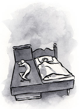
But no, there had to be a better way. I just needed to think “outside the box.” And what is outside the box? Borders. If I could float my “sidebar” (or “rail”) div over the border of my “content” div, I could simulate equal-height columns no matter which one was the tallest.
If this sounds familiar, that’s probably because a version of this method was introduced by Douglas Livingstone and extended by Holly
Bergevin and John Gallant at Position Is Everything. While relying on the same core theory, the method presented here uses cleaner, less deeply nested markup, includes elastic and two-column layout variations, and generally benefits from having been developed in the post–One-True-Layout world. Here is how it’s done. (Line wraps marked » —Ed.)
The HTML:#section2
<div id="container">
  <div id="content">This is<br />some content</div>
  <div id="rail">This is the rail</div>
</div>
The CSS:#section3
#container{
  background-color:#0ff;
  overflow:hidden;
  width:750px;
}
#content{
  background-color:#0ff;
  width:600px;
  border-right:150px solid #f00; »
  /* The width and color of the rail */
  margin-right:-150px; /* Hat tip to Ryan Brill */
  float:left;
}
#rail{
  background-color:#f00;
  width:150px;
  float:left;
}
I created a right border on the content div of the same width and color as the rail, then floated the rail div over it. The margin-right:-150px on the content div allows the rail div to move into the newly vacated space. If the content div is taller than the rail div, the border grows with it making it appear that the rail is growing. I set the container’s background color to match the content so if the rail div is the tallest, the container grows with it and it appears that the content column is growing. It only takes a small change to the CSS to make the rail left-aligned, whether the content or the rail is taller.
See it in action or check out the elastic version; try changing your font size and watch the layout change with it.
Three columns: three colors#section4
The three-column layout takes a slightly different approach: the borders are applied directly to the container div. (I could have done this with the two-column layouts as well but I didn’t think of it at the time. Line wraps marked » —Ed.)
The HTML:#section5
 <div id="container">
   <div id="center">CENTER<br />COLUMN CENTER</div>
   <div id="leftRail">LEFT RAIL</div>
   <div id="rightRail">RIGHT RAIL</div>
 </div>
The CSS:#section6
#container{
  background-color:#0ff;
  float:left;
  width:500px;
  border-left:150px solid #0f0; »
  /* The width and color of the left rail */
  border-right:200px solid #f00; »
  /* The width and color of the right rail */
}
#leftRail{
  float:left;
  width:150px;
  margin-left:-150px;
  position:relative;
}
#center{
  float:left;
  width:500px;
  margin-right:-500px;
}
#rightRail{
  float:right;
  width:200px;
  margin-right:-200px;
  position:relative;
}
The center column has a right margin of -500px. This allows the left rail div to float all the way over it to the left edge of the center column. Negative margins pull the sidebars into place. There are a few ways to do this, but this one seems to work the best when we get to liquid layouts later on.
I’ve floated the container div to honor the column heights instead of setting overflow:hidden. This is because the sidebar divs are outside of the container div, floating over its borders, so they would be hidden using the overflow setting: IE does not hide them, but Firefox, correctly, does.
The columns don’t need a background color. Since the colors are set on the container div, which grows with the tallest column, the illusion of equal height is taken care of.
Liquid layouts#section7
After figuring out the fixed-width layouts, I decided to attempt liquid layouts using the same technique. The sidebars would still need to be fixed-width since most browsers won’t respect a percentage-width border setting, but we can make the center column liquid.
The CSS:#section8
#container{
  background-color:#0ff;
  overflow:hidden;
  margin:0 100px;
  padding-right:150px; /* The width of the rail */
}
* html #container{
  height:1%; /* So IE plays nice */
}
#content{
  background-color:#0ff;
  width:100%;
  border-right:150px solid #f00;
  margin-right:-150px;
  float:left;
}
#rail{
  background-color:#f00;
  width:150px;
  float:left;
  margin-right:-150px;
}
The markup is the same as the two-column, fixed-width version, with the exception of some additional content to show what happens when it wraps. The CSS doesn’t really change much either, but there are a few differences: the container two-column, fixed-width version no longer has a width, and I added height:1% so IE will respect overflow:hidden. (I used the star HTML hack for this, but could have used conditional comments to include an IE specific style sheet.)
I also added a margin to create space on the sides; this is optional. The padding-right shrinks the space the content div will take up: since the content div now has a width of 100%, if there was no padding on the container, the sidebar div would be outside of the container and hidden. Finally, the content div’s width switches from fixed width to 100%, and margin-right:-150px is added to the sidebar div.
As with the two-column, fixed-width layout, the left-rail version requires only minor changes to the CSS. I added a simple header and footer for grins, and you can view the source to see how it’s done.
Three-column liquid layouts#section9
A three-column liquid layout with equal-height columns has been called many things: “Holy Grail,” “One True Layout,” “pain in the @$$”… The following technique is relatively painless, uses proper source order, does not require the use of an image, and seems to be bug-free.
The HTML:#section10
 <div id="container">
   <div id="center">Center Column Content</div>
   <div id="leftRail">Left <br />Sidebar</div>
   <div id="rightRail">Right Sidebar</div>
 </div>
The CSS:#section11
body{
  margin:0 100px;
  padding:0 200px 0 150px;
}
#container{
  background-color:#0ff;
  float:left;
  width:100%;
  border-left:150px solid #0f0;
  border-right:200px solid #f00;
  margin-left:-150px;
  margin-right:-200px;
  display:inline; /* So IE plays nice */
}
#leftRail{
  float:left;
  width:150px;
  margin-left:-150px;
  position:relative;
}
#center{
  float:left;
  width:100%;
  margin-right:-100%;
}
#rightRail{
  float:right;
  width:200px;
  margin-right:-200px;
  position:relative;
}
The margin and padding go on the body this time. The margin pushes the layout in from the edges of the screen, and the padding is the width of the sidebars. The remaining area is the width that the container can grow to be: 100% of the browser width minus margin and padding. On the container div, I set borders and negative margins the same width as those borders. This places the borders over the body padding, making everything fall into place. Then we just can position the divs.
The next example illustrates a nested liquid two-column layout and a basic header and footer. View source to see how easy it is to put the content into place and style it. The nested two-column layout uses the border on the container technique. This allowed me to add a 2px left border to the content and a 2px right border to the rail and overlap them, creating the full-height divider between. This divider will grow with whichever column is tallest.
If you wanted to get carried away, you could eliminate the column divs and just position the pieces of content into place. Because the sidebars are really the borders of the container div, they will still work. If you really wanted to go crazy with it, you could eliminate the container entirely and put the borders right on the body, achieving a three-column liquid layout with columns of equal height and no container divs! The only problem is that the background color of the center column cannot be a different color from the rest of the body—and eliminating the containers makes it much more difficult to position and style things…but it can be done.
I should note again that these techniques only work with fixed-width sidebars, as only Opera lets you set a border width using percentages. Also, the rails cannot have an image for a background, but that may change with the border-image property in CSS3.
So there you have it: multiple columns, equal column heights, fixed or liquid center column, clean markup, and CSS. All it took was a little thinking outside the box.
Hmm … I’m trying to adapt this to a percentile size for the rail instead of “150 pixels or else” (on some resolutions and/or text-sizes, 150 pixels might be way too small). Unfortunately … it seems that borders really don’t like percentages for their sizes. Oh well.
Is this really worth all the agony and effort?
Elegant? Since when hack became elegant?
A 2 or 3 col table inside a div is not going to break the page. C’mon! You’re not going to:
– Raise a cow in your own backyard because you don’t trust the beef at your local grocers
– Drive extra 15 miles to find a gas station that sells gas for 2 cents less per gallon
– Photocopy all the pages of your neighbor’s newspaper to save subscription cost.
Think about what it’s really worth.
I don’t design web sites very often, but I have a couple to do now. As a law-abiding netizen my instinct is of course to follow every possible rule.
But I was taught at Harvard never to have anything to do with negative margins.
I am therefore working on a layout that uses negative tables. These allow special relative positioning or absolute superpositioning, with measurements in quems or quixels. They are completely undetectable by the CSS police.
I felt I had to chime in here re. tables vs. css. In principle I agree with the ‘use whatever is easiest for the job’ idea; but does no-one else care about source-ordering? We find most clients care a great deal about SEO and you just cannot get a nice source-ordered document with tables. This is the #1 reason we have switched to CSS/div based layouts.
So yes tables may be quicker, but for a real company’s site often they just aren’t good enough.
honestly, this is exactly the solution I’ve been waiting (looking?) for, for ages! Thanks listapart!
I have used this technique recently for a website and almost everything works well. I have also put a simple explanation as to how to achieve it at “Three column layout – Pearce Method “:http://www.latenightengineer.com/play/three-column-layout-pearce
I hope it may help someone.
I can’t get this to work in ASP.NET 1.1. Even the example breaks when I move the style rules into a linked CSS, and the HTML inside the <form> tag of an aspx web form. This is what I get.
Any ideas for fixing it? (No, I absolutely cannot change the platform or work outside of a FORM tag.)
“This is what happens in ASP.NET 1.1 get”:http://www.acadrad.org/images/stuff/ala_liquid3b_aspx.jpg
Hi. I think this is a great solution to deal with three column layout. I don’t have any negative thoughts about this, but I have a problem to solve.
I didn’t see any problems when I created the template for the particular project. Once I started putting content in each column, the left column sometimes jumps into the middle column. It’s recognized in IE6. It doesn’t happen always. Here is the screen shot: http://newsite.netatlantic.com/jumping-column.jpg
The margin width of each side of the shell
I looked through the posts and don’t see anybody has the same issue as mine. Do you think of anything to trigger this issue? I want to know what I did wrong.
I encountered the same problem with as Yukiko Tomosada. If the content is overflowing the #center, the #leftRail is moving the same amount to the right. It’s caused by the following declaration:
#center{
float:left;
width:100%;
margin-right:-100%;
}
as it is in percentage. My solution was declare overflow:hidden;.
I know, I know, table layouts are evil. But sometimes there is just no better choice. Table elements are for structuring tabular data, I’have heared it hundreds of times. But you know, I prefer using a table to make columns instead of all those obscure css hacks.
First, these are not standard ways of doing things, they are hacks; you’ve said it yourself, you have to “think outside the box” to find them. You had to think about unfamiliar, unfriendly and unintuitive code hacks to achieve a simple effect whitch can be easily done with a table and a few “normal” css.
Second, by using a “hack” to layout your stuff, you lose the hability to easily change your presentation style. Try to put a background image to your columns : you will have to completely rewrite your css code. You won’t get all these headakes with a table.
Third, using a floating div to make a column is not better than using a table to layout non tabular data. I mean, the float property is meant to be used in making an image float over some text. Ok, you can twist the original meaning of this property and handfully use it to achieve your goal, but, in my humble opinion, it is not better practice than using a table to layout non tabular data, even more, it IS also a semantic error.
The real nice solution would be to use the “display : table-cell” css attribute in my opinion. However it is not supported by IE. So what do we do then ? My personal choice is to use tables instead of figuring out a new pointless unintuitive hack. ( I’m gonna be crucified for saying this… )
Wow, what will they think of next?
I agree with you Nicholas, so far I have not seen anything to top the performance of an absolute width declaration (via table) and then pinching around with that. I use “includes” to be able to recycle the code pieces (the greatly touted advantage of css). but the point is you can vary backgrounds and images and make a “tasteful” or a “noisy” site. I think the style of the “3ColLiquidWithContent.html” is particularly _ugly_. But I am mrPictures not mr Text, and probably a “Design Dinosaur” to boot.
Hi Folks;
Sorry I can’t post a link to the site, as it’s still only served internally … I’ve got a two column layout, using the “+large” padding-bottom & “-large” margin-bottom, and the containing div has overflow:hidden.
The problem is when you hit an intra-page link to a named anchor, the content above that anchor gets hidden! If you refresh the page in IE7 the whole content comes back, but this does not happen in FF. Using links back to “top” is a solution, but I’m getting some pushback from content developers who think there are too many top links (d’oh!).
Is there a CSS fix for this out there? This is for a state government site, so we’re trying to avoid javascript solutions for such things (which is why the multi-column “one true layout” CSS is so much appreciated).
I’ve been using this in many recent designs, as it appeared the perfect solution — spent the entire morning trying to debug a new site, which was fine yesterday — just traced it to Firefox update to 2.0.0.8 — breaks all instances of this solution. Anyone any ideas on how to work round this, until Mozilla can sort themselves out?
Shouldn’t this be a bug reported on Bugzilla (Mozilla Bug tracker)?
I’m doing a redesign for my site right now and I don’t see how this is a big deal.
I had read this column before but did not have its exact coding in mind when I started filling out the style sheet for the page. I ended up in more or less the same place.
http://www.besalighting.com uses tables. Do you know what that design has? table-tr-td-td-td-table-tr-td-etc. There are over 250 lines of code, including java, the page itself is 15k, and employs about 80 (EIGHTY!) images totaling an additional 100ish kb for buttons, mouseover effects, etc. This code is copied on every page in order to provide a consistent look, and in fact it exposed a problem when the wrong lefthand menu appears on some of the pages.
The work in progress is http://www.besalighting.com/newindex.shtml. It employs less than 40 lines of code. The style sheet is a whopping 2k. It currently uses 4 images. The left hand column is a fixed width, and the main body scales. The footer is actually not below the main div, but at the bottom of the left hand column (using negative margin-top). As far as I can tell, it works correctly in IE 6/7 and Firefox at any width 800 or greater, the footer always drops to the bottom, the dividing line always covers the intended area, I can change the text without affecting the layout, I can update the header , navigation bar and left-hand menu by manipulating the SSI pages and have them show up identical on every single page. And everything so far comes back 100% validated.
How are tables a better or more elegant solution?
Wouldn’t it be just as easy using positioned graphics on the container div?
Thank you! works great. I’m new to CSS, and already feel the relief.
I’m trying this method with a fluid, two-column layout, and I’m running into some problems.
The page is here: http://imp.purplelagoon.org/current/index.shtml
CSS is here: http://imp.purplelagoon.org/css/imp.css
CSS exceptions for IE6 are here: http://imp.purplelagoon.org/css/iestyle.css
In Firefox, the contents of the rail (called #menu in my code) are not showing up.
In IE7, the position of #content fluctuates as the width of the browser window is changed.
In IE6, the contents of the rail aren’t showing up and the left edge of #content is cut off.
Any ideas?
Great article!
I have a website that I developed in IE. It looks fine in Safari and Firefox. However the fonts, letters are looking a bit smeared. Are there established stylesheets out there that can assist me. I mainly am looking for font styles, etc. not layout.
Unfortunately, this solution suffers what much of the web suffers from of late: fixed width websites. Alas. A List Apart suffers from this as well. “For People Who Make Websites”. Yes, but really for “People Who Make Fixed Width Websites”. It’s a regression in functionality. Oh well.
I have approached the equal height columns from a different angle. By nesting the column divs they automatically take on the height of the tallest column. I have created some examples that have no CSS hacks and they work in all the common web browsers:
Pixel widths:
“3 column liquid layout – pixel widths”:http://matthewjamestaylor.com/blog/ultimate-3-column-holy-grail-pixels.htm
Em widths:
“3 column liquid layout – em widths”:http://matthewjamestaylor.com/blog/ultimate-3-column-holy-grail-ems.htm
Percentage widths:
“3 column liquid layout – percentage widths”:http://matthewjamestaylor.com/blog/perfect-3-column.htm
Sorry to take part into discussion so late, but I found this layout and discussion recently. Thank you Matthew for very nice and useful solution. Why not to play with negative margin, it’s OK.
I found a little IE6 bug when adding pictures or texts on the articlerail.
The pictures escape often to the right over the rail border, when you rezise IE window. The highest picture does no escape, no matter the picture widht.
Here is example before resizing: http://juhanile.fidisk.fi/3layout_wPictures_1.jpg
… and here after resizing: http://juhanile.fidisk.fi/3layout_wPictures_2.jpg
When I switch the pictures, always the first picture stays in the rail but the two last ones escape to the right.
Of course, all other browsers behave nicely.
Here is css for the pictures on the article rail:
#raide img {
margin-left:2px;
margin-top:2px;
display: inline;
overflow: hidden;
}
Also I have added to the #center this line:
overflow: hidden;
Is this article rail useless on IE6?
I worked with it for a while but gave up. Thank you, thank you, Matthew Taylor for posting the links to your samples. You have just the solution I have been looking for. Just plain common sense and CSS without any buggy hacks.
In working my way through the code in the “Three-column liquid layouts” section, I can’t figure out what this rule is supposed to do, unless it’s to accommodate a particular browser:
#container{
margin-right:-200px;
}
The layout doesn’t seem to change (at least visibly) if it’s taken out.
And the site I’m working on will need borders around the sidebars, can y’all recommend a solid “holy grail” alternative?
The preview looked fine I swear! Here’s another try with code tagging:
Here’s an alternative way to use negative margins to get a three-column layout. I’ve used the example HTML from this article, but note the CSS methods used for layout are quite different, using padding on an “inner wrapper” div within the center rather than borders.
Three questions:
Do you see a problem with using this method as the basis for a fully fleshed out three-column layout?
Have you seen it used as such before, and if so, can you point to further examples or information on the technique? (side note, if not, I christen it the “Kapok” method since it uses padding
and
Can you point to “tried and true” three-column layout techniques robust enough for a CMS-driven site where users are contributing unpredictable content that may disrupt a fragile layout?
I’ve set the code up in three stages like a howto, so that newbies can easily see the logic behind it.
Stage 1:
Rail
Stage 2:
add:
#articles{

  padding:0 200px 0 150px;

}
Stage 3:
add:
margin-right:-100%;
to the ruleset for the #center div
Here’s my explanation for how the negative margin works, please let me know if I’m off base:
By setting a negative margin equal to the width, the float rules act as if this div has no width at all, allowing the following floated boxes to overlap it.
Thanks for your time and attention, and hope someone finds this helpful, or at least interesting. . .
first, thanks to help me climb out oft the box
————————————————
i try to use it in asp.net
in file MasterPage.master
it can’t work
it can’t display like you in design page but
it cant preview in ie 7.0+ only
help me pls.
The solution is the multiple column proportional synchronized scrolling layout!
The SLIRK Layout.
great article indeed!
I tested it with some odl browsers and yeah – it is not taht good but who cares? Just look at the recent stats of what users use and you’ll find that IE 6 is the oldest while IE 7 and FF are two equal leaders.
Brilliant! I was trying to figure out how to do a three column, equal height layout just last night, and though I hacked out a decent idea, the one in this article is so much simpler. Thanks!
Working on a website for our local volunteer fire department, and just can’t seem to get the columns right. Site looks okay in IE7 with the use of a few
‘s, etc., but not okay in Firefox and Opera. And Safari is way off. All I know about using this type layout came from your website.
Website url http://www.jwgmg.com/TSVFD/index1.html
CSS url http://www.jwgmg.com/TSVFD/styles/style.css
I have found this solution useful in getting my site done the way I want. Now, the only thing left is to figure out how to center the entire layout in the middle of the screen, versus having it align to the left edge of the screen. Any thoughts?
You can have a look as well at Flexi CSS Layouts – a Dreamweaver Extension that help you create Css layouts in Dreaweaver without coding.
Thanks for the article! I was really floundering in a sea of div’s, floats, and classes. I incorporated your model and got the alignment I needed.