It’s normal for your website users to have recurring questions and need quick access to specific information to complete … whatever it is they came looking for. Many companies still opt for the ubiquitous FAQ (frequently asked/anticipated questions) format to address some or even all information needs. But FAQs often miss the mark because people don’t realize that creating effective user information—even when using the apparently simple question/answer format—is complex and requires careful planning.
As a technical writer and now information architect, I’ve worked to upend this mediocre approach to web content for more than a decade, and here’s what I’ve learned: instead of defaulting to an unstructured FAQ, invest in information that’s built around a comprehensive content strategy specifically designed to meet user and company goals. We call it purposeful information.
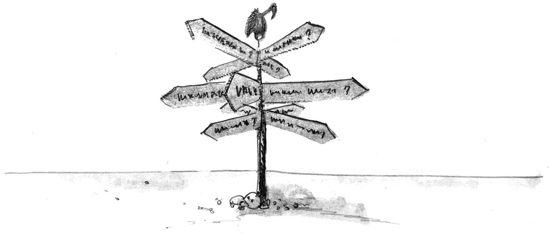
The problem with FAQs#section2
Because of the internet’s Usenet heritage—discussion boards where regular contributors would produce FAQs so they didn’t have to repeat information for newbies—a lot of early websites started out by providing all information via FAQs. Well, the ‘80s called, and they want their style back!
Unfortunately, content in this simple format can often be attractive to organizations, as it’s “easy” to produce without the need to engage professional writers or comprehensively work on information architecture (IA) and content strategy. So, like zombies in a horror film, and with the same level of intellectual rigor, FAQs continue to pop up all over the web. The trouble is, this approach to documentation-by-FAQ has problems, and the information is about as far from being purposeful as it’s possible to get.
For example, when companies and organizations resort to documentation-by-FAQ, it’s often the only place certain information exists, yet users are unlikely to spend the time required to figure that out. Conversely, if information is duplicated, it’s easy for website content to get out of sync. The FAQ page can also be a dumping ground for any information a company needs to put on the website, regardless of the topic. Worse, the page’s format and structure can increase confusion and cognitive load, while including obviously invented questions and overt marketing language can result in losing users’ trust quickly. Looking at each issue in more detail:
- Duplicate and contradictory information: Even on small websites, it can be hard to maintain information. On large sites with multiple authors and an unclear content strategy, information can get out of sync quickly, resulting in duplicate or even contradictory content. I once purchased food online from a company after reading in their FAQ—the content that came up most often when searching for allergy information—that the product didn’t contain nuts. However, on receiving the product and reading the label, I realized the FAQ information was incorrect, and I was able to obtain a refund. An information architecture (IA) strategy that includes clear pathways to key content not only better supports user information needs that drive purchases, but also reduces company risk. If you do have to put information in multiple locations, consider using an object-oriented content management system (CMS) so content is reused, not duplicated. (Our company open-sourced one called Fae.)
- Lack of discernible content order: Humans want information to be ordered in ways they can understand, whether it’s alphabetical, time-based, or by order of operation, importance, or even frequency. The question format can disguise this organization by hiding the ordering mechanism. For example, I could publish a page that outlines a schedule of household maintenance tasks by frequency, with natural categories (in order) of daily, weekly, monthly, quarterly, and annually. But putting that information into an FAQ format, such as “How often should I dust my ceiling fan?,” breaks that logical organization of content—it’s potentially a stand-alone question. Even on a site that’s dedicated only to household maintenance, that information will be more accessible if placed within the larger context of maintenance frequency.
- Repetitive grammatical structure: Users like to scan for information, so having repetitive phrases like “How do I …” that don’t relate to the specific task make it much more difficult for readers to quickly find the relevant content. In a lengthy help page with catch-all categories, like the Patagonia FAQ page, users have to swim past a sea of “How do I …,” “Why can’t I …,” and “What do I …” phrases to get to the actual information. While categories can help narrow the possibilities, the user still has to take the time to find the most likely category and then the relevant question within it. The Patagonia website also shows how an FAQ section can become a catch-all. Oh, how I’d love the opportunity to restructure all that Patagonia information into purposeful information designed to address user needs at the exact right moment. So much potential!
- Increased cognitive load: As well as being repetitive, the question format can also be surprisingly specific, forcing users to mentally break apart the wording of the questions to find a match for their need. If a question appears to exclude the required information, the user may never click to see the answer, even if it is actually relevant. Answers can also raise additional, unnecessary questions in the minds of users. Consider the FAQ-formatted “Can I pay my bill with Venmo?” (which limits the answer to one payment type that only some users may recognize). Rewriting the question to “How can I pay my bill online?” and updating the content improves the odds that users will read the answer and be able to complete their task. However, an even better approach is to create purposeful content under the more direct and concise heading “Online payment options,” which is broad enough to cover all payment services (as a topic in the “Bill Payments” portion of a website), as well as instructions and other task-orientated information.
- Longer content requirements: In most cases, questions have a longer line length than topic headings. The Airbnb help page illustrates when design and content strategy clash. The design truncates the question after 40 characters when the browser viewport is wider than 743 pixels. You have to click the question to find out if it holds the answer you need—far from ideal! Yet the heading “I’m a guest. How do I check the status of my reservation?” could easily have been rewritten as “Checking reservation status” or even “Guests: Checking reservation status.” Not only do these alternatives fit within the line length limitations set by the design, but the lower word count and simplified English also reduce translation costs (another issue some companies have to consider).
Purposeful information#section3
Grounded in the Minimalist approach to technical documentation, the idea behind purposeful information is that users come to any type of content with a particular purpose in mind, ranging from highly specific (task completion) to general learning (increased knowledge). Different websites—and even different areas within a single website—may be aimed at different users and different purposes. Organizations also have goals when they construct websites, whether they’re around brand awareness, encouraging specific user behavior, or meeting legal requirements. Companies that meld user and organization goals in a way that feels authentic can be very successful in building brand loyalty.
Commerce sites, for example, have the goal of driving purchases, so the information on the site needs to provide content that enables effortless purchasing decisions. For other sites, the goal might be to drive user visits, encourage newsletter sign-ups, or increase brand awareness. In any scenario, burying in FAQs any pathways needed by users to complete their goals is a guaranteed way to make it less likely that the organization will meet theirs.
By digging into what users need to accomplish (not a general “they need to complete the form,” but the underlying, real-world task, such as getting a shipping quote, paying a bill, accessing health care, or enrolling in college), you can design content to provide the right information at the right time and better help users accomplish those goals. As well as making it less likely you’ll need an FAQ section at all, using this approach to generate a credible IA and content strategy—the tools needed to determine a meaningful home for all your critical content—will build authority and user trust.
Defining specific goals when planning a website is therefore essential if content is to be purposeful throughout the site. Common user-centered methodologies employed during both IA and content planning include user-task analysis, content audits, personas, user observations, and analysis of call center data and web analytics. A complex project might use multiple methodologies to define the content strategy and supporting IA to provide users with the necessary information.
The redesign of the Oliver Winery website is a good example of creating purposeful information instead of resorting to an FAQ. There was a user goal of being able to find practical information about visiting the winery (such as details regarding food, private parties, etc.), yet this information was scattered across various pages, including a partially complete FAQ. There was a company goal of reducing the volume of calls to customer support. In the redesign, a single page called “Plan Your Visit” was created with all the relevant topics. It is accessible from the “Visit” section and via the main navigation.
The system used is designed to be flexible. Topics are added, removed, and reordered using the CMS, and published on the “Plan Your Visit” page, which also shows basic logistical information like hours and contact details, in a non-FAQ format. Conveniently, contact details are maintained in only one location within the CMS yet published on various pages throughout the site. As a result, all information is readily available to users, increasing the likelihood that they’ll make the decision to visit the winery.
If you have to include FAQs#section4
This happens. Even though there are almost always more effective ways to meet user needs than writing an FAQ, FAQs happen. Sometimes the client insists, and sometimes even the most ardent opponent (ahem) concludes that in a very particular circumstance, an FAQ can be purposeful. The most effective FAQ is one with a specific, timely, or transactional need, or one with information that users need repeated access to, such as when paying bills or organizing product returns.
Good topics for an FAQ include transactional activities, such as those involved in the buying process: think shipments, payments, refunds, and returns. By being specific and focusing on a particular task, you avoid the categorization problem described earlier. By limiting questions to those that are frequently asked AND that have a very narrow focus (to reduce users having to sort through lots of content), you create more effective FAQs.
Amazon’s support center has a great example of an effective FAQ within their overall support content because they have exactly one: “Where’s My Stuff?.” Set under the “Browse Help Topics” heading, the question leads to a list of task-based topics that help users track down the location of their missing packages. Note that all of the other support content is purposeful, set in a topic-based help system that’s nicely categorized, with a search bar that allows users to dive straight in.
Conference websites, which by their nature are already focused on a specific company goal (conference sign-ups), often have an FAQ section that covers basic conference information, logistics, or the value of attending. This can be effective. However, for the reasons outlined earlier, the content can quickly become overwhelming if conference organizers try to include all information about the conference as a single list of questions, as demonstrated by Web Summit’s FAQ page. Overdoing it can cause confusion even when the design incorporates categories and an otherwise useful UX that includes links, buttons, or tabs, such as on the FAQ page of The Next Web Conference.
In examining these examples, it’s apparent how much more easily users could access the information if it wasn’t presented as questions. But if you do have to use FAQs, here are my tips for creating the best possible user experience.
Creating a purposeful FAQ:
- Make it easy to find.
- Have a clear purpose and highly specific content in mind.
- Give it a clear title related to the user tasks (e.g., “Shipping FAQ” rather than just “FAQ”).
- Use clear, concise wording for questions.
- Focus questions on user goals and tasks, not on product or brand.
- Keep it short.
What to avoid in any FAQ:
- Don’t include “What does FAQ stand for?” (unfortunately, not a fictional example). Instead, simply define acronyms and initialisms on first use.
- Don’t define terms using an FAQ format—it’s a ticket straight to documentation hell. If you have to define terms, what you need is a glossary, not FAQs.
- Don’t tell your brand story or company history, or pontificate. People don’t want to know as much about your brand, product, and services as you are eager to tell them. Sorry.
In the end, always remember your users#section5
Your website should be filled with purposeful content that meets users’ core needs and fulfills your company’s objectives. Do your users and your bottom line a favor and invest in effective user analysis, IA, content strategy, and documentation. Your users will be able to find the information they need, and your brand will be that much more awesome as a result.
But, but…I like FAQs! Look, as long as you don’t come down on the wrong side of history in the debate over the Oxford comma, we can still be friends 🙂
True story, I once came across an FAQ with the leading question, “How do I find the FAQ?”
When I check the google analytics data, one of the most used pages of my webSite is FAQ, I am taking a consediration about that. Nice post, thanks
Have you ever struggled to think of what content you should create for your audience?
Even if you’ve got lots and lots of ideas on what to share with people…all the things that you know so much about that you simply must share with your audience to help them succeed with their health and fitness goals!
But…even if you’ve got lots of ideas, it’s not always that easy to turn them into a plan for creating and sharing content.
Ride or die for the Oxford comma, @akutz!
@carybeep I 100% believe that! It’s really sad.
@marka tescil That’s a great starting point. Good on you for being open to looking at it.
Preach! I wrote a similar article a few months ago: http://www.contentcompany.biz/2017/08/30/faqs-not-effective-web-content/
As long as we will consider technical content (Help Center and manuals) NOT as a part of branded content, we will continue to have divided opinions on the merits and need of FAQs.
For instance, Tom Johnson (the celebrated technical communicator who writes at idratherbewriting) wrote a thought-provoking post on FAQs, recently, at: http://idratherbewriting.com/2017/06/23/why-tech-writers-hate-faqs/
As Lisa talks about conference websites, likewise FAQs are so important for SaaS pricing pages. So it is all about context and specific use cases and I am afraid we should not generalize the need for relevance of FAQs.
If UX/UI are well made, faqs are useless. But, if there are still some remaining question, it can be a great way to attract customers with SEO skills.
I love this post, I despise FAQs. I manage a University website and have this conversation often — this article will be a great place to send people!
As a joke I once did a FAWA (Frequently Assumed Wrong Answers) instead of an FAQ.
1. FAQs are a useful way to organize information on a website.
WA. Nope, you’re wrong… blah blah blah…
Hello
Thank you so much for the news update. It is important to conduct faqs in order to know the views of people. Looking forward to more such posts.
Thanks
Essays writing service
Completely agree. FAQs are a lazy way to answer user questions (both from a business and SEO perspective).
Start with your users’ questions – that’ll take you to user intent, which will take you to content models, which will help you write relevant content.
And… if you do need FAQs, give them purpose. Make it part of a Help & Support strategy. Make it part of your adaptive content models, give them fragments.
The Daytona 500 start time, the 60th running of the event, is a Monster Energy NASCAR Cup Series race held on February 18, 2018, Contested over 200 laps, on the 2.5-mile asphalt superspeedway.
The 90th Academy Awards ceremony, presented by the Academy of Motion Picture Arts and Sciences, will honor the best films of 2017 and will take place at the Dolby Theatre in Hollywood, Los Angeles, California at 5:00 p.m. PST on March 4, 2018.
Oscars 2018
janabd is a bangla sms writing web for every people.
Bangla Love Sms
bangla romantic love sms
Thanks Bangla Sms