In the previous article in this series, we covered the basic concept of progressive enhancement; now, we can begin discussing how to use it. There are many ways to integrate progressive enhancement into your work using Cascading Style Sheets (CSS), and this article will cover a few of the biggies and get you thinking about other ways to progressively enhance your sites.
Style sheet organization#section2
A lot of web designers and developers don’t think much about how they incorporate stylesheets into their documents, but there is a real art to it. With the right methods, you can immediately gain many of the benefits of progressive enhancement.
Use multiple style sheets#section3
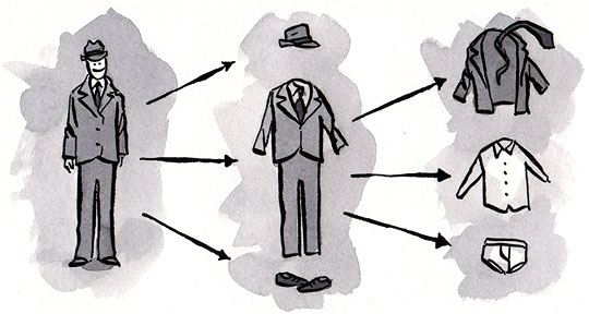
There are many benefits to getting a little separation in your styles. Obviously, stylesheets that are 1500+ lines long are a bit hard to maintain and separating them into multiple stylesheets can improve your workflow (and your sanity). Another benefit not often considered is that this separation can help you obtain greater consistency of presentation across the media types you are targeting.
Consider taking your main.css file, which contains all of the style rules for your site, and breaking it up into individual stylesheets containing typographic, layout, and color information. Name the files accordingly: type.css, layout.css, color.css.

How a single stylesheet is divided into multiple, contextual stylesheets.
Once you’ve done that, you can use a little wizardry to automatically provide a “low-fi” experience to older browsers (such as Internet Explorer 5/Mac) and many other browsers lacking solid support for CSS layouts. How? Well, it’s all in how you link to the files. Let’s assume we started with a main.css file included via a link element:
<link rel="stylesheet" type="text/css" href="main.css" />
First, we’ll break it into separate calls to our three contextual stylesheets:
<link rel="stylesheet" type="text/css" href="type.css" />
<link rel="stylesheet" type="text/css" href="layout.css" />
<link rel="stylesheet" type="text/css" href="color.css" />
In the past, many of us used a media value of “screen,projection” to put the kibosh on Netscape 4.x getting the layout styles, but there’s a better way. Before we look at that solution though, let’s think about alternate media types.
Working with alternate media types#section4
Since content delivery is the main focus of progressive enhancement and we want to deliver an “enhanced” experience to any device that will support it, we should really begin to think beyond the browser; most importantly, we should be thinking about print and mobile.
Unfortunately, the mobile market is still fragmented and immature (don’t get me started on all the handheld browsers that think they should render styles targeted at the “screen” media type). Consequently, a discussion of the ins and outs of handling that medium in a progressively-enhanced way would take several articles, if not a whole book. But don’t despair: things are beginning to gel a bit in the mobile world, and some very smart people are starting to put together resources to help you. But in the interest of time, and our collective sanity, we’ll focus on print.
Now, normally, we would add print styles with another link element:
<link rel="stylesheet" type="text/css" media="print"
href="print.css" />
Traditionally, this stylesheet would contain all of our print-related rules, including typographic and color rules. In the case of typography in particular, the rules in our print stylesheet most likely mirror those in our main stylesheet. In other words, we have a lot of duplication.
This is where the separation of typographic and color styles from layout styles becomes a great asset: we no longer need those rules in our print stylesheet. On top of that, we can use another little organizational technique to improve the scalability of our site and hide certain layout styles from problematic browsers.
Let’s start by revisiting our stylesheets. Consider the following:
<link rel="stylesheet" type="text/css" href="type.css" />
<link rel="stylesheet" type="text/css" href="layout.css" />
<link rel="stylesheet" type="text/css" href="color.css" />
Now, since we don’t have a media type declared, Netscape 4.x will read any styles in these three files, but we can use its very basic understanding of CSS against it and provide further organization for our style rules by moving all of the styles that layout.css contained into a new stylesheet, appropriately named screen.css. Finally, we update the contents of layout.css to import screen.css and NS4.x and its ilk won’t be any the wiser (as they don’t understand the @import directive).
@import 'screen.css';
There’s still a bit of room for improvement though—we should really declare which media that this stylesheet is for, and we’ll do that by adding a media type to the @import declaration:
@import 'screen.css' screen;
The problem is that IE7 and below won’t understand this syntax and will ignore the stylesheet, but if you want to provide these styles to those browsers as well (which you probably will), you can do that quite easily using Conditional Comments, which we’ll cover below. Those of you with eagle eyes may also have noticed the use of single quotes (’) instead of a double quotes (”) around the stylesheet name. This is a nifty trick for getting IE5/Mac to ignore a stylesheet. And since IE5/Mac’s CSS layout is pretty sketchy (especially when it comes to floats and positioning), hiding layout rules is a perfectly acceptable way to treat it. After all, it will still get the color and typography information, which counts for something.
Using the same technique, we can import our print.css file (which contains, you guessed it, print-layout–specific rules).
@import 'screen.css' screen;
@import 'print.css' print;
Not only do we have nicely organized stylesheets now, we also have an effective means of progressively enhancing the design of our site.
Now for the $10M question: how do we deal with IE6?#section5
To many folks, Internet Explorer 6 is the new Netscape 4—everyone just wishes it would go away.
We’ll skip the litany of problems in IE6; its issues are well-documented and, honestly, not all that difficult to work around. Furthermore, the adoption of IE7 has been especially swift (particularly in the consumer market) and IE8 is already in beta, meaning that one day, we may actually be able to bid adieu to the aging 6.
Whether it was intentional or not, Microsoft delivered a great tool for enabling progressive enhancement when it shipped IE5: conditional comments. These ingenious little bits of logic (which degrade to HTML comments in all other browsers) allow us not only to direct certain bits of markup at IE, but also to direct them at particular versions of IE.
As web standards-aware developers, we should always start by testing our designs in the most standards-compliant browsers available, and then provide fixes for those browsers that just need a little nudge to get them on the right track. Everyone’s workflow is different, but I have found it best to start every project with a standard set of files. My base set includes the following:
type.csslayout.cssscreen.cssprint.csscolor.css
Then, depending on the requirements of the project, I add browser-specific CSS files that contain the “nudges.” In most current projects those are ie7.css and ie6.css, though if the project calls for supporting an IE version earlier than 6, I will create a corresponding file for that one as well (ie5.5.css, etc.). With those files in place, I begin adding my style rules to the applicable stylesheet in my base set.
I start all of my CSS testing in Mozilla Firefox because I write the bulk of my CSS using its Edit CSS sidebar. As soon as I have wrapped a page design in Firefox, I fire up other browsers to take a peek. Most perform flawlessly, as they grok web standards. Then it’s on to IE7. In most cases, I don’t find many issues, but occasionally there’s a need to invoke hasLayout or fix another minor layout glitch. Instead of adding those fixes to my base set of stylesheets, I add them to ie7.css and then link that file in the HEAD of the document, inside a conditional comment:
<!--[if lte IE 7]>
<link rel="stylesheet" type="text/css" href="ie7.css" />
<![endif]-->
That conditional comment directs that particular stylesheet to any version of IE less than or equal to (lte) 7. So, if someone comes to this page in IE7, they will get the fixes I have applied within, but if they come in a newer version—which may have fixed those rendering issues as IE8 has done by abolishing hasLayout—the stylesheet will be ignored. On the flip side, if someone comes to this page with IE6, they will get the fixes from this stylesheet, which is perfect, as any rendering error present in IE7 is likely to be present in IE6 as well. One such fix would be to cover for IE’s inability (in versions 7 and below) to understand a media-typed @import (as mentioned above) by adding an @import for screen.css to the top of ie7.css without declaring a media type, thereby importing the styles that were missed the first time around.
Once I am done adding the fixes for IE7, I open IE6 and see if it needs a little hand-holding as well. If it does, I add another conditional comment to the document, linking out to ie6.css.
<!--[if lte IE 7]>
<link rel="stylesheet" type="text/css" href="ie7.css" />

<link rel="stylesheet" type="text/css" href="ie6.css" />
<![endif]-->
Then, I simply add the fixes required for IE6 to that stylesheet and they will be ignored by IE7, but will still trickle down to IE5.5.5, etc.
Using conditional comments in this way allows you to easily manage the browsers you need to target for your project and keep your CSS files hack free.
Other considerations#section6
Progressive enhancements in CSS aren’t limited to how we associate our stylesheets with our documents: we can also apply the concept to how we write our CSS.
Consider generated content, for instance. Not all browsers can handle it yet, but it is a great way to add in additional bits of design or text that are not necessary to the usability of the page, but that provide some visual or other enhancement.
For example, take this simple contact form:

The HTML form used in this example (code is provided below).
When coding this, you may be tempted to put those colons (:) inside the label element. Why? Do they add anything to the labels? No. While they do serve a purpose, to provide additional visual cues to a user, they are superfluous to the label and should be left out (Line wraps marked » —Ed.):
<form id="contact-form" method="post">
  <fieldset>
    <legend>Contact Us
    <p>Send us a message. All fields are required.</p>
<ol>
    <li>
        <label for="contact-name">Name</label>
        <input type="text" id="contact-name" name="name" />
      </li>    <li>
        <label for="contact-email">Email</label>
        <input type="text" id="contact-email" name="email" />
      </li>
    <li><label for="contact-message">Message</label>
        <textarea id="contact-message" name="message" rows="4" »
        cols="30"></textarea>
      </li>
    </ol>
    <button type="submit">Send It</button>  </fieldset>
</form>
Generated content is a perfectly appropriate way to add them back into the document:
label:after {
  content: ":";
}
Approaching the form in this way gives us the flexibility to remove those decorations from our entire site by simply editing the CSS, rather than having to touch each and every form (and yes, I’ve been there). This technique also degrades nicely because the form is not rendered useless without the colons—a perfect example of progressive enhancement.
You may also find that writing rules with more advanced selectors helps you progressively enhance your site by targeting certain styles to more advanced browsers. One great example is the attribute selector, which is not understood (and is, therefore, ignored) by IE6 and others of its generation and earlier. Egor Kloos played with this concept beautifully in his submission to the CSS Zen Garden titled “Gemination.”

A comparison of Egor Kloos’ CSS Zen Garden entry (“Gemination”) as viewed in standards aware browsers and IE6.
How did he do it? Well, the following is a slightly modified sampling from his code:
/* <= IE 6 */
body {
  margin: 0;
  text-align: center;
  background: #600 none;
}/* IE 7, Mozilla, Safari, Opera */
body[id=css-zen-garden] {
  margin: 100px 0 0;
  padding: 0;
  text-align: center;
  background: transparent url(squidback.gif);
}
The differences are striking and illustrate beautifully how progressive enhancement can be implemented in your CSS.
In a similar vein, Andy Clarke had a little fun with IE6 on his site. By tapping into the filters available in IE and employing some conditional comments, he was able to strip all of the color from his website and provide some alternative imagery for a truly “low-fi” experience.

A comparison of Andy Clark’s website in standards-aware browsers and IE6.
The image-graying technique is accomplished by adding the following declaration block in a stylesheet directed at IE6 (and under) by using conditional comments:
/* =img for Internet Explorer < 6 */
img {
  filter: gray;
}
Though these two examples may include more tricks than you can get away with in your day-to-day work, they certainly serve as excellent proofs-of-concept for the ways in which you can practice progressive enhancement with CSS.
Putting it all together#section7
As we’ve discussed, there are numerous ways to begin implementing progressive enhancement on your site using CSS. The easiest, and perhaps best, way to begin is by organizing your stylesheets and making informed decisions about how those stylesheets will be connected to your document. Handling the idiosyncrasies of IE is a breeze once you understand the power of conditional comments, and you can accomplish more granular tweaking in the CSS itself if you’re discerning about the selectors you choose and the situations in which you use them.
Armed with this knowledge, you should be well on your way to becoming a progressive enhancement expert. Join me next time, when we discuss progressive enhancement with JavaScript.
@”Richard Fink”:http://www.alistapart.com/comments/progressiveenhancementwithcss?page=5#49
I don´t think it will take that much longer for IE7 to disappear, than it will take IE6. IE8 installs on the same platforms as IE7 and has the version switch. This makes switching from IE7 to IE8 pretty easy, not like switching from IE6 to IE7. I can even imagine that for that reason IE7 will again have a smaller market share than IE6 in the end. Certainly hope not though.
I agree with a lot of commenters here that splitting all your stylesheets into colour, type and layout is unhelpful. The suggestion that the print styles for any of these three will relate to the screen styles is pretty unimaginative too – on most of my sites, there is very little correlation between type (sans serif for screen, serif for print), colour (may use light-on-dark for screen, not for print – may use background colours on screen, often doesn’t work in print) and layout (print sheet removes most layout styles, and removes some elements completely!).
No, where multiple stylesheets come into their own is when you have a site with a set of generic styles across all pages, but with a different colour scheme for different sections. That is exactly what ALA does! Each edition has a different colour scheme, which keeps all the colours in a separate stylesheet so they don’t clog up the main one.
When CSS can recognise user-defined variables, this may become redundant, or at least less useful, but in the meantime, it’s a very good use for multiple stylesheets.
I think the article title was a little misleading, I (like others) expected more e.g. bit’s and bobs from CSS3 (and browser extensions) e.g. multiple background images, css gradients, css transforms, @font-face, css tables etc, etc, (with IE 6 as a baseline browser).
Having used third party software that utilises multiple stylesheets I have to agree with most of the comments:
1. It’s a maintenance nightmare… 8+ stylesheets!!
2. It will slow down the initial load of the site
3. A CDN is used to serve content based on the (network) proximity of the user requesting the resource – the fewer the network hops to the server the quicker the response time.
There is an “alternative”:http://blog.niccai.com/post/51688182/maintainable-css-using-ie-specific-css-selectors (better?) way of using conditional comments to target specific versions of IE without having to result to multiple stylesheets.
There are lies, dam lies, and statistics but… I’ve access to the log stats of a (non-technical) public facing website and over the last 12 months there has been 1 visitor using IE5(Mac) and none using Netscape 4… I wouldn’t spend anytime designing for those browsers…
This might be worth a look for writing maintainable css “CSS Systems”:http://natbat.net/2008/Sep/28/css-systems/
Just my 2p.
recent articles have been below par in quality. I think even Sixrevisions and Smashing magazines are getting a lot better. This article really does sounds like it was written in 2005. IE 5.5? Netscape? Which world are we living in? Splitting css into so many files is a maintenance nightmare that I am glad to do without. I use 1 stylesheet and if a page is complicated, I use another style sheet for a specific page when working with sites with more than 30 templates.
I only hope the next articles are of a better standard.
I’m really surprised to read this article in _2008_ from somebody as experienced as Aaron. Everybody is trying to _reduce_ HTTP requests these days, and we all know that @import is the *worst, slowest way* to add more stylesheets. Kids, don’t try this at home — you will hurt the web!
Apart from the maintenance nightmare it’s simply superfluous to create extra stylesheets for print, not to mention handheld styles. Usually my print stylesheets just involve setting a few elements to display:none and fixing a few colors and widths. That can be perfectly done in one stylesheets with the @media print rule:
@media print { #stuff-that-doesnt-get-printed { display: none } }
This all sounds really awesome in theory. We are all about separating content and style, so why not break up the styles into logical units as well?
But in practice I don’t know how good this is…
Has anyone come up with actual metrics on whether it’s better to have everything in one css file (large initial size, but only one http request) versus broken up (small individual sizes, but multiple http requests) in terms of bandwidth, and perhaps page loading? If multiple http requests causes the bigger hit, then in many cases the separation is a weakness.
Also, initially it seems good to break everything up into different chunks of style. Typography, layout, color, etc. But, as has been mentioned this can make maintenance, and especially development, hell. Currently, if I want to change an element, or there is a bug with an element, I can go directly to that element’s style definition and play with all of its properties in one place. Using this method, I would have to jump around between files searching for the right places.
Also, with page loading, what if one stylesheet hangs when its being downloaded. So the user might see a giant red colored eyesore for a while until the next stylesheet jumps in and fixes it. With one stylesheet, it may take a bit longer for the page to completely load, but for the most part each element receives all of its styles at once.
@sander
IE7 ships with Vista. That’s the big problem. Every new computer with Vista = 1 new IE7 user.
If the results of Microsoft’s efforts at pushing out IE7 to IE6 users – as a “critical update”, no less – is any guide, efforts at pushing out IE8 will come nowhere near eradication. We’ll be dealing with IE7 for many years.
BTW, Microsoft publishes a schedule of product lifecycles listing when they will drop support (exclusive of security updates) for different products.
IE6 on Windows XP gets shelved in late Spring 2010.
I’m barely learning C++ and Objective C, would you guys have a recomendation for a book to learn about HTML, XHTML, and CSS? I’ve seen too many and I can’t figure out how to separate the good one from the average ones. Thank you guys.
I always have problems getting conditional statements to work, so I actually use a very lightweight snippet of php code to call seperate stylesheets for IE and firefox. Check it out on my website in the header section. http://www.shockforcestudio.com
As much as I hate when it’s time to apple+tab over to IE6 and 7 from firefox and hit refresh, I must admit that the 2 browsers help to point out a lot of problems with my CSS that sometimes FF/Safari etc. “ignore” and “appear” to render correctly anyway. I find that making small adjustments to my CSS to fix IE6 and 7 issues cause no problems in FF/Safari renders and am embarrassingly grateful that my foes (IE6 and 7) pointed those things out to me. Usually, the fixes make sense too. I very rarely even need to make a separate style for IE6 and 7, thanks especially to standards-compliant ways of invoking has-layout and clearing floats. The last site I made has an IE stylesheet for ONE element, the “behavior” element for PNG support in IE. My continuing inspiration is found in the fact that even the most elite CSS designers today are still abusing CSS because it wasn’t intended to do what we’ve made it do at all. Floating for layout? Although necessary for us now, DIVs were intended to stack one on top of the other. So, in exaggeration, we’re all just hacking our way to the coming days of CSS3 table support, but thank you W3C for current CSS 2.1 spec.
Have a look at a “new book from sitepoint titled Everything You Know About CSS is Wrong”:http://www.sitepoint.com/books/csswrong1/ .
In contrast to the parts of this article you’re dissapointed with, you’ll appreciate “the book’s”:http://www.sitepoint.com/books/csswrong1/ _drive toward the future_ in regards to preparing for new CSS and Browsers and what to do about older browsers, _rather than discussing support for NN5 and IE older than 6_.
“I very rarely even need to make a separate style*sheet* for IE6 and 7…”
“This is a nifty trick for getting IE5/Mac to ignore a stylesheet.”
It may seem nifty but it makes the code brittle and easily broken. It means that everyone who ever works on this code must recognize all the tricks you are using so they don’t break them.
I don’t call that nifty … I call that hard to maintain.
To have the cake and eat it.
(i build sites based on PHP, but similar prospects exist for other methods, such as SASS for ruby…)
Write yourself a simple “css compiler”, let it concatenate (and minify) your many, many css files into one block and return that to the browser.
I now have simply a css link tag with an href like:
css/css_compiler.php?i=vars.php,reset.php,typography.php,grid.php,project.php
the PHP spits out a condensed result of loading those files in turn (vars.php allows me to define global values such as “$ugly_red=’#faa'” and then use those values throughout my other css files. (parameterised CSS is good – should have been in the spec all along)
When production time comes along, I just load that css url into the browser as is, and copy/paste the result into “site.css” and change the value in the link tag of the template to remove the time spent by PHP producing my css.
Best of both worlds: single http request, minified css code, and I get to work on small, reusable, maintainable and understandale CSS
As a bonus I also get to parameterise my CSS when I want to as well.
The (very basic) ‘compiler’ I use is here – “http://pastebin.com/f4ea23657”:http://pastebin.com/f4ea23657
Its probably bug-ridden, and its VITAL that you don’t put such a script onto a public server (it only gets used on the dev server that lives under my desk and isn’t externally routable …)
I agree with a lot of posters that this is a bit too much. Here’s my full blog post about the matter: http://tr.im/10u1
In my current position I work on a site that has many dynamic pages. I would find it too timely to maintain the site wide and page specific CSS in this manner (i just prototyped a page to test). This seems as though it is geared for a small / static site.
We load a few different CSS files (I don’t think load times from different CSS files causing multiple requests is a problem), which are usually a global.css, a portal specific CSS file, and then a page specific CSS file. I prefer to have my CSS rules in one place, because this removes the chance that you may have identical mistakes hidden throughout your 2k lines of CSS. Keep it simple, keep it fresh.
Sorry, this is kind of an off topic question. I am using the same kind of browser detector the author used in the article. I have gotten it to work in all version of IE but not Mozilla and Firefox. Is there a browser detector I can use for Mozilla and Firefox similar to the one used in the article that doesn’t require any Javascript? Can anyone help?
I just wanted to say that I really enjoyed the article as well as the discussion that has followed.
I would like to respond to some of the comments with relation to actually having multiple style sheets. I think a good technique or tip, is to create one style sheet when in development of the site. Only after the CSS design is complete should you break it up. I think this process with help designers better structure their markup and make it not as cumbersome as first thought.
Using a CDN to compensate for the additional HTTP requests doesn’t make sense to me.so i want to apply this on thecraps dice site.The network does nothing to reduce the amount of requests. It just adds another DNS look up into the mix and adds cost to the project for no reason. If I’m not mistaken, the point of a CDN is to have the files served from a location closer to the client.Say several pages list forum topics and have a comment box (like a profile page). It makes sense to have a comments.css and a forums.css file. This greatly reduces the amount of CSS I need to write and maintain, with the additional benefit that simpler pages do not need all the CSS overhead that more complex pages do.I agree with Jens Meiert, performance and maintainability needs more digging.I would like to thank you for the efforts you have made in writing this article. I am hoping the same best work from you in the future as well.
Using a CDN to compensate for the additional HTTP requests doesn’t make sense to me.so i want to apply this on thecraps dice site.The network does nothing to reduce the amount of requests. It just adds another DNS look up into the mix and adds cost to the project for no reason. If I’m not mistaken, the point of a CDN is to have the files served from a location closer to the client.Say several pages list forum topics and have a comment box (like a profile page). It makes sense to have a comments.css and a forums.css file. This greatly reduces the amount of CSS I need to write and maintain, with the additional benefit that simpler pages do not need all the CSS overhead that more complex pages do.I agree with Jens Meiert, performance and maintainability needs more digging.I would like to thank you for the efforts you have made in writing this article. I am hoping the same best work from you in the future as well.
I generally try to optimize my website css using gzip or defalte methods. These methods are for Apache Server versions.
You can simply create “.htaccess” file and modify accordingly. This will speed up your css and website as well when it get loads.