Comics are a unique way to communicate, using both image and text to effectively demonstrate time, function, and emotion. Just as vividly as they convey the feats of superheroes, comics tell stories of your users and your products.
Comics can provide your organization with an exciting and effective alternative to slogging through requirements documents and long reports. So let’s see how you can start using comics to communicate in your work.
Comics?!#section2

Imagination: A key property of comics#section3
In the book Understanding Comics, Scott McCloud discusses the idea of abstraction. He describes how in comics, you can abstract details in characters so as to allow the reader to bring his own imagination into the story. To illustrate this, I’m going to borrow an example from Scott’s book.
I’ve drawn three versions of myself in Figure 2.5 with differing levels of detail. At one end, the simple stick-figure rendition could be interpreted as not resembling me at all or possibly resembling anyone. The lack of detail makes it look like nobody and everybody. On the far right, the drawing is much more detailed and leaves little room for interpretation as to who is being represented.

By reducing the amount of detail in a drawing, you can encourage your reader to relate personally to what’s being presented. The more detailed and specific a drawing, the more concretely defined it is. You can draw a bridge that looks like a bridge, or you can make it very plainly the Golden Gate Bridge. When it’s just a bridge, the reader might associate a bridge they’re familiar with in their mind and thus create a more personal connection to your comic.
The lack of detail can be accomplished in the art by using fewer lines. But you can also remove details by being symbolic instead of literal. For example, you could use animals instead of people—like a talking rabbit or a hapless coyote.
When we watch cartoons like Bugs Bunny and Road Runner, we feel a certain connection to the characters. We laugh at the plight of Wile E. Coyote, but also sympathize with him. These characters are drawn simply and don’t try to photo-realistically portray rabbits and coyotes; we would have a lot of trouble connecting with that! In addition to being simplified drawings, though, they’re also abstracted by not being human characters. They’re not old or young, black or white. They are simply characters. For Road Runner and Wile E. Coyote, the characters are abstracted even further by having no voice. Without a voice, you can’t presume anything based on their accents.
The viewer isn’t consciously thinking, “I’m just like Wile E. Coyote. I can never seem to get things right,” or “Road Runner is just like my friend Peter!” Nevertheless, they’re likely to feel a deeper connection to the characters because subconsciously they can apply their own experiences to fill in the abstractions.
You don’t have to use the same level of detail across the whole comic, either. By varying the detail of various elements, you can call attention to particular aspects and help guide the reader’s imagination.
A common practice in manga is to draw a very detailed background with fairly simplistic characters. The effect is twofold. First, the characters pop out of the detailed background, creating an effective contrast that guides the reader’s focus to the characters. Second, the detailed background makes the setting very clear while the character remains abstract, allowing for better reader-to-character immersion, as shown in Figure 2.6. Scott McCloud eloquently calls this “one to see, one to be.”

The practice of reducing detail isn’t just restricted to the art. We can also be deliberately vague when conveying user interfaces or processes in our comics.
We learned this when we were creating our comics at Yahoo! Local. In one particular panel, we wanted to illustrate that our character, Dana, was searching through Yahoo! Local (see Figure 2.7). How the search was performed was unimportant; we simply wanted to convey how Dana got to the subsequent page.

Because the search results page already existed, we thought it would be easier to use a screenshot. In hindsight, the outcome should have been quite predictable. Readers focused on the design and content of the search results page more than the story itself.
Once we discovered this problem, we reduced the level of detail so the reader saw only what was necessary to understand context. We included the site’s logo, a search box, and the location in large print. The fact that the screenshot wasn’t entirely accurate wasn’t an issue—just as the fact that a face is only a caricature wasn’t an issue.
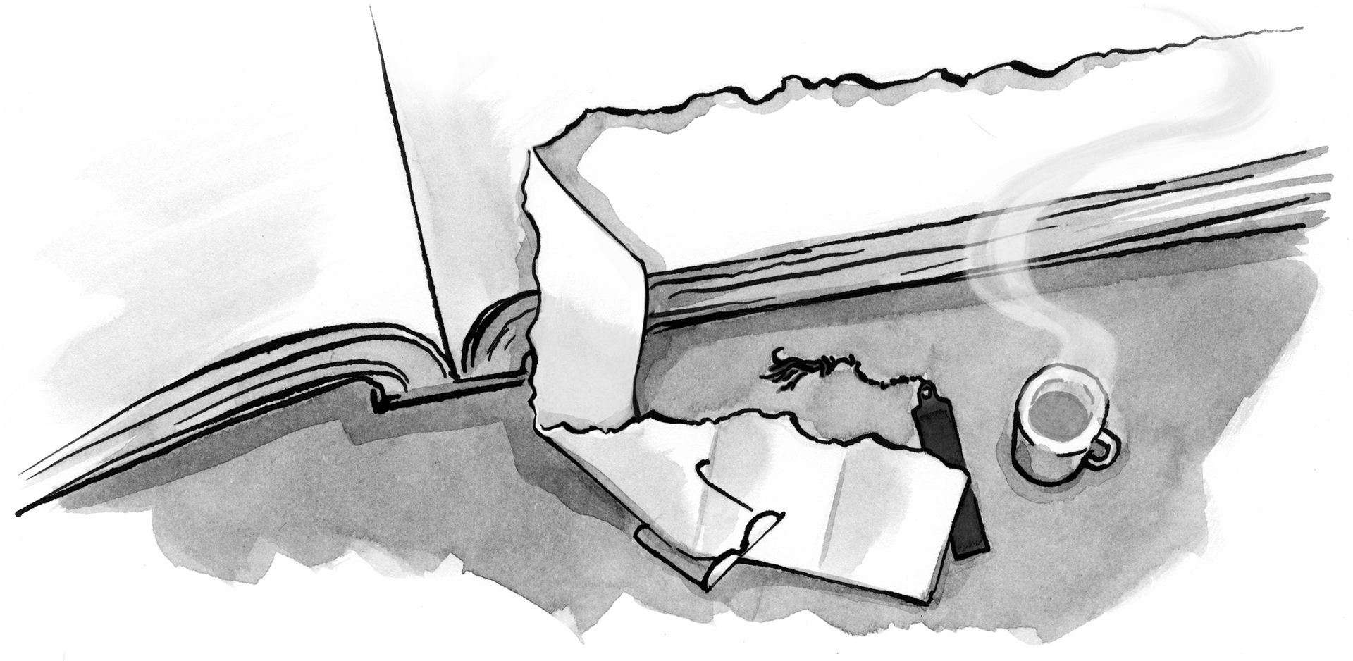
Then we took the idea of simplification even further by removing the view of the screen entirely, as shown in Figure 2.8.

In both of these versions, we can’t see the screen that the character is viewing, but we reveal just the right amount of interface to communicate the pertinent elements. In the second iteration, the interface elements are handdrawn, making the elements informal and even more concise. Keeping the interface within the same artistic style as the rest of the comic also made it less jarring for the reader.
Recognizing how much to abstract away requires some amount of experimentation and practice. For the moment, simply remember the power that abstraction in comics gives you.
I really like the last scenario, with a very simple excerpt of the relevant content over the person’s shoulder. I first noticed that concept in the show “Sherlock,” where not only was it much more informative to look at a person’s face during the device interaction, but it also makes the concept device-independent.
I actually went to school with a focus in Digital Storytelling. This is the kind of thing I’ve been insisting the web SHOULD be for the past three years. It’s not just about getting a job done or looking pretty; it’s about businesses, organizations, and individuals telling their story, whether collaboratively or not, to the people who are supposed to hear it.
Great post and having read the book, it is very well worth it, gives a whole new perspective to scenarios / personas. Now onto the arduous task of getting the organizational buy-in 🙂
Inspiring post.
Ah!
Now I understand the strange feeling I have when watching modern 3d cinema versions of old comicstyle television series.
Thanks for this insight!
It looks like someone was inspired by `Understanding Comics` 😉
Great post, comics are a continuum medium, awesome entertaining and useful, thx!
Great post… this helped me synthesize Dan Roam’s vivid thinking with Scott McCloud’s Understanding Comics.
It felt me just similar like a reading Comic.Really a great post…
Interesting, especially considering that with a greater dependency on the “visual” using the comic format strikes a balance between the traditional text format and the visual web base format. Now echoing others comments getting organization to “buy in” to the concept.
After reading it I’m still uncertain how to replace slogging through requirements documents and long reports with comics? I love comics but I’d need some practical way to implement it into business…
i think comic has a way to explain things so that a 10 year old kid can understand it. It is a way to simplify things so people can understand. Sometimes, I see writing that just makes it more confusing (possibly intentionally, just to make its status unshakable at the top).
i think comic has a way to explain things so that a 10 year old kid can understand it. It is a way to simplify things so people can understand. Sometimes, I see writing that just makes it more confusing (possibly intentionally, just to make its status unshakable at the top).
Graphic recording / animated scribing has is very fashionable in some c-suites at the moment see http://www.animatedscribing.com or http://www.alphachimp.com
It’s good to be reminded of these ideas, but they have been around for a long, long time.
The other issue that might be noted is that it’s a good approach to some topics, but not for all. Well written text is still the best format for expressing ideas with precision. The problem is that few have taken the time or trouble to learn to write well.
Thanks Kevin for informative share! with modern design, I like your comic..readers will get understand easily with this kind of post…use comic to explain more..thanks!
Thanks Kevin.
A very inspiring post.
Great comics!!!!! I am glad to see that. carry on… I want to see next……….