Typesetting is the most important part of typography, because most text is meant to be read, and typesetting involves preparing text for reading.
You’re already great at typesetting. Think about it. You choose good typefaces. You determine font sizes and line spacing. You decide on the margins that surround text elements. You set media query breakpoints. All of that is typesetting.
Maybe you’re thinking, But Tim, I am a font muggins. Help me make better decisions! Relax. You make better decisions than you realize. Some people will try to make you feel inferior; ignore them. Your intuition is good. Practice, and your skills will improve. Make a few solid decisions; then build on them. I’ll help you get started.
In this chapter, I’ll identify the value of typesetting and its place within the practice of typography. I’ll talk about pressure, a concept I use throughout this book to explain why typeset texts sometimes feel awkward or wrong. I’ll also discuss how typesetting for the web differs from traditional typesetting.
Why does typesetting matter?#section2
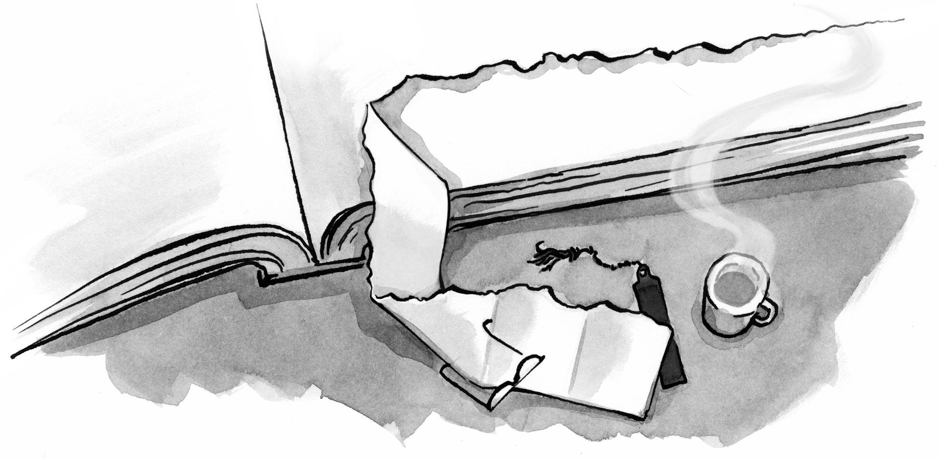
Typesetting shows readers you care. If your work looks good and feels right, people will stick around—not only because the typography is comfortable and familiar, but also because you show your audience respect by giving their experience your serious attention (Fig 1.1).

Sure, you could buy the “it” font of the moment (you know, the font all the cool people are talking about). You could use a template that promises good typography. You could use a script that spiffs up small typographic details. None of these things is necessarily bad in and of itself.
But when you take shortcuts, you miss opportunities to care about your readers, the text in your charge, and the practice of typography, all of which are worthwhile investments. Spending time on these things can feel overwhelming, but the more you do it, the easier and more fun it becomes. And you can avoid feeling overwhelmed by focusing on the jobs type does.
Imagine yourself in a peaceful garden. You feel the soft sun on your arms, and take a deep breath of fresh, clean air. The smell of flowers makes you feel happy. You hear honeybees hard at work, water trickling in a nearby brook, and birds singing. Now imagine that this garden needs a website, and you’re trying to find the right typeface.
Sorry to spoil the moment! But hey, if you do this right, the website could give people the same amazing feeling as sitting in the garden itself.
If you’re anything like me, your first instinct will be to recall sensations from the imaginary garden and look for a typeface with shapes that evoke similar sensations. But this is not a good way to choose among thousands upon thousands of fonts, because it’s too easy to end up with typefaces that—as charming as they may seem at first—don’t do their jobs. You’ll get disappointed and go right back to relying on shortcuts.
Finding typefaces that are appropriate for a project, and that evoke the right mood, is easier and more effective if you know they’re good at the jobs you need them to do. The trick is to eliminate type that won’t do the job well (Fig 1.2).

Depending on the job, some typefaces work better than others—and some don’t work well at all. Detailed, ornate type is not the best choice for body text, just as traditional text typefaces are not great for signage and user interfaces. Sleek, geometric fonts can make small text hard to read. I’ll come back to this at the beginning of Chapter 3.
Considering these different jobs helps you make better design decisions, whether you’re selecting typefaces, tending to typographic details, or making text and layout feel balanced. We’ll do all of that in this book.
Typesetting covers type’s most important jobs#section3
Typesetting, or the act of setting type, consists of typographic jobs that form the backbone of a reading experience: body text (paragraphs, lists, subheads) and small text (such as captions and asides). These are type’s most important jobs. The other parts of typography—which I call arranging and calibrating type—exist to bring people to the typeset text, so they can read and gather information (Fig 1.3).

Let’s go over these categories of typographic jobs one by one. Setting type well makes it easy for people to read and comprehend textual information. It covers jobs like paragraphs, subheads, lists, and captions. Arranging type turns visitors and passersby into readers, by catching their attention in an expressive, visual way. It’s for jobs like large headlines, titles, calls to action, and “hero” areas. Calibrating type helps people scan and process complicated information, and find their way, by being clear and organized. This is for jobs like tabular data, navigation systems, infographics, math, and code.
Arranging and calibrating type, and the jobs they facilitate, are extremely important, but I won’t spend much time discussing them in this book except to put them in context and explain where in my process I usually give them attention. They deserve their own dedicated texts. This book focuses specifically on setting type, for several reasons.
First, typesetting is critical to the success of our projects. Although the decisions we make while typesetting are subtle almost to the point of being unnoticeable, they add up to give readers a gut feeling about the work. Typesetting lays a strong foundation for everything else.
It also happens to be more difficult than other parts of typography. Good type for typesetting is harder to find than good type for other activities. Good typesetting decisions are harder to make than decisions about arranging type or calibrating type.
Furthermore, typesetting can help us deeply understand the web’s inherent flexibility, which responsive web design has called attention to so well. The main reason I make a distinction between typesetting, arranging type, and calibrating type is because these different activities each require text to flex in different ways.
In sum, typesetting matters because it is critical for readers, it supports other typographic activities, the difficult decisions informing it take practice, and its nature can help us understand flexibility and responsiveness on the web. A command of typesetting makes us better designers.
Why do some websites feel wrong?#section4
It’s not hard to find websites that just feel, well, sort of wrong. They’re everywhere. The type they use is not good, the font size is too small (or too big), lines of text are too long (or comically short), line spacing is too loose or too tight, margins are either too small or way too big, and so on (Fig 1.4).

It’s logical to think that websites feel wrong because, somewhere along the line, a typographer made bad decisions. Remember that a type designer is someone who makes type; a typographer is someone who uses type to communicate. In that sense, we are all typographers, even if we think of what we do as designing, or developing, or editing.
For more than 500 years, the job of a typographer has been to decide how text works and looks, and over those years, typographers have made some beautiful stuff. So if some websites feel wrong, it must be because the typographers who worked on them were inexperienced, or lazy, or had no regard for typographic history. Right?
Except that even the best typographers, who have years of experience, who have chosen a good typeface for the job at hand, who have made great typesetting decisions, who work hard and respect tradition—even those people can produce websites that feel wrong. Websites just seem to look awful in one way or another, and it’s hard to say why. Something’s just not quite right. In all likelihood, it’s the typesetting. Specifically, websites feel wrong when they put pressure on typographic relationships.
Typographic relationships#section5
Have you ever chosen a new font for your blog template, or an existing project, and instinctively adjusted the font size or line spacing to make it feel better?

Those typesetting adjustments help because the typeface itself, as well as its font size, measure (a typographic term for the length of lines of text), and line spacing all work together to make a text block feel balanced. (We’ll return to text blocks in more detail in Chapter 3.) This balance is something we all instinctively notice; when it’s disrupted, we sense pressure.
But let’s continue for a moment with this example of choosing a new font. We sense pressure every time we choose a new font. Why? Because each typeface is sized and positioned in unique ways by its designer (Fig 1.6).

In Chapter 2, we’ll take a closer look at glyphs, which are instances of one or more characters. For now, suffice it to say that glyphs live within a bounding box called the em box, which is a built-in part of a font file. Type designers decide how big, small, narrow, or wide glyphs are, and where they are positioned, within this box. The em box is what becomes our CSS-specified font size—it maps to the CSS content area.
So when we select a new typeface, the visible font size of our text block—the chunk of text to which we are applying styles— often changes, throwing off its balance. This means we need to carefully adjust the font size and then the measure, which depends on both the typeface and the font size. Finally, we adjust line spacing, which depends on the typeface, font size, and measure. I’ll cover how to fine-tune all of these adjustments in Chapter 4.
Making so many careful adjustments to one measly text block seems quite disruptive, doesn’t it? Especially because the finest typographic examples in history—the work we admire, the work that endures—commands a compositional balance. Composition, of course, refers to a work of art or design in its
entirety. Every text block, every shape, every space in a composition relates to another. If one text block is off-kilter, the whole work suffers.
I’m sure you can see where I’m headed with this. The web puts constant pressure on text blocks, easily disrupting their balance in myriad ways.
Pressure#section6
There are no “correct” fonts, font sizes, measures, or line heights. But relationships among these aspects of a text block determine whether reading is easier or harder. Outside forces can apply pressure to a balanced, easy-to-read text block, making the typesetting feel wrong, and thus interfering with reading.
We just discussed how choosing a new typeface introduces pressure. The same thing happens when our sites use local fonts that could be different for each reader, or when webfonts fail to load and our text is styled with fallback fonts. Typefaces are not interchangeable. When they change, they cause pressure that we have to work hard to relieve.
We also experience pressure when the font size changes (Fig 1.7). Sometimes, when we’re designing sites, we increase font size to better fill large viewports—the viewing area on our screens—or decrease it to better fit small ones. Readers can even get involved, by increasing or decreasing font size themselves to make text more legible. When font size changes, we have to consider whether our typeface, measure, and line spacing are still appropriate.

Changes to the width of our text block also introduce pressure (Fig 1.8). When text blocks stretch across very wide screens, or are squeezed into very narrow viewports, the entire composition has to be reevaluated. We may find that our text blocks need new boundaries, or a different font size, or even a different typeface, to make sure they maintain a good internal balance—and feel right for the composition. (This may seem fuzzy right now, but it will become clearer in Chapters 5 and 6, I promise.)

We also experience pressure when we try to manage white space without considering the relationships in our text blocks (Fig 1.9). When we predetermine our line height with a baseline grid, or when we adjust the margins that surround text as if they were part of a container into which text is poured rather than an extension of the balance in the typesetting, we risk destroying relationships among compositional white spaces— not only the white spaces in text blocks (word spacing, line spacing), but also the smaller white spaces built into our typefaces. These relationships are at risk whenever a website flexes, whenever a new viewport size comes along.

Typesetting for the web can only be successful if it relieves inevitable pressures like these. The problem is that we can’t see all of the pressures we face, and we don’t yet have the means (the words, the tools) to address what we can see. Yet our natural response, based on centuries of typographic control, is to try to make better decisions.
But on the web, that’s like trying to predict the weather. We can’t decide whether to wear a raincoat a year ahead of time. What we can do is get a raincoat and be ready to use it under certain conditions. Typographers are now in the business of making sure text has a raincoat. We can’t know when it’ll be needed, and we can’t force our text to wear it, but we can make recommendations based on conditional instructions.
For the first time in hundreds of years, because of the web, the role of the typographer has changed. We no longer decide; we make suggestions. We no longer choose typefaces, font size, line length, line spacing, and margins; we prepare and instruct text to make those choices for itself. We no longer determine page shape and quality; we respond to our readers’ contexts and environments.
These changes may seem like a weakness compared to the command we have always been able to exercise. But they are in fact an incredible strength, because they mean that typeset text has the potential to fit everyone just right. In theory, at least, the web is universal.
The primary design principle underlying the web’s usefulness and growth is universality.
We must now practice a universal typography that strives to work for everyone. To start, we need to acknowledge that typography is multidimensional, relative to each reader, and unequivocally optional.
Read the rest of this chapter and more when you buy the book!
Thanks a lot for the description of typesetting and its relationship to typography, however my concern is on its difference from typewriting and word processing.
The same thing happens when our sites use local fonts that could be different for each reader – http://www.lvbagses.com/belts.html
Not only do you show to the readers that you care, but your articles will be perfect (not only in words) in settings. An article settled correct will influence the readers to share it. Trust me!
Maple Arch provides the essential Structural Engineering design support for todays concepts in Architectural designs.
http://maplearch.in/structural-des.html
Typesetting for the web can only be successful if it relieves inevitable pressures like these. The problem is that we can’t see all of the pressures we face, and we don’t yet have the means