Over the past few years, we’ve been learning how to adapt our layouts to the infinite canvas of the web. Our sites can be viewed on any size screen, at any time, and responsive design is one approach that lets us accommodate the web’s variable shape. But with all of the challenges we’re facing and those yet to come, we need to begin building not just patterns, but principles for responsive design—principles that will allow us to focus not just on layout, but on the quality of our work.
If each part of your responsive interface is more or less self-contained—with its own layout rules, content needs, and breakpoints—then the code behind each element’s design is far less important than thinking carefully about how and why an element should adapt. In other words, how do we move beyond thinking in terms of columns and rows, and start talking about the quality of our responsive designs? And what would frameworks to support that look like?
Finding the words#section2
Honestly, there’s no perfect answer to that question. But recently, a number of designers and organizations have started sharing the vocabulary they use to decide how and when their responsive designs should adapt. Vox Media, for example, thinks of their content as existing within a river—and in keeping with the metaphor, the flow of that content can be interrupted at certain points. Here’s how they describe the front pages of Vox.com:
Content flows around “rocks” and “breakers,” which are modules such as a “Most Commented” list or a row of “Popular Videos.” Many of these behaviors remain in the new layout system, but the key difference is an added contextual layer. Elements in the river are laid out to better highlight the diversity of content on Vox—articles, features, videos, editorial apps, card stacks, to name a few. Each one displays differently depending on its type and neighboring entries.
Note that the language they use to talk about the quality of their layouts doesn’t revolve around columns or rows. There’s nary a mention of grids. For Vox, the design process begins with content priority and evolves into a layout. By understanding the weight and importance of each piece of content that flows through the river, the Vox team can algorithmically generate a responsive layout that best reflects the importance of the information within it.
Starting with an abstract system of columns and rows would be wrong for them—and, I’d argue, for every web designer. After all, according to Mark Boulton, there are three fundamental benefits of a grid system:
- Grid systems create connectedness. A well-made grid can visually connect related pieces of content or, just as importantly, separate unrelated elements from each other. In other words, they help us create narratives from our layout.
- By establishing predefined alignment points, grid systems help designers solve layout problems.
- A well-designed grid system will provide visual pathways for the reader’s eye to follow, and allow them to better understand a visual hierarchy.
As Boulton notes, we historically created grid systems by adopting a “canvas in” method. Working from the edges of a printed page, designers would subdivide a page into a system of columns and rows, and place images and text upon that grid in pleasing, rational arrangements. But the web doesn’t have any such boundary—after all, it’s the first truly fluid design medium. As a result, Boulton argues we should instead adopt a “content out” approach to designing our grids: to build more complex layout systems out from a foundation of small, modular pieces of content. And to do so, Boulton proposes three guiding principles:
- Define relationships from your content. A grid for the web should be defined by the content, not the edge of an imaginary page.
- Use ratios or relational measurements above fixed measurements.
- Bind the content to the device. Use CSS media queries, and techniques such as responsive web design, to create layouts that respond to the viewport.
By understanding the shape of our content, we can create flexible layouts that support connectedness—not just between related pieces of information, but between our layouts and the device. We can make responsive grid systems that don’t just fit on an ever-increasing number of screens—they’ll feel at home, wherever they’re viewed.
Finding the seams#section3
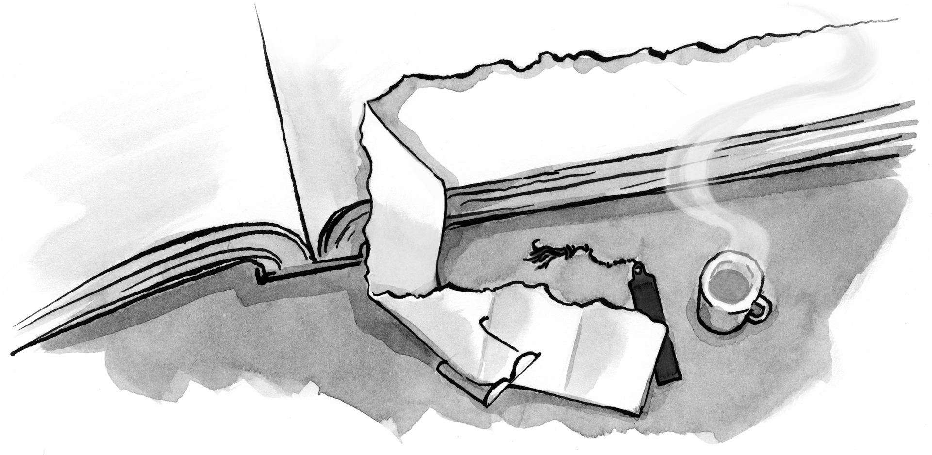
Principles are wonderful, of course, but we still have to find a means of implementing them: of translating those ideals into practical responsive patterns and layouts. For me, that “content out” process begins by looking at the smallest version of a piece of content, then expanding that element until its seams begin to show and it starts to lose its shape. Once that happens, that’s an opportunity to make a change—to introduce a breakpoint that reshapes the element and preserves its integrity.
But first, we need a method of finding an element’s seams, and understanding how it loses its shape. For me, that process begins by looking at four characteristics: width, hierarchy, interaction, and density.
Width#section4
Width might be a little self-evident. As the width of a viewport changes, so does the width of a responsive design. But as the design gets wider or narrower, so will the elements within it, and as those modules expand or contract, there may be opportunities to add a breakpoint.

Hierarchy#section5
Width is, I’m sure you’ll agree, the most common characteristic of a responsive design—but it’s not the only one. As the shape of an element changes, the hierarchy of elements may need to change as well.
Let’s take a quick look at a product page on Tattly’s responsive ecommerce site. When viewed on wider screens, the primary content area has two key pieces of information: a photo carousel of the product on the left, and a call to action to purchase the product on the right.

But that’s just one view of this particular part of the design, because as screens get narrower, we lose the ability to place multiple columns side by side. That’s where a question of hierarchy arises: in a single-column layout, which piece of content should appear first? Tattly opted, quite rightly, to lead with photos of the product—but you may answer hierarchy questions differently on your site.

Hierarchy is generally a reminder to be more vertically aware in our designs. After all, we have min-width and max-width media queries, but can also avail ourselves of min-height and max-height queries more often. I think the navigation menu for the Field Museum beautifully balances vertical and horizontal layouts.

On wider screens, the navigation is anchored to the left edge of the design, and spans the full height of the viewport. You may notice that they’re using the flexible box model, or flexbox, an advanced CSS layout method we’ll look at later in this chapter. But since flexbox allows elements to automatically fill the space available to them, as the menu gets taller or shorter, the navigation elements resize vertically—but below a certain width or height, the menu is placed at the top of the page.
By minding the navigation’s vertical edges, the Field Museum was able to introduce alternate layouts to ensure the content inside their navigation menu was never concealed, obscured, or clipped. In other words, the breakpoints we introduce to our responsive designs aren’t tied to the shape of a device’s screen. Instead, our media queries defend the integrity of the content we’re designing.
Interaction#section6
The way we interact with an element may change along with the design. Responsive navigation systems are probably the most obvious example of this. As we saw in Chapter 2, menus are often displayed in full at wider breakpoints but concealed at smaller ones, perhaps hidden behind expandable icons or links when space is at a premium.

But navigation isn’t the only kind of content that might require interaction changes. For example, take the responsive sports brackets designed by SB Nation. While they appear as complex-looking charts at wider breakpoints, a simpler, more linear view of the brackets is shown on smaller screens.

Along with the simplified layout, the brackets are presented as carousels in the smaller view, where real estate is more dear. Each of the four regions for the bracket are a single slide in the carousel, allowing the user to cycle through for details. The information in both visual states is the same, but the interaction model changes.
Density#section7
Finally, the amount of information you’re showing in an element might need to vary over time—in other words, the density of information can change. The Guardian’s feature on the 2015 Oscars is full of examples of this, with responsively designed timelines displaying a significant amount of movie data. Above a certain width, thumbnail images are loaded in, slightly increasing the visual (and informational) density of the timeline.

Density is, as you might have guessed, an area where you should tread very carefully. As we’ve discussed before, removing or hiding information because it doesn’t fit can be problematic.

Personally, I think the Guardian’s timelines work so well because the images shown at wider breakpoints are enhancements: they’re not critical to understanding the information around them. Could they have designed alternate versions of the timelines to show images at all breakpoints? Possibly. But I think this is a wonderful example of density used to lighten the visual impact of a design, removing extraneous information without impeding access to the content.
ALA team, can you get Eric (Meyer) or Jens (Meiert) to comment on frameworks, too, for an alternative view? I believe that in The Little Book of Frameworks they’ve talked about when to use frameworks in the first place…and why design and code should be tailored, an idea that ALA has never talked about, and Ethan neither (I think).
I guess I’ll be the prude that things it’s really unnecessary for ALA to be include swearing in their screenshots.
Personally, I don’t care about it. But I think it’s an unneeded distraction.
Nice article, I registered an account just to comment how pleased I was with the screenshot that used some spicy words, it made my day, reading industry blogs can get too boring with too much squeaky clean
When I scanned frameworks and grid I was thinking that this was going to be about things such as ZURB Foundation and Neat/Bourbon.
Are you suggesting that principles for responsive design really needs a golden grail framework?
Nice article about layout, but layout depends on some underlying strategy, whether it is grids or flexbox, or CSS @media queries.
I’ve solved my layout strategy with a 12-line pure JavaScript “framework”, and CSS tables instead of flexbox. In my experience iOS 9 and flexbox don’t work well together. Using JavaScript means I don’t need CSS @media queries.
The result is lightweight pages that load quickly and respond well to any viewport size.
Thanks Ethan – you’ve got some really nice sites covered here.
Thanks Ethan -Nice article about layout,and framework.
Nety Design group has become incredibly specialist in addition to simple to do business with. They supplied substantial effects in a timely manner in addition to their particular constant customer service has become exceptional.
An excellent techno-philosophical (non-technical) article on the guiding principles for Responsive Web Design. Hoping that this will become the guiding article for responsive design like Ethan’s earlier article on Responsive Web Design (http://alistapart.com/article/responsive-web-design) published five years ago.
This article clarified what aspects to consider for making a design responsive.
Thanks Ethan for capturing the principles succinctly.
I’m not sure I agree with the website that hides 3 simple navigation items behind another click on mobile. I worry about this approach of just “simplifying” everything when you get down to smaller screens. I think their navigation could still have worked on mobile.
On the website for the agency I work for (http://watb.co.uk) we bucked this trend and felt that our navigation still worked (with a little tweaking of styles) on mobile.
I did turn a contact link into an icon, this gave me more options without compromising on usability so much. Everything that is accessible through one interaction on desktop, is on mobile too.
If you’re only dealing with a handful of navigation links, I think we should always try to come up with new ways of getting this to work on mobile without always just resorting to hamburger/toggle menus.
Why the profane screenshots? Surely there are many others able to illustrate your point without attracting a ‘parental advisory’ label, even many that would also avoid the ‘squeaky clean’ label disliked by ta least 1 reader.
That was such a big distraction for me that I struggle to find benefit in the article as a whole.
It seems to make a few suggestions regarding layout or styling choices, but doesn’t address the primary issue hinted at in the title.
HTML is essentially an hierarchy of elements, and what we try to do is present that content as if it were not. We must apply layers of control in order to persuade the browser to display elements out of sequence, or with different visualization, or hide them from view until some trigger occurs.
Frameworks enable us to do that consistently without having to re-think everything every time.
Great article. I’m torn about the Field Museum navigation, though. On a short wide screen, it seems like the navigation should take advantage of the width (perhaps with a tile interface instead of a simple row), which would leave more usable room for content. Keeping a persistent navigation at the top of a short screen can be very annoying.
PS – Personally, I love the profane screenshots, adds a nice bit of humour.
Great article. I particularly liked the comment about the underutilization of height-based media queries. There are often elements that don’t work well if they can’t be seen without scrolling on a smaller laptop screen, and I wish developers/designers would take this into account more often.
PS – I’m fascinated with this side debate about using profanity in two of the screenshots here. How do people that get hung up on this even use the Internet regularly?
As someone who has to build sites from the ground up on a semi regular basis I have a huge love hate relationship with CSS Frameworks. On one hand they make basic responsive design so simple and straight forward. On the other hand when you get into more complex layouts and unique designs, they can hinder what you are trying to do and make your create a workaround for something that was suppose to make this easier.
Thanks Ethan, love it!
article quality . discussions were very useful , especially for me who was working on the task Harga Ban Bridgestune Terbaru