Jeremy Keith notes that what happens between the breakpoints is just as important as the breakpoints themselves—perhaps even more so. While I agree with this, we do have to start somewhere. In a way, this part of the process reminds me of storyboarding, or creating animation keyframes, with the in-between frames being developed later. We’re going to do that here.
Let’s say you’ve chosen three basic design directions from your thumbnails. Think about what your major breakpoints will look like (Figure 7.6). And here’s the key: try to come up with as few major breakpoints as possible. That might sound crazy, since we’re talking about responsive design. After all, we have media queries, so let’s use about 12 of them, right? No! If a linear layout works for every screen and is appropriate for your particular concept, then there’s no need for different layouts. In that case, simply describe what will happen when the screen gets larger. Will everything generally stay the same, with changes only to font size, line height and margins? If so, sketch those. For these variations, make thumbnails first, explore some options, and then move on to larger, more detailed sketches. Use your breakpoint graph as a guide at first and make sketches according to the breakpoints you’ve estimated on your graph.
When thinking about major breakpoints, remember to think about device classes. If you’re thinking about smartphones, tablets, laptops/desktops, TVs, and game consoles, for example, you’re heading in the right direction. If you’re thinking in terms of brand names and specific operating systems, you’re on the wrong track. The idea is to think in terms of general device classifications and, sometimes, device capabilities. Capabilities are more important when designing web applications, since you should be thinking about what screens will look like both with and without any particular capability.
Rough sketches of major breakpoints can help you determine:
- Whether or not more major breakpoints are needed
- Which design choice will be the most labor intensive; you might opt for a design that will better fit within time and budget constraints
- Whether or not a particular device class has been neglected or needs further consideration
- What technologies you’ll need to develop the design responsively

So where and when will you sketch minor breakpoints? In the browser, when you do your web-based mockup. You’ll find out why and how in the next chapter. In the meantime, simply focus on making sketches of the state of your web pages or app screens at the major breakpoints of each design.
At this point, don’t worry too much if you notice that the initial breakpoints on your breakpoint graph simply won’t do. Those were just a starting point, and you’re free to revise your estimate based on your sketches. You might even decide that you need an extra breakpoint for a given design and record that in sketch form; you can add that breakpoint to your graph. This is a cycle of discovery, learning, and revision.
Think about your content while sketching#section2
While sketching, you’ll certainly be thinking about the way things should look. My experience is that much UI sketching of this type revolves around the layout of elements on the screen. I’ve found it useful to keep thinking about the content while sketching, and to consider what will happen to the content in various situations. When designing responsively, it can be useful to consider how you’ll handle the following content in particular:
- Text
- Navigation
- Tables
Oh, sure, there are many more things to consider, and you’ll end up creating your own list of “things to do some extra thinking about” as the project progresses. For now, let’s take a look at the items listed above.
Text#section3
Before you say, “Hey, wait a minute, didn’t you just tell me that I didn’t have to draw text while sketching?” hear me out. While sketching, there are a couple of text-related issues you’ll need to tackle: column width and text size, both of which are relevant in proportion to the screen and the other elements on the page.
Column width is fairly obvious, but it can be difficult to estimate how wide a column will be with actual text. In this case, sketching on a device might give you a better idea of the actual space you have to work with. Another method I’ve used is just to make a simple HTML page that contains only text, and load that into a device’s browser (or even an emulator, which while not optimal still gives a more realistic impression than lines on paper). When the text seems too large or too small, you can adjust the font size accordingly. Once it seems right, you’ll be able to make your sketches a bit more realistic.
Think about the size of links—not only the text size, but also the amount of space around them. Both of these factors play a role in the touchability or clickability of links (and buttons): large links and buttons are easier targets, but slightly smaller links with plenty of space around them can work just as well. That said, there’s a decent chance that no matter what you choose to sketch, you’ll end up making changes again when you create your mockups.
This is the great thing about sketching that I can’t repeat often enough: you’re going to refine your design in the browser anyway, so the speed with which you can try things out when sketching means you won’t have to do detail work more than once (unless your client has changes, but we all know that never happens).
Navigation#section4
Navigation is another poster child for sketching on actual devices. The size issues are the same as with links, but there’s a lot more thinking to do in terms of the design of navigation for various devices, which means navigation might change significantly at each major breakpoint.
Think back to Bryan Rieger’s practice of designing in text first, and ponder what you would do before the very first breakpoint if you had only plain HTML and CSS at your disposal—in other words, if you had no JavaScript. That means no, you can’t have your menu collapsed at the top of the screen and have it drop down when someone touches it. If you have your menu at the top, it’s in its expanded form and takes up all the vertical space it normally would.
This is a controversial enough subject, with even accessibility gurus in disagreement: JavaScript, after all, is currently considered an “accessibility supported” technology. But this isn’t necessarily about accessibility. It’s about thinking about what happens when a browser lacks JavaScript support, or if the JavaScript available on the device is different than what you’d expect. Your content will be presented in a certain way before JavaScript does its thing with it, no matter what the browser. So why not think about what that initial state will be?
In the chapter on wireframes, I talked about my preferred pattern for navigation on the smallest screens: keep it near the bottom of the screen and place a link to that navigation near the top of the screen. JavaScript, when available and working as expected, can move that navigation up to the top and create the drop-down menu on the fly.
But a pattern is not design law, so how you choose to handle the smallest screens will depend on your project. If I had only a few links in my navigation, I might very well put the menu at the top from the very start, and there it would stay at every breakpoint.
Remember that JavaScript and CSS let you do a lot of rearranging of stuff on the screen. That knowledge should empower you to safely design a great page with plain HTML and use JavaScript and CSS to spice it up any way you like. This is the essence of progressive enhancement.
Tables#section5
Tables! Oh, the bane of the responsive designer (or wait, is that images? Or video? Or layout? Ahem). Tables are tough to deal with on small screens. I’d love to tell you I have all the answers, but instead I have more questions. Hopefully, these will lead you to a solution. It’s good to think about these while you’re sketching.
First of all, what types of tables will you be dealing with? Narrow? Wide? Numerical? Textual? Your content inventory should give you enough information to answer these simple questions. Once you’ve considered those, try to categorize the types of tables you have into something like the following classes (Figure 7.7):
- Small-screen-friendly tables, which you’ll probably leave as they are, because they’re small enough and will work fine on most small screens.
- Blockable tables, which you can alter with CSS so that each row in the table functions visually as a block item in a list (Figure 7.8).
- Chartable tables, which contain numerical data that can be transformed into a chart, graph, or other visualization that will take up less space on a small screen.
- Difficult tables, which are hard enough to deal with that you’ll need to come up with a different plan for them, sometimes even on a case-by-case basis. These are our enemies, but unfortunately, are the friends of our clients, who all love Microsoft Excel. Oh well.


Thinking again in terms of progressive enhancement, the base design should probably just include the whole table, which means that the user will have to scroll horizontally to see the whole thing in many cases. On top of this, we can employ CSS and JavaScript, when they’re available, to do some magic for us. Blockable and chartable tables can be blocked with CSS and charted with JavaScript. Plenty of designers and developers have experimented with many different options for tables, from simply making the table itself scrollable to exchanging columns and rows.
The fun part is that what you do on small screens isn’t necessarily what you’ll do on larger screens. That’s why now—when all you have to do is sketch and it won’t take much time—is the time to think about the changes you’ll be making at each breakpoint.
What to do if you get stuck#section6
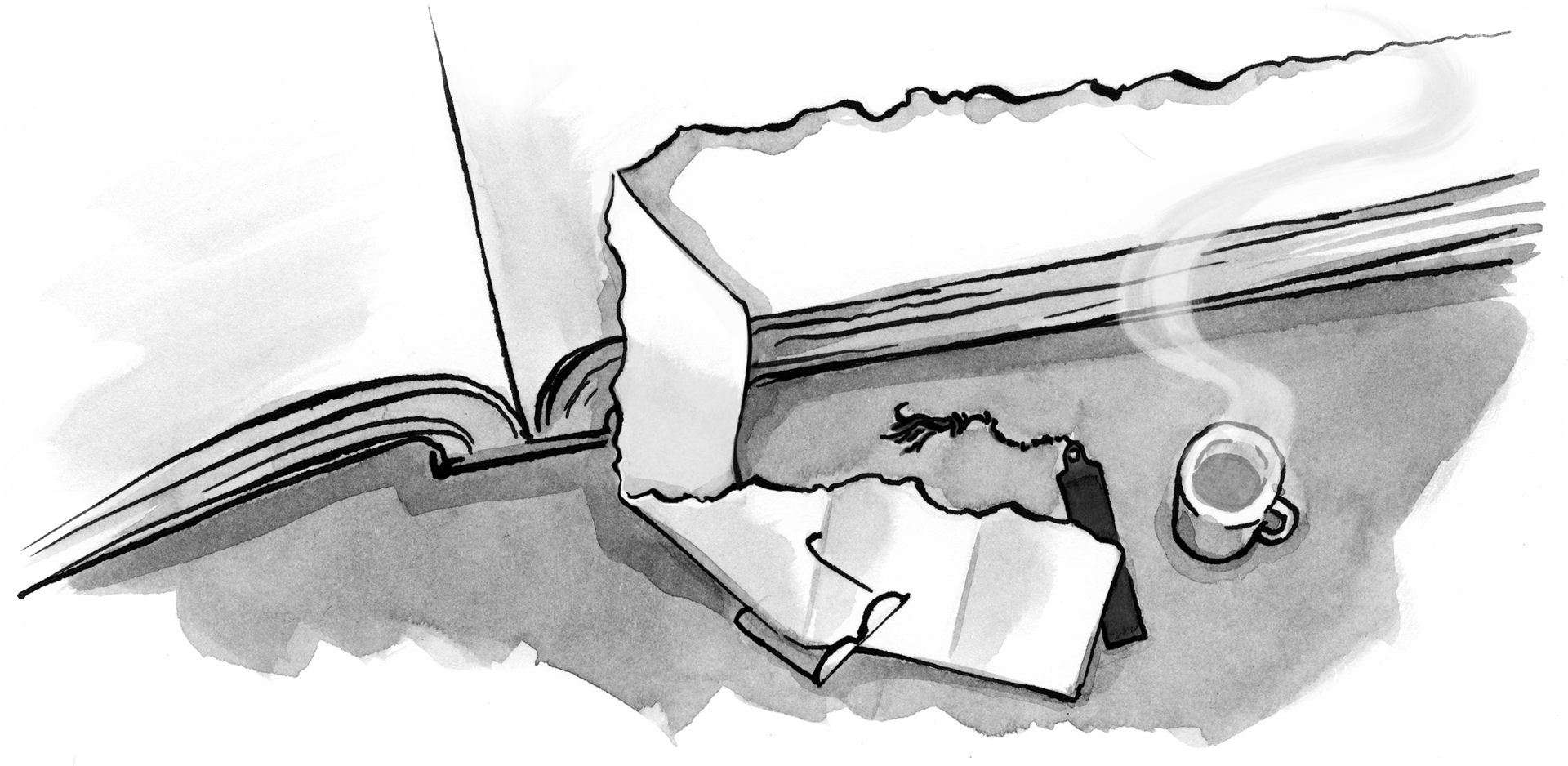
Every designer gets stuck at some point. It’s no big deal unless you treat it like one. There are countless ways to deal with it, from asking yourself what if questions (“What if it weren’t a table, but a list?” is what I asked myself before “blockifying” the attendees table for the Mobilism site) to the cliché taking a shower, which you hopefully do on a regular basis anyway. The reason this chapter focuses so much on sketching is because the act of drawing itself can actually stimulate your brain to come up with more ideas, provided you push it hard enough by sketching past your comfort zone of first-come ideas.
If your problem is that you’re stuck creatively, there are many inspiring books and resources to get your creative engine started during the bitter cold of designer’s block. Although there are plenty of resources on design and creativity itself (try such classics as Edward de Bono’s Lateral Thinking), the greatest inspiration can come from sources outside the realm of design.1 Trying to combine things that normally aren’t combined can lead to surprising results. It’s a simple little trick, but I’ve often used Brian Eno and Peter Schmidt’s Oblique Strategies to force me to take a different approach.2 Worst case, it’s a lot of fun. Best case, you’ve got a great idea!
If your problem is that you’re not sure how to handle something in the context of responsive design, there’s no harm in researching how others have solved problems like yours. Just be sure to use your creativity and tailor any ideas you might find to your own situation; after all, you’re a designer. At the time of this writing I find Brad Frost’s This Is Responsive to be one of the most exhaustive collections of responsive design patterns and resources available.3 You can spend hours going through there and you’ll certainly come across something that will get you unstuck.
Excerpted from Responsive Design Workflow by Stephen Hay. Copyright © 2013.
Used with permission of Pearson Education, Inc. and New Riders.
Great article! Was very impressed with your references to De Bono’s book and Eno’s cards. The book was a big help to me when it first came out in the 60’s and I used Eno’s cards to help inspire my art students in the 70’s. Thought they were both forgotten by your generation -glad to see they weren’t.
Thank you for the great article! Also, you’re funny!
Wonderful article! I will be directing anybody I come across who is confused about break points and why they are affecting our designs to it:) Thanks for making my job a little easier!!
A good approach of defining breakpoints is explained here in this example http://openweb.eu.org/articles/defining-breakpoints
Reading this book now, and I must say, it’s awesome! Even though I just skimmed the article, I’ve already read the real thing. So this is a reinforcement that the material is great. Thanks again for a great read A List Apart (and Stephen Hay).
Great read indeed and good luck with the book!
Emil
All of you: Thanks so much for the kind words and taking the time to comment! I’m glad the excerpt is well-received; ALA did a great job of taking a part of the book that doesn’t need (as much) context as other excerpts would have. That said, @Nick: I’m glad you’re enjoying the book as well 😉
@William: I’m a big fan of De Bono, as well as the kind of thinking that went into Oblique Strategies. Then again, I’m also an Eno fan. While I’m not as young as you might think, I find that most breakthrough thinking on creativity was done around De Bono’s time (read: when Lateral Thinking came out) and the classics are essential; I think they help as much today as when they were written.
@Nicolas: (re your link) I’m all for content-out thinking. That said, I think the definition of breakpoints is really expanding. So I’ll see your link and raise with this from Stephanie Rieger: http://stephanierieger.com/on-designing-content-out-a-response-to-zeldman-and-others/ 😉 Cheers!
@Diana: I’m a grump. KIDDING
Thanks, all!
It’s a great piece Stephen and I’m sure the book’ll be great. Stephanie’s article is great too. The notion of major and minor breakpoint still irks me. Typically these are based on popular current device classes, which seems really odd.
Can a breakpoint not be a breakpoint, adjust design/layout as and when needed for the best possible experience. A single point may or may not have large amounts of code or create significant visual change. What is major and minor should surely be in the eye of the creator?
Like I say…it’s a genuinely great article but find this notion of device classes and major & minor breakpoints a little too fixed in a truly fluid & flexible landscape.
@Dan: this is probably where the excerpt fails slightly, as I’m a huge (and outspoken) proponent of letting content determine where breakpoints are. The chapter this comes from is mainly about sketching; you already know a lot about your content and you’re making *estimates* about what this content will do based on very loose categories of devices or screens or browsers (or even capabilities). You will revise this when you get to a web-based design mockup, but you have to start somewhere, and for many designers, starting in the browser is just too much to ask. I have to give them a break, since I ask them in the book to ditch Photoshop comps.
This process is more like, “Once this gets much wider than a smartphone, one column simply won’t do for this content. I’ll most likely change the layout. How might that look?”
Devices *classes* are groups of similar devices, not specific devices. Since they are just “types” of devices, they are not fixed at all. Device classes could be “devices with very narrow screens”, or even “devices with a camera”. They are NOT, however, iPhone 5 or HTC One. So I tend to disagree with you that device classes are too fixed.
See this sketching as a way of planning for the web’s fluidity. Designers need to accept that fluidity, but sketching what they might want to do at various breakpoints helps them design for it.
In the end (and unfortunately what happens next is not part of the excerpt), the design will take the form of a mockup in the browser, and what happens there will determine where the real breakpoints are. Sure, you don’t know beforehand exactly where a particular major breakpoint will be. Sketching breakpoint designs beforehand, though, does afford you the opportunity to have an idea of what you’d like to do when that breakpoint does occur. In this sense, where breakpoints happen is absolutely in the eye of the creator.
Well said. And great content. Love Edward deBono.
Most of my recent projects based on the data available for users have had 2 to 3 break points and been fluid from then at each break point, as you quite rightly say at the start of the article “let’s use about 12 of them, right? No!”
This process is more like, “Once this gets much wider than a smartphone, one column simply won’t do for this content. I’ll most likely change the layout. How might that look?”
Devices classes are groups of similar devices, not specific devices. Since they are just “types” of devices, they are not fixed at all. Device classes could be “devices with very narrow screens”, or even “devices with a camera”. They are NOT, however, iPhone 5 or HTC One. So I tend to disagree with you that device classes are too fixed.
オススメのデジカメ
Wow – you covered a lot here! Thanks for the solid article.
What I love about working in the web design ‘space’ is that’s it’s always evolving, changing, and a challenge to stay current with. Keep learning, and keep challenging yourself! Thanks!
Great article with some solid points about approach. Thanks!
This post is quite impressive. I liked this concept of breakpoints. Appropriate breakpoints are informed by the design, if breakpoints are dead, responsive design is dead, because responsive design relies on breakpoints both in creative work flow and as a key to establishing user-need-and-context-based master layouts.
During most of our responsive web design projects, we use classic typography theory to determine the right breakpoints for the responsive website design & development. We also create different webdesign layouts for different languages.
Great article, thank you for sharing! I think this would be a good starting point for responsive design. The way I’ve worked before was to do the desktop design first, think about the navigation on smaller screens and go from there. It worked, but there was a lot of stopping to think about the smaller details and throwing in breakpoints wherever needed. Your way sounds much more structured and organised!
I also like your ideas for asking ‘what if’ when stuck on a problem. Looking at issues from a different perspective, or discussing with the person next to me usually throws up some good ideas and this sounds like it would jump start the process.
I find tables are one of the most awkward things when designing for mobiles, like you said every case is different. I’ve used the foo tables plugin a few times and that works well, but I wondered if a case could be made for leaving complex tables as they are, and allowing users to scroll horizontally. I find it easier to understand tables when I do that, maybe other people feel the same? Or at least offer the option to see the tables as they originally were, then the user can make the choice.
this is OT, but why isn’t the illustrator credited in the by line?
@Andy Parker 1: He’s credited in the ever-present sidebar at the top of the article.
well! this is one of impressive article. Thanks Stephen for the solid article. What I love about working in the web design ‘space’ is that’s it’s always evolving, changing, and a challenge to stay current with. Keep up your hard workign on that. I think the book will be informative too.
I found the Table solution very helpful when thinking about displaying database data across devices. It actually solved a problem I was thinking I would get stuck on a team scheduling application.
Lateral Thinking has a great synergy with responsive design and mobile first. I love the direction web development is going. Looking forward to more great content for us website makers.
up to I looked at the receipt that said $8681, I have faith that…my… brother was actually erning money parttime from their laptop.. there neighbour has done this 4 less than eleven months and a short time ago paid the dept on their condo and purchased a great new Acura. read more at, http://m3mi.com/3621CHECK IT OUT
Diseño de respuesta: Es tan natural esta tendencia para la construcción de contenidos digitales que surgen interesantes tips como los de este artículo. La recomendación, ir del dispositivo más pequeño al más grande. Lo curioso, comparar el diseño de maquetas con un storyboard.
Phew… This is kind of what I have been doing intuitively when working with Responsive pages / sites. Thanks and good luck with your book. I hope to get a copy soon.
Hi there, this is a great resource for the Responsive Design Knowledge Hub. Check it out here: http://goo.gl/0FkpcE
Thanks!
Thanks a lot! Great read, just bookmarked it 🙂
Thanks You lots, nice article, breakpoints designs is must to clear. best website designing company in Delhi for best designer for breakpoints designs