Animation is fast becoming an essential part of interface design, and it’s easy to see why. It gives us a whole new dimension to play with—time. This creates opportunities to make our interfaces better at every level: it can make them easier to understand, more pleasant to use, and nicer to look at.
For example, animation can help offload some of the work (PDF) of processing interface changes from our brains to the screen. It can also be used to explain the meaning and relationships of interface elements, and even teach users how to do things—all without making an interface more complex.
Sometimes all of these factors converge: when you minimize a window, would you be able to tell where it goes without the animation? How much longer would it take you to find the minimized window in the dock?
So far, so uncontroversial, right? Animation is a good thing—when done well, at least. But there’s one aspect of animation that nobody ever seems to talk about. Some animation, while technically well executed, makes interfaces more confusing instead of less.
Consider the following process:
When we tap the Overcast app icon on the homescreen, the icon zooms and morphs into the app. The other icons stay in place. They’re still in their initial positions, laid out in a grid around the open app.
We start multitasking. The app zooms out. We should get back to the icons around the app on the homescreen, but instead we see a stack of other apps. Why is the icon above the app now? Where are all the other icons? And why does another homescreen appear next to the apps?
The app is both inside its icon on the homescreen and next to the homescreen. The two animations give us conflicting information about where the homescreen and the apps are located in space.

These animations might make sense if you designed the individual screens in a vacuum. It’s only when they all try to play together as parts of a single experience that things get confusing. The problem isn’t with any of the individual transitions, but with the fact that the animations contradict each other.
History#section2
How did we get here? Let’s take a step back and quickly review the history leading up to this point.
Since their inception in the 1970s, graphical user interfaces were basically a series of static screens (PDF) linked together without any transitions. Every state change was a hard cut.
Although there are some notable early examples of good interface animation that date all the way back to the original Macintosh (PDF), because of the limited graphical capabilities of computers back then, effective animation was the exception rather than the rule.
As computers got increasingly powerful, animation started to be used more frequently for things like maximizing windows or opening new tabs. It was still mostly pressed into service for small things, though, and rarely influenced the overall structure of interfaces.
Only now are we starting to get to a point where computing resources aren’t holding interfaces back anymore. With today’s devices, everything can be animated—and increasingly everything is. The problem is that the design process hasn’t caught up to this change in technology. For the most part, interfaces are still conceived as separate, static screens and then linked together with relatively crude animations.
This is probably how our multitasking example came to be; different parts of the experience were designed separately and then linked together without considering either the relationships between them or the consequences of arranging them this way. The problem is that if animation (and therefore the spatial structure of an interface) is an afterthought, it’s all too easy to create contradictory behaviors.
Now that we’ve figured out how we got here, let’s think about how we can avoid such pitfalls.
A simple shift#section3
Adding animation to interfaces fundamentally changes them, and necessitates a new way of thinking. We call this new approach semantic animation. It all starts with a simple conceptual shift:
You can’t treat individual screens as separate entities if the transitions between them are animated. To the user, the entire experience is one continuous space.
Similarly, two representations of the same element on different screens can’t be seen as separate from each other. To the user, there is only one element—it simply changes form.
This means that when you add animations, an interface isn’t a series of screens anymore, but a collection of semantic components inside a single, continuous space. These self-contained components enclose everything associated with them, like meta information or interactive controls.
This may sound complicated, but in practice it’s actually quite simple: instead of designing screens and then adding transitions between them, start by designing individual components and thinking about how they change and move in different contexts. With that in place, layout and animations will come together naturally, following the semantic structure of the content.
Explain relationships between elements#section4
Animations are most useful when they reflect and reinforce the semantic relationships between elements: for example, “this comment belongs to this article,” or “these menu items are part of this menu.”
Think of every element of your interface as a single, self-sufficient component with a specific meaning, state, and position in space. Then make sure your animations reflect this. If a popover belongs to a button, it shouldn’t just fade in; it should emerge from that button. When opening an email, the full message should not just slide in from the side, but come from within the preview.
You get the idea, right? Once you’re used to this way of thinking, it almost becomes second nature.
The following examples show two completely different approaches to the same problem: one is screen-based; the other takes semantic animation into account. When opening Launchpad on OS X, the app icons just fade in and the background is blurred. This doesn’t tell the user anything about where the icons come from and what their relationship is with other parts of the interface.
The app drawer in GNOME (a desktop environment for GNU/Linux), on the other hand, uses an animation that elegantly explains where the icons come from and where they are when they’re not visible.
Multiple representations#section5
A common problem to look out for is different representations of a single element that are visible at the same time. This is bad, because it doesn’t make sense from the user’s point of view to see the same thing in more than one place simultaneously.
In the following example from Google’s Material Design Guidelines, when you tap on an image in a list view, a bigger version of the image is shown. The bigger version slides in from the right on a separate layer. This is a textbook case of multiple representations: there’s no connection between the two images.
Why is the image both in the list view and on that other screen? Are all of the big versions of the images stacked to the right?
Google recently changed this example in their guidelines. Here’s the updated version:
The new example is better because there are no multiple representations, but the animation fails to account for the interface elements on top, which change with no animation at all.
Now, here’s an instance of something that checks all the boxes: Facebook Paper’s timeline makes the relationship between thumbnail and detail view completely obvious. No multiple representations, no semantic loose ends. The transition is so smooth that you barely notice the state change.
See how the interface elements on the bottom of the detail view come from within the image? The image is a self-sufficient component, containing all of the information and actions associated with it.
Another example of how to do this well is Apple’s Passbook app. It may seem unremarkable at first, but imagine if it behaved like the first Material example, with the full cards sliding in from the right when you tap a list item. That would be ridiculous, wouldn’t it?
The transition between list and detail view is so fluid that you don’t really think of it as a transition; the elements just naturally move in space. This is semantic animation at its best.
Keep space consistent#section6
Animations create expectations about where the animated elements are in space. For example, if a sidebar slides out to the left, you intuitively know that it’s somewhere left of the visible elements. Thus, when it comes back into view, you expect it to come in from the left, where you last saw it. How would you feel if it came back in from the right?
Lest they break the space established by earlier animations, animations should not communicate contradicting information. Our earlier iOS multitasking example shows exactly why this is problematic: two different transitions tell the user conflicting things, completely breaking their mental model of the interface.
Interestingly, OS X does something similar, but handles it in a spatially consistent way. When you full-screen a window, it scales to fill the entire screen, similar to iOS. However, it also moves horizontally to a new workspace. The window isn’t inside the first workspace anymore; spatial consistency is thus preserved.
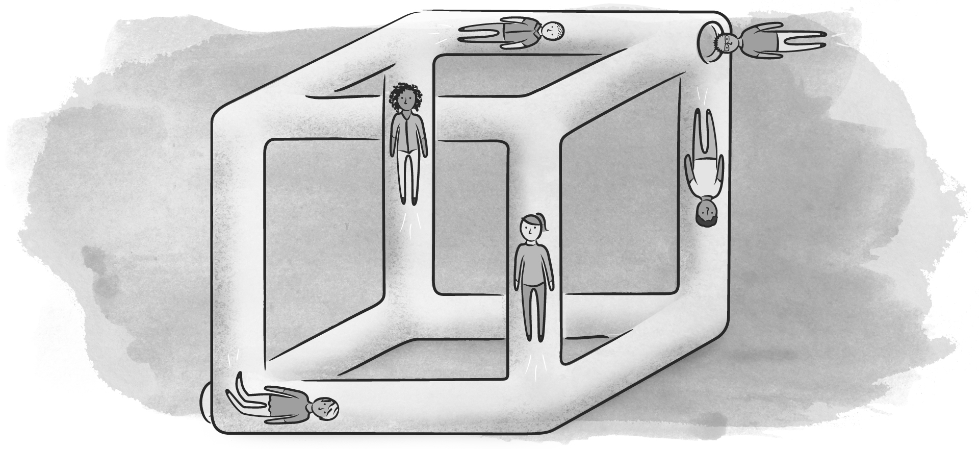
Remember: violating spatial consistency is the user interface equivalent of an M.C. Escher painting. So unless your app is Monument Valley, please make sure to keep your space simple and non-contradictory.
Practical considerations#section7
Right now you may be thinking, “But wait—there’s no way to apply this to everything!” And yeah, you’re probably right.
If you did manage to do that, you’d end up with something like a single, zoomable surface containing every possible state of the system. And although that’s an interesting idea, “pure” zoomable user interfaces tend to be problematic in practice, because they’re hard to navigate if they go beyond a certain level of complexity (PDF).
When designing real products, semantic animation needs to be balanced with other considerations like user experience and performance. Most of your interfaces are probably never going to be 100 percent correct from a semantic-animation perspective, but that’s okay. Semantic animation is a way of thinking. Once you’ve adopted it, you’ll be surprised how many things it applies to, and how much low-hanging fruit is out there. It forces you to think about hierarchy and semantics, which helps you find simpler solutions that make more sense to the people who use your products.
Note that we, the authors, are far from having figured all of this out yet. Our article doesn’t touch on many important questions (which we’re still exploring) related to the consequences of animating interfaces. Nevertheless, we’re convinced that semantic animation is a promising idea with real potential for making digital interfaces more intuitive and comprehensible.
Just a heads up: might want to check that Meteor Toys link.
Thank you Lucas! The link has been corrected.
Thanks, Tobias, for your article and showing the animation examples.
Different triggering events may or may not be in the user’s mental model. They may have associated the zoom animation with tap, double tap, home button press, double home button press, pinch, and spread. That build up of prior experience may or may not contradictory. When we consider what the person has semantically encoded as a triggering behavior, we can design more cohesive interactions and experiences.
I think one of my challenges is figuring out what people have already learned to do vs. what they have yet to learn to do. I try to keep that learnability gap as small as possible, and at the very least, recognize that the gap could be large or small, depending on the person who’s going through the experience.
Was pleasantly surprised to see a shoutout to GNOME in this article. Nice read. 🙂
Semantic animation feels a lot like how Prezi has you design the presentation on a giant ‘canvas,’ and then control keyframe points in to, out of, and around the components.
Chris we agree with you, interaction is something we don’t touch on in the article but that is definitely closely connected to semantic animation. The problem is, as you pointed out, that people already have a lot of preconceptions regarding what certain gestures should or should not do, both from the real world as well as other apps. This means that making elements behave in a consistent and intuitive way can be really challenging.
great paper from great designers!
I liked the content of this article, but a special shout out for the citations – they take your assertions beyond opinion. I wish there was more of this sort of thing in our field.
@Amin Al Hazwani Your point is well-taken. I’m currently doing UX design for two apps whose audience is kids and teens on the autism spectrum, and I think it will be very important for me to try to figure out what they already have as mental models of interactions and gestures. I’m totally new to interaction design, so this piece is great food for thought.
Thanks! A nice read with insightful illustrations.
Thank you Chris. And thank you Benoit. We are really glad to hear that!
Great article guys!
One thing. You say that “… two different transitions tell the user conflicting things, completely breaking their mental model of the interface.” when comparing the “open-app” animation with the “cross-app-navigation” animation.
Wouldn´t it be more fair to see the open and close animation as living within the same spacial perception? Those are consistent in my opinion.
Cross navigation is conceptually a different mental model, and need to see applications within the OS in relations to one another including “time”.
Hans Christian, interesting point, but I disagree.
If the animation is the same (zooming in this case), then the effects should be the same. That doesn’t mean there can’t be different modes of interaction within an interface though.
Respecting spatial consistency doesn’t mean you can’t, for example, show applications both in a grid of icons and in a chronological list. It just means that when you move between these states, the change must be explained with an animation. The OSX multitasking example hints at a possible solution: Instead of zooming, the application could move off the homescreen horizontally and become part of the list of open apps next to the homescreen.
If you treat individual interactions as separate from the rest of the system you’re doing the user a disservice, because you make it impossible for them to keep a single, consistent mental model of the interface.
Would love to see how you might remedy the iOS multi-tasking animation to be consistent with the App Launch animation.
Great article, but I believe your assessment of the iOS transitions is incorrect. First, you claim the switch from app view to multitasking view is the reverse of launching an app, when it is not. Pressing the home button is the reverse of launching an app, and switches your view to the home screen as you left it, following your statements about consistency and context.
Next, by faulting the iOS transition to multitasking, you seem to imply that transitions should be limited to 2 views — either app or home. In fact, the multitasking view can be seen as a third, intermediate view, providing options BEFORE you return to the home screen. You can choose another app to zoom into, or zoom all the way out to the home screen. You could argue the inconsistency here: from an animation standpoint, launching an app from the home screen should take you to the multitasking view. But clearly that would be less productive, requiring more steps to get to where you want to be.
As UI animation becomes more prevalent and sophisticated, it seems reasonable to expect that transitions beyond 2 views will be employed, having the potential to better communicate spatial location in applications and provide additional navigation options. Of course, this will be effective when, as you say, the animation is done well.
Hey Guys, great read.
This is really a great guide for designing tips and animation in interface design
I tend to disagree with many examples. In my view UI animation has a tradeoff between ergonomics and logic.
Lets take movies as an example. Consider the beginning of this scene https://www.youtube.com/watch?v=OtmQ-NyE6Cw
The camera is moving while keeping the actor in focus. This is logical, since you as the observer would have to move your point of view to observe an actor that is moving.
Now take beginning of this clip https://www.youtube.com/watch?v=jEDjLoc1RoI
There are hard cuts and there are transitions in the point of view. Do hard cuts have logical explanation from the point of view of the observer? No. Do full transitions provide meaning in this case? No. Would it make you sick if the whole movie would be filmed with full transitions? Yes.
Hard cuts, and disconnected transitions can be ergonomic and more pleasant to people. Because we are not robots, we don’t need everything to be logical, we can understand abstract spaces and find them comforting.
I am not saying that semantics are not necessary, in contrary they are often neglected. But the examples above don’t provide a clear comparisons. Take for example Ubuntu vs OS X launcher. The OSX example is fantastic, it is pleasant to watch, while being rich in animation it is not distracting when used 100 times a day. Also, the OS X dashboard can be invoked by doing 3 fingers pinch which makes it semantic in this scenario. Where is Ubuntu can be excessive when used frequently, and its elaborate animation might not bring any value either, since your Application launcher stays at the same place.
In my opinion a better question to ask is: When there is a need to use semantic animation? Like in the first movie example the continuous (aka logical transition) has a purpose of communicating the scene and emphasizing dramatic state transition. Because the scene is continuous we understand the state change and space better. But in the other type of scenes directors use hard cuts, to make things faster, ergonomic or simply less distracting.
Hi Scott,
We never claim that the switch from app view to multitasking view is the reverse of launching an app, we just say that the *animation* is the reverse (zooming in and zooming out).
Nope, definitely not. There can be any number of views, they just need to be connected by animations that make sense when you put them all together.
As the Mac OSX example shows, that doesn’t have to be the case: It’s the same interaction, except instead of zooming, the app just scales and moves horizontally. That wouldn’t be any more complex than the current animation, but a lot less confusing.
As I pointed out in my response to Hans Christian above, employing semantic animation doesn’t mean you can’t have complex interactions or spatial structures. It just forces you to think about the bigger picture, how everything works together. In my experience this constraint is very useful, because if a design doesn’t play well with semantic animation it’s often because it’s more complicated than it needed to be in the first place.
This was a good, thought-provoking read. Thanks.
Regarding the GNOME Application Launcher: We know that application icons aren’t actually coming out of the icon that’s been clicked on the desktop. What’s presented is a fiction in service of building a stronger connection between a click event and the resultant action in the mind of the user. And this example does that well.
I’m left wondering though: What if the way that interactions were presented came out of an attempt to visually represent the actual processes taking place? This relationship between form and function in the digital space is very appealing, at least, to me.
While the impetus for this inquiry has more to do with design considerations than user experience, I see no reason that such work could not satisfy both things.
Great, eye-opening article, thanks.
I don’t ever use the OS X launchpad, but the GNOME application launcher is nice.
Hi Jim,
One possible solution could be what I alluded to in my response to Scott, using the same general principle as the OSX animation.
That said, I think iOS has bigger problems in this respect than just these animations. It started as a simple grid of apps, but then Apple kept adding stuff on top of that every year (notification pane, Siri, multitasking, settings pane…), without ever revisiting the overall structure (probably because they didn’t want to alienate existing users).
The result is an operating system with many different parts that don’t really feel like a consistent whole because they were all designed separately. The animations are just a symptom of that.
In my humble opinion, solving the multitasking problem isn’t enough – what’s needed is a restructuring of the OS, in order to make the various parts work together better, both spatially and from a UX perspective.
Hi Timur,
thank you for your comment, this is exactly the kind of discussion we hoped to spark with our article.
You make some good points, but I don’t think it’s that simple. These movie examples are fundamentally different from user interfaces, because they show real people in real environments. Viewers already know how the real world works, how people move etc. and thus have a lot of additional context that they don’t have in abstract user interfaces they see for the first time. In interfaces we can’t rely on all the real-world affordances that make these movie examples easily understandable.
That said, the core of our argument isn’t about whether or not everything is animated, but whether it is understandable. That’s why structuring interfaces semantically is so important. Animations don’t always have to describe every change of state in perfect detail, they just need to give users enough context for it all to makes sense.
As for the OSX/GNOME examples: while I think that the GNOME animation could perhaps be a bit more understated, it definitely does a much better job explaining the semantic relationships in the interface than the OSX one. Whether or not it’s better for the overall UX is a different question (it’s worth noting that the GNOME app launcher is not a very frequently used part of the interface, not sure if that’s different on OSX).
Hi cbutter,
yes, you nailed it. As studies showed, animation really help users build mental maps of spatial interfaces. It explains where things come from and where they go.
Of course we could even consider the whole interface fictional. But in my opinion every graphical representation of the machine processes is “fictional”.
Regarding your question I think you could end up with a pure zoomable interface, which clearly explains where things are placed and their level of hierarchy. So where every bit of data is located but that would make the whole interface not so friendly in terms of user experience.
I feel Pasquale D’Silva’s on Spatial Interfaces should be mentioned here. https://medium.com/elepath-exports/spatial-interfaces-886bccc5d1e9#.9889s5bud
While I agree that animation/motion should consider and support the framework, I think the iOS multitasking example is broken at the framework level. Therefor, animation won’t completely solve the weirdness and confusion of the multitasking framework.
Otherwise, great examples and I’m glad people are discussing this!
Great article! I really like how you explained that an interface isn’t a series of screens anymore, but a collection of semantic components inside a single, continuous space.
Ultimately, animation is about guiding the viewer’s eye to focus on a what you the designer/developer wants them to. Developers that want to improve their animations would benefit by learning some animation principles. Here is a break down of Disney’s Twelve Basic Principles of Animation
I’m curious what was your rationale for using the word “semantic” to describe this way of thinking about the types of animation you presented?
It was a well-spent time to read this article.
I might need it for my web design bangkok company.
Semantics are necessary, it’s now clear more than any time that multitasking is a concrete consequence of this.
iOS follows up this trend, and offers us a useful device that can now do almost everything we need.
“We start multitasking. The app zooms out. We should get back to the icons around the app on the homescreen, but instead we see a stack of other apps.”
Really? That’s a bit of an assumption isn’t it?
I wouldn’t expect that to happen because to start multitasking I’ve had to press the home button twice in quick succession. If I press it once then I get back to where I was. This makes perfect sense to me.
Anyway good article with some nice ideas and examples.
Hi Evan,
At its core, this approach is about structuring interfaces in components with a clearly defined meaning, behaving in ways that reflect the changes in their meaning. That’s why semantic was the most obvious choice for the name.
Hi cambersands,
as I’ve pointed out in my responses to Hans-Christian and Scott, it’s not really about the interaction being the opposite, but about the animations not making sense. It doesn’t matter whether it was triggered by a single press, double press, long press, or something else, the fact is that the animations contradict each other, and that’s the part we’re criticizing.
An incredibly interesting article resulting in a lot of epiphanies and realizations. I’m definitely bookmarking this so that I can go back to it during my Information Architecture studies!