Grids serve well to divide up a predefined canvas and guide how content fits onto a page, but when designing for the web’s fluid nature, we need something more… well, responsive. Enter ratios, which architects, sculptors, and book designers have all used in their work to help set the tone for their compositions, and to scale their material from sketch to final build. We can apply a similar process on the web by focusing on the tone and shape of our content first, then working outward to design fluid, ratio-based grid systems that invite harmony between content, layout, and screen.
Columns are boring. Build with relationships.#section2
Layout choices can set the tone for our designs. As graphic designer Anne Burdick liked to teach, “the structure of the page can be seen as the embodiment of a particular philosophical perspective.”1 Do we favor order for our content? Or does it require a humanist touch? Should we tempt chaos? Whatever the tone, each can be successfully introduced in your layout through the use of a ratio: even (1:1), golden (1:1.618), or random proportions (no ratio), respectively.
Our chosen ratio will be the DNA from which all of our layout decisions are formed. This one number will connect every element of our design, and by adjusting it, we will be able to dramatically affect the tone of our designs. Ratios with a lower proportion—or smaller difference between numbers—will yield subtler layout differences, and work well for nuanced, quieter content like personal blogs or long reads. Greater proportions energize a composition with dramatic size differences, perfect for more dynamic content.


Rational Ratios#section3
A ratio can consist of any two numbers, giving us an infinite palette of possibilities, but to narrow things down it might be best to start with some familiar territory. Rational ratios are friendly enough, as the math isn’t too scary:
| Even | 1:1 |
| Halves | 1:2 |
| Thirds | 1:3 |
| Fourths | 1:4 |
The Rule of Thirds is a well-known example of the power of rational ratios in layout. Highly structured content—like arrays of images or videos, or text with a neutral or formal tone—is represented best by a rational ratio. These ratios work well when designing for symmetry, but can be used for asymmetrical layouts as well.
Irrational Ratios#section4
In The Book of Rectangles, Spatial Law and Gestures of The Orthogons Described (1956), Czech designer and architect Wolfgang von Wersin compiled a set of dynamic ratios used by artists, architects, and calligraphers throughout history to guide their compositions. According to Wersin, it was believed that “nothing excels these proportions.” Not a bad place to start, then.
| Quadrat (or Square/Even) | 1:1 |
| Hemidiagon | 1:1.118 |
| Trion | 1:1.154 |
| Quadriagon | 1:1.207 |
| Biauron | 1:1.236 |
| Penton | 1:1.272 |
| Diagon | 1:1.414 |
| Bipenton | 1:1.458 |
| Hemiolion | 1:1.5 |
| Auron (the golden ratio) | 1:1.618 |
| Hecton (or Sixton) | 1:1.732 |
| Doppelquadrat (Halves) | 1:2 |
The most famous irrational ratio in design is, of course, the golden ratio (the “Auron,” according to Wersin), which is derived from patterns in nature and the human form. Irrational ratios give us smaller increments in proportions, and their idiosyncratic relationships work best in asymmetrical layouts.
What else?#section5
On its own, a ratio is not enough to create an engaging composition. Luckily, pure geometry is not our only guide here. I’ve always loved Bringhurst’s concept of choosing typefaces based on who designed them, and where. Perhaps a similar methodology can be applied to layout, where we derive ratios from tangential influences like type choices, or even music.
Working within a scale#section6
Successful compositions use variety to create hierarchy and movement. Using our chosen ratio, we can extrapolate an array of sizes much like notes on a musical scale, then build our layouts using the “notes”—or widths—from that scale. We can then repeat and skip around the scale to create a kind of visual melody.
To build our scale, we first select a base unit. I would suggest using your typography’s base font-size to further connect the proportions of your layout to your content. Let’s use 1em to keep the math simple. We then multiply our base unit by the number on the right side of our ratio to generate the next size up the scale, and repeat until we have enough size variants to build our layout. Eight should do.

By deciding sizes based on a scale, we can choose relationships that better fit the tone of our design. Large leaps across the scale can be dramatic. Small steps can be more nuanced than in traditional columnar layouts. No matter the size of the change, the result is geometrically connected by our ratio.


Lightening the cognitive load#section7
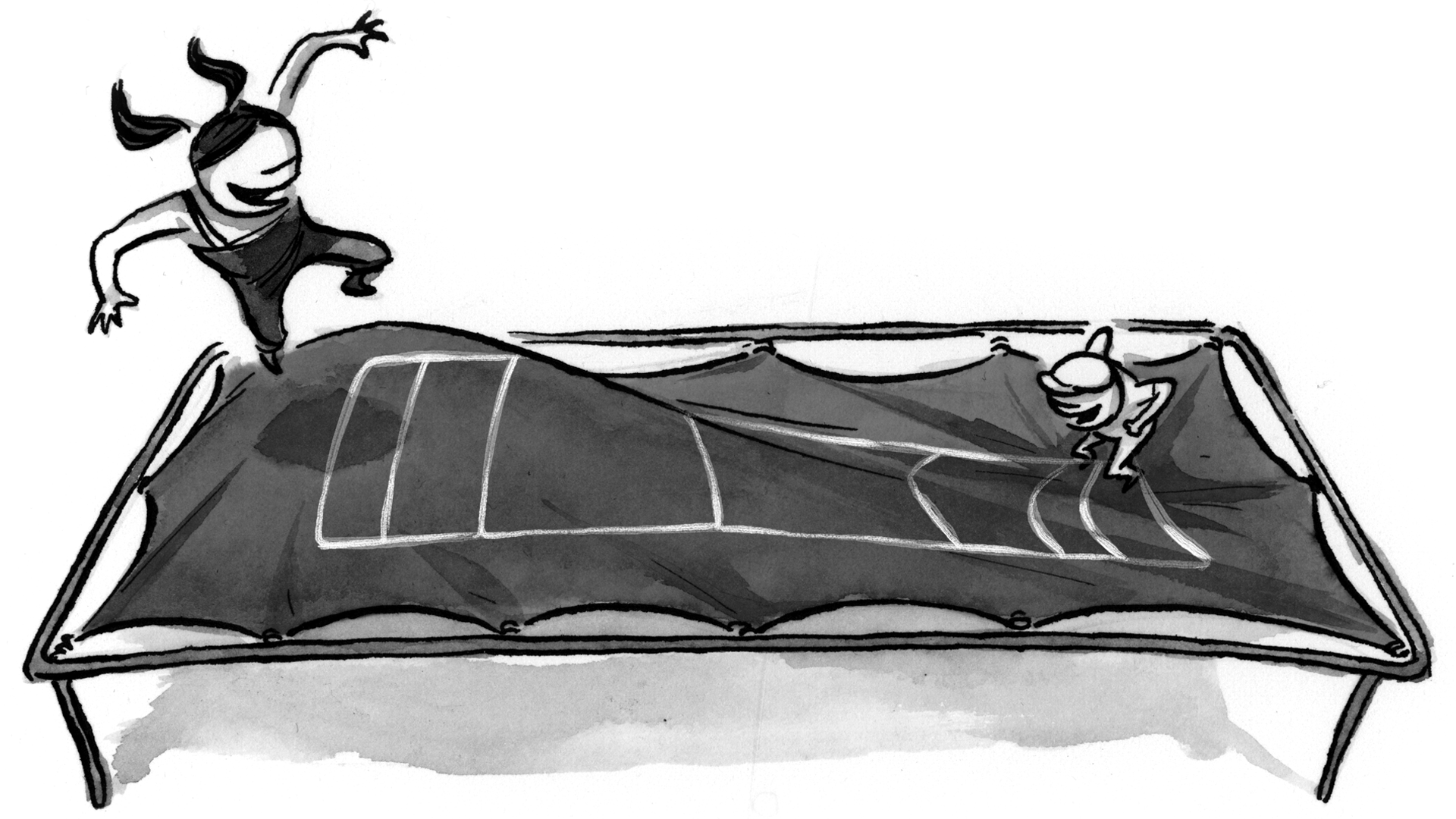
When working with ratios and scales, your layout decisions will become more strictly defined. For example, if we were laying out the content of a blog with the common image-plus-copy pattern (I call this a “blurb”), three or more columns are needed in an even-column grid to give any size distinction between the elements.

In a ratio-based grid, only two columns would be necessary here. Since blogs are intended to be a more personal expression, I think the golden ratio, with its humanist proportions, would be appropriate.

Each text width is 2.618 times larger than its corresponding image, or two steps up on our scale.
Reducing columns helps us out in two ways, giving us:
- more layout clarity: hierarchy and alignment are strengthened by the restricted threshold options;
- fewer decisions when designing: constraints keep our minds free to focus on bigger issues like content and usability.
Our simpler, ratio-based blurb grid codifies a relationship between two elements based on the shape of the content. Using this relationship as a start, we can now flesh out a fluid, content-based grid system.

Grids within grids#section8
We can now design simpler grids that build upon and within each other, sharing a common ratio to keep harmony between their various contexts. I call grids like the one used for our blurb example a “content grid.” Content grids define relationships within a portable piece of content and work well for articles, sidebar modules, and other reusable elements of a design system.
To divide up the available viewport space, we can use a global “layout grid” that behaves more like the grids we’ve been using on the web for years now.
A system emerges#section9
Continuing our blog example, we’ll use our scale to derive another content grid for our posts. In a typical blog post, we have a large image, the body of text, social media links, inline images, and some supporting content pulled out into the margins. By trying various arrangements from our scale, we can arrive at a grid that accommodates our content needs.

To convert these widths into fluid CSS percentages, we just need to total the corresponding widths from our scale, and then convert each column using Ethan Marcotte’s famous formula:
target ÷ context = result
…with “target” being a column width and “context” being the sum of all columns used in the grid. (Or if you’re braving flex-box for layout, you can just use the exact ratio numbers from your scale.)
We can build a simple three-section “layout grid” to accommodate our larger content sections: an area for branding and navigation, an area for the main body of content, and a third area for related and featured content links. Our main content area likely needs to be much wider to house our post content, and the navigation area much thinner. We’ll find column widths from our scale that feel right for our layout, giving the appropriate room for each section.

Finally, we place our content grids (the article grid and our blurb grid from earlier) into our layout grid, creating a layout that is both fluid and completely driven by our content. (View the blog demo.)

For comparison, I also built this same layout on Twitter Bootstrap’s 12-column grid. (View the Bootstrap blog demo.) While fairly similar, the ratio-based layout holds up better at any random size.
Fitting to constraints#section10
Adapting our layout to various viewports now becomes much simpler, as we have fewer variables to consider. For this process, we can build a fluid prototype in the browser, then scrutinize where the layout starts to falter when resizing the window.
Identifying the usual suspects#section11
As the viewport stretches and narrows, our relationships will strain and crack, especially at sizes in between typically targeted device sizes like “tablet” and “desktop.” After exploring how fluid layouts crumble on many well-trafficked sites, I’ve isolated some common issues that signify where a change in grid is needed:
7s#section12
Sevens find an image shortened as its width is scaled down, and adjacent text squished to a tall, unreadable measure. The resulting form resembles a “7,” and creates a conspicuous square of white space beneath the image. This is especially distracting when repeated across a layout.

Drifts#section13
Drifts are so far removed from their related content that they no longer have any relationship to anything. They may wind up paired with other disparate pieces of content flotsam, or just drift all by their lonesome. Across a layout, drifts destroy hierarchy and cause troubling rivers of negative space to creep in.

Pinches#section14
Pinches happen as elements get too close to other pieces of content. Relationships are destroyed as the viewer makes incorrect associations: images pair with the wrong headline, links run into a list of their own creation. In extreme cases, content collides—at the cost of all readability.

Finding elemental constraints#section15
After adjusting your layouts for fluidity, certain elements will need special attention. Paragraphs should maintain a readable measure, ads should maintain size and relative position, and images should not enlarge beyond what their resolution will allow. Setting a specific width is an easy fix, but does not truly embrace fluidity. Instead, we can set a min-width and/or max-width in our CSS to maintain the integrity of this content.
A fitter method#section16
The use of the grid as an ordering system is the expression of a certain mental attitude inasmuch as it shows that the designer conceives his work in terms that are constructive and oriented to the future.
A ratio-based, modular approach to grids allows us to navigate a medium where we cannot know the container size, nor what type of content will flow into that container. We can build layout systems from our content, and rely on ratios to keep harmonious compositions from these disparate parts. From there, a keen understanding of how fluid designs fail can show us when to adapt these systems, and when to add constraints.
In 2009, and again in 2010, Ethan Marcotte gave us the tools with which to respond. In 2011, Mark Boulton gave us a guiding philosophy. By weaving these highly influential ideas together with a pliable method, we can move towards more sophisticated layouts tailored to the needs of our content, patterned with unique character, and perfectly suited to the nature of our ever-changing web.
Great article! Just one question, i’m confused about the golden ratio blurb. It doesn’t look like the width of the text column is 1.618 x larger than the image column… am I reading this wrong?
Good question Thijs. The blurb grid uses the 6th and 8th “notes” from our scale, 2 notes apart, so the difference is 1.618 to the power of 2 (2.617924). Therefore the text column is 2.617924 times larger than the image column.
I thoroughly enjoyed reading your article: great stuff. “Fitting to constraints” threw a whole new light on something I thought I knew all along.
Content-Out is the way to go, but for me Canvas-In can’t be ignored either:
No matter which proportioning system I’ve used in the past I’ve bumped by head against how my layout fits in its viewport. There is always a window proportion where an important page element ends up below the fold (amongst other annoyances)…
I’ve been playing with a variation on the Van De Graaf page layout canon (canvas-in, macro grid) for page layout, and Golden Mean (content-out, micro grid) for type.
See http://all-sorts.biz/architects-websites/in-search-of-the-perfect-web-layout
.
Interesting read! Thank you.
You’re absolutely right, Gary. Given more space in this article, I would have addressed the connection between the viewport and content. Though I do see this falling later in the process, so it still flows content out. I should probably write this up somewhere.
Thank you Mr. Ford!
Thanks for this article Nathan – I’ve struggled a bit to find the right hook to use as my base unit, and I really like the idea of building the grid out from something as simple as the base font size.
I’ve been quite interested in the idea of a compound grid system with an irrational grid laid on top of a rational grid. Placing site-wide elements like navigation, headers, footers etc. on to a rational grid brings a real sense of order and dependability, while using an irrational grid for the page content allows me to get nicely off-kilter if I want. I’ve never quite managed to get that working as harmoniously as I would like, but I’m going to give it another go using the base font size as the base unit for both grids.
One question, Nathan: when building grids like this which are based on ratios, how do you decide where to place the margins? In figure #11, you have a two column grid with the right edge of the image placed along the dividing line, but it could have just as easily been the left edge of the text which is aligned instead. You could have also chosen to split the difference and have the line fall between the image and the text, how do you decide?
Very insightful, Dan. Fluid gutters can cause headaches, so I sometimes prefer to apply margins to elements instead. In the blurb example, I felt the shape of the text is more inferred by the space around it (more than the image), so it could absorb the margin and still keep the visual relationship. This is, of course, a judgement call, and depends on the context. The goal being to separate the content just enough, and keep the visual (maybe not exact) proportion between elements.
Very nice article! I’m going to come back and spend some more time with it, but as an illustrator I’ve always been fascinated by the golden ratio. You might like this article on its use in illustration design by Maxfield Parrish. I hadn’t thought of using it in a grid system, but I’ll be playing with it shortly. (Also see this calculator for working out golden ratios. Adding the multiplications for the golden ratio looks like a nice little weekend project.)
Edit: Updated the calculator to display the 8 notes for any number you enter. Ironically, the page is on the 960 grid.
Nathan commented about the relation between content & viewport:
“I should probably write this up somewhere.”
Yes, please!
“Though I do see this falling later in the process”
I’d love to hear your insights on this. My take is that you need to think about both simultaneously, else trouble sets in once you start testing your layout across various screen proportions.
Awesome! As a content strategist, I love seeing designers and architects really care about and solve for content … because at the end of the day, it’s about consumption, connection and engagement. And we all know when design, interaction and content work together in harmony — BAM! — it’s not just a beautiful thing, it’s an experience that truly meets the goals of the user and the business. Thanks, Nathan.
I appreciate your research which is done by you very well, i also agreed with your kind information of content layout, but i have a little question, if designer not a writer than how can he/she manage its layout content, i know for a web design he/she must need to take care regarding page payout but also this little confusion is surrounding in my mind so please share more steps if know well.
Thanks
http://www.logodesignbest.com/
@Shawn: It is important to start the design process with content. So, in a redesign, scrape some existing content from the site. In the case of new content being needed, try making it up. Your client/writers will definitely have opinions on your attempts. This tends to get them motivated to provide the real content.
I know starting with content is not always possible, but you can make some educated assumptions and start working out from there.
Thoroughly enjoyed this article! I have made use of the golden ratio in my designs in the past and have been very pleased with the results. It really lends itself to creating a design that feels organic and interesting. I don’t know why, but I haven’t used it much lately. Time to dust off the ol’ golden ratio for my next design! =)
good indeed.
Figure 13’s image shows three columns labelled 6, 7 and 8. The caption states “A four-column article grid using 1 and 2 from our scale.” I’m not understanding this one. May you help me?
Decent article, but did we need the political headlines snuck into the figures at the end?
@powrsurg: The headlines were from real layouts from fairly neutral sites (mashable and time, if I remember correctly). Nothing political intended, just pulling from real world responsive sites… though I think these sites are on new iterations by now.
I forgot to mention this when I first read this amazing article: Isn’t figure #13 showcasing a 3-column grid instead of a four-column grid?
I think methods like http://gridstylesheets.org/ are the way forward we are no longer constrained by the limitations of the archaic css methodology, it’s in a very early phase but it potential in the future of layout is something to stand up and take notice of.
I really like this system but I’m having trouble understanding how to use the ratios to design the grids. You say to multiply the base by the right side of the ratio and repeat for each step but then you use the Golden Ratio as an example where you’re adding. Additionally how would you suggest using this system with something like Bourbon Neat?
Hey Mr. Ford, you made my morning one of the most interesting that I can remember. Thanks!
Great article! Adjustable electric beds!
That’s a lot of ratios explained quite simple. I am bookmarking this page so my next design project can benefit from it. Thanks Nathan.