I want you to think about what you’re doing right now. I mean really think about it. As your eyes move across these lines and funnel information to your brain, you’re taking part in a conversation I started with you. The conveyance of that conversation is the type you’re reading on this page, but you’re also filtering it through your experiences and past conversations. You’re putting these words into context. And whether you’re reading this book on paper, on a device, or at your desk, your environment shapes your experience too. Someone else reading these words may go through the same motions, but their interpretation is inevitably different from yours.
This is the most interesting thing about typography: it’s a chain reaction of time and place with you as the catalyst. The intention of a text depends on its presentation, but it needs you to give it meaning through reading.
Type and typography wouldn’t exist without our need to express and record information. Sure, we have other ways to do those things, like speech or imagery, but type is efficient, flexible, portable, and translatable. This is what makes typography not only an art of communication, but one of nuance and craft, because like all communication, its value falls somewhere on a spectrum between success and failure.
The act of reading is beautifully complex, and yet, once we know how, it’s a kind of muscle memory. We rarely think about it. But because reading is so intrinsic to every other thing about typography, it’s the best place for us to begin. We’ve all made something we wanted someone else to read, but have you ever thought about that person’s reading experience?
Just as you’re my audience for this book, I want you to look at your audience too: your readers. One of design’s functions is to entice and delight. We need to welcome readers and convince them to sit with us. But what circumstances affect reading?
Readability#section2
Just because something is legible doesn’t mean it’s readable. Legibility means that text can be interpreted, but that’s like saying tree bark is edible. We’re aiming higher. Readability combines the emotional impact of a design (or lack thereof ) with the amount of effort it presumably takes to read. You’ve heard of TL;DR (too long; didn’t read)? Length isn’t the only detractor to reading; poor typography is one too. To paraphrase Stephen Coles, the term readability doesn’t ask simply, “Can you read it?” but “Do you want to read it?”
Each decision you make could potentially hamper a reader’s understanding, causing them to bail and update their Facebook status instead. Don’t let your design deter your readers or stand in the way of what they want to do: read.
Once we bring readers in, what else can we do to keep their attention and help them understand our writing? Let’s take a brief look at what the reading experience is like and how design influences it.
The act of reading#section3
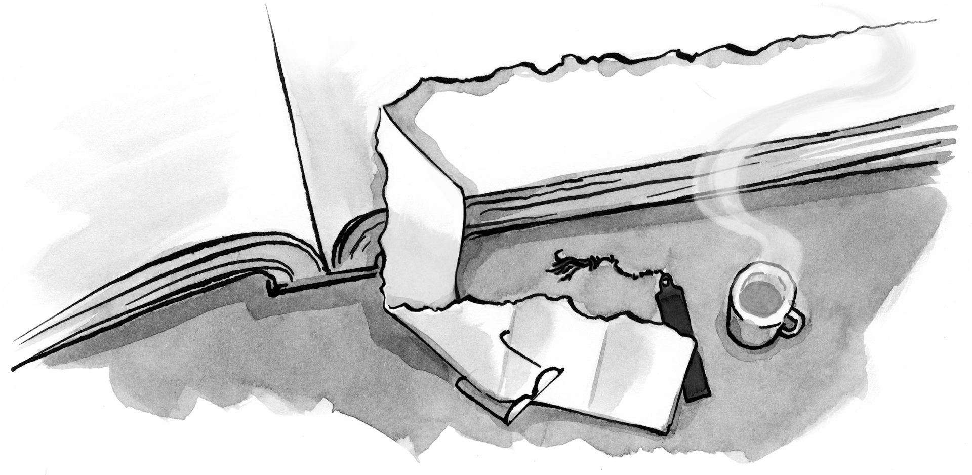
When I first started designing websites, I assumed everyone read my work the same way I did. I spent countless hours crafting the right layout and type arrangements. I saw the work as a collection of the typographic considerations I made: the lovingly set headlines, the ample whitespace, the typographic rhythm (fig 1.1). I assumed everyone would see that too.

It’s appealing to think that’s the case, but reading is a much more nuanced experience. It’s shaped by our surroundings (am I in a loud coffee shop or otherwise distracted?), our availability (am I busy with something else?), our needs (am I skimming for something specific?), and more. Reading is not only informed by what’s going on with us at that moment, but also governed by how our eyes and brains work to process information. What you see and what you’re experiencing as you read these words is quite different.
As our eyes move across the text, our minds gobble up the type’s texture—the sum of the positive and negative spaces inside and around letters and words. We don’t linger on those spaces and details; instead, our brains do the heavy lifting of parsing the text and assembling a mental picture of what we’re reading. Our eyes see the type and our brains see Don Quixote chasing a windmill.
Or, at least, that’s what we hope. This is the ideal scenario, but it depends on our design choices. Have you ever been completely absorbed in a book and lost in the passing pages? Me too. Good writing can do that, and good typography can grease the wheels. Without getting too scientific, let’s look at the physical process of reading.
Saccades and fixations#section4
Reading isn’t linear. Instead, our eyes perform a series of back and forth movements called saccades, or lightning-fast hops across a line of text (fig 1.2). Sometimes it’s a big hop; sometimes it’s a small hop. Saccades help our eyes register a lot of information in a short span, and they happen many times over the course of a second. A saccade’s length depends on our proficiency as readers and our familiarity with the text’s topic. If I’m a scientist and reading, uh, science stuff, I may read it more quickly than a non-scientist, because I’m familiar with all those science-y words. Full disclosure: I’m not really a scientist. I hope you couldn’t tell.

Between saccades, our eyes stop for a fraction of a second in what’s called a fixation (fig 1.3). During this brief pause we see a couple of characters clearly, and the rest of the text blurs out like ripples in a pond. Our brains assemble these fixations and decode the information at lightning speed. This all happens on reflex. Pretty neat, huh?

The shapes of letters and the shapes they make when combined into words and sentences can significantly affect our ability to decipher text. If we look at an average line of text and cover the top halves of the letters, it becomes very difficult to read. If we do the opposite and cover the bottom halves, we can still read the text without much effort (fig 1.4).

This is because letters generally carry more of their identifying features in their top halves. The sum of each word’s letterforms creates the word shapes we recognize when reading.
Once we start to subconsciously recognize letters and common words, we read faster. We become more proficient at reading under similar conditions, an idea best encapsulated by type designer Zuzana Licko: “Readers read best what they read most.”
It’s not a hard and fast rule, but close. The more foreign the letterforms and information are to us, the more slowly we discern them. If we traveled back in time to the Middle Ages with a book typeset in a super-awesome sci-fi font, the folks from the past might have difficulty with it. But here in the future, we’re adept at reading that stuff, all whilst flying around on hoverboards.
For the same reason, we sometimes have trouble deciphering someone else’s handwriting: their letterforms and idiosyncrasies seem unusual to us. Yet we’re pretty fast at reading our own handwriting (fig 1.5).

There have been many studies on the reading process, with only a bit of consensus. Reading acuity depends on several factors, starting with the task the reader intends to accomplish. Some studies show that we read in word shapes—picture a chalk outline around an entire word—while others suggest we decode things letter by letter. Most findings agree that ease of reading relies on the visual feel and precision of the text’s setting (how much effort it takes to discern one letterform from another), combined with the reader’s own proficiency.
Consider a passage set in all capital letters (fig 1.6). You can become adept at reading almost anything, but most of us aren’t accustomed to reading lots of text in all caps. Compared to the normal sentence-case text, the all-caps text feels pretty impenetrable. That’s because the capital letters are blocky and don’t create much contrast between themselves and the whitespace around them. The resulting word shapes are basically plain rectangles (fig 1.7).


Realizing that the choices we make in typefaces and typesetting have such an impact on the reader was eye-opening for me. Small things like the size and spacing of type can add up to great advantages for readers. When they don’t notice those choices, we’ve done our job. We’ve gotten out of their way and helped them get closer to the information.
Stacking the deck#section5
Typography on screen differs from print in a few key ways. Readers deal with two reading environments: the physical space (and its lighting) and the device. A reader may spend a sunny day at the park reading on their phone. Or perhaps they’re in a dim room reading subtitles off their TV ten feet away. As designers, we have no control over any of this, and that can be frustrating. As much as I would love to go over to every reader’s computer and fix their contrast and brightness settings, this is the hand we’ve been dealt.
The best solution to unknown unknowns is to make our typography perform as well as it can in all situations, regardless of screen size, connection, or potential lunar eclipse. We’ll look at some methods for making typography as sturdy as possible later in this book.
It’s up to us to keep the reading experience unencumbered. At the core of typography is our audience, our readers. As we look at the building blocks of typography, I want you to keep those readers in mind. Reading is something we do every day, but we can easily take it for granted. Slapping words on a page won’t ensure good communication, just as mashing your hands across a piano won’t make for a pleasant composition. The experience of reading and the effectiveness of our message are determined by both what we say and how we say it. Typography is the primary tool we use as designers and visual communicators to speak.
Thanks for writing this. The tops of letters being more legible than the bottom is something I had never seen discussed before.
This was like the first shot for a typographic heroin addict. I’m even more excited to read your book than I was before (if this is possible ;))
It’s so great that you’re writing about this topic. I’m looking forward to reading the rest of the book. There are a couple of corrections you might want to consider updating in later printings.
The idea that the top half of letters are more important comes from the work of Emile Javel in the 1870s. While this is generally true for some letters, it’s not true for all letters. Daniel Fiset’s research shows that we the lower half is far more important for letters with descenders like g, j, p, q, and y. It is difficult to read the top half of the words apply and jimmy.
The idea that we read word shapes dates back to Cattell in the 1880s, but the last 40 years of eye tracking research by Keith Rayner has shown that we really do read each letter in a word. We can see this by deliberately altering words: if you keep the first couple of letters intact, but change the shape of the word, you read normally. If you retain the shape, but change the first letters, you read slowly. Recent work by Aries Arditi even shows that uppercase words are read faster than lowercase words.
Sofie Beier’s has investigated the idea that “we read best what we read most.” While some would claim that given enough time they could read a Gothic blackface as fast as Verdana, letter legibility is an important factor.
Beier’s book Reading Letters: designing for legibility does an excellent job at covering recent research.
If you’re into the subject of “readability” then +1 to Dr. Kevin Larsen’s recommendation of Sophie Beier’s book “Reading Letters”.
I would also recommend perusing the work of former UCLA Professor Richard Lantham.
Lantham focuses mostly on rhetoric – on “staying readable by writing readable”, but he also makes great points about the future of text onscreen and the forms we might expect it to take on screens and platforms yet to come.
Example: the main texting app on my Android based Samsung phone uses an italic version of the main typeface to signal that the text message is “in transit”. Only when the message gets through does the italic version of the font revert to it’s non-italic equivalent font and thus signal that the message got through.
This was the first time ever I have seen the italic (or ‘oblique’) style of a font used to communicate to the reader the state of the text: such as ‘in transit’ or ‘received’.
And it made me think of Richard Lantham cause he thought about all this stuff and envisioned a lot of it decades ago.
A copy of Lanham’s short and sweet “Revising Prose” deserves a place on the shelf of anybody who works with words. And a yearly “refresher” read wouldn’t hurt either.
Found a synopsis of Lanham’s ingenious “Paramedic Method” in a Powerpoint on Youtube: https://www.youtube.com/watch?v=XNo3v-pDtqE
The start of Jason’s book seems a bit geeky, frankly, but I’m a geek for this stuff so I don’t mind. But wondering how it will play in Peoria.
I’ll be buying it to see how it handles the nuts and bolts issues of embedding fonts into web pages. Nuts and bolts like going with a service company like Adobe Typekit versus DIY, for example. Anxious to see the recommendations made.
Best of luck to it.
But if there’s a wiseass reference somewhere in the book to Comic Sans, then shame, shame, shame.
(That and Papyrus are my favorite fonts! 😉
It reminds me when Microsoft switched to all-caps menus in Visual Studio 2013. Recently they put a flag for that, after developers’ uproar.
But all-caps menus still plague a lot of recent Microsoft products, starting with Office. They really need better designers…
Looking forward to reading this book also, but glad to see Kevin Larson’s comment.
I have seen the idea of word shape recognition leading to improved readability in numerous typography books, and taught my design students the same when I was an adjunct. It wasn’t until I read Dr. Susan Weinschenk’s book, 100 Things Every Designer Needs to Know About People, that I learned this was inaccurate and that there is research to back it up.
I feel badly that I contributed to perpetuating this myth (that I read in books). Ahh, if only scientists and designers would talk to each other (more)!
There’s this great line from Jason’s book, which I love:
Personally, I feel the benefit of this book is that while there’s a lot of formality, rigor, and tradition to typography—which is, of course, wonderful—there’s also a lot of instinct behind executing it. Understanding when each is helpful is the best part of this book. What’s more, I think Jason’s book makes a deep, occasionally intimidating field more approachable to the less experienced, and give them the tools to learn more.
A thoroughly enjoyable read and, having had the pleasure of reading Jason’s entire book in advance, thanks to the A Book Apart team’s generosity, I can highly recommend it.
If this tickled your fancy, you’ll enjoy Jost Hochuli’s excellent book ‘Detail in Typography’, which not only underpins these ideas, but expands upon them considerably. It’s a small, but beautifully designed tome, which is well worth owning. It effortlessly makes the case for the permanence – and sheer pleasure – of printed books.
Hochuli goes into considerable depth, exploring the importance of detail in typography and how – when one attends to the details – one can improve the reader’s experience of a text. As Hyphen Press, the publishers of ‘Detail in Typography’ put it: “Answers may be found here, not least in the way the book itself has been set and produced.”
I’ve long recommended Hochuli’s book to my students, it’s an essential companion to Robert Bringhurst’s ‘The Elements of Typographic Style’. If you’re just embarking on your journey into the wonderful world of typography, I can think of no better start than Jason’s new book, it’s the perfect gazetteer to accompany you on your adventure.
Kevin, Richard, and Anne: Thanks very much for your comments. I’m familliar with Sofie Beier’s work too, her book “Reading Letters” is wonderful. I agree, just as I mentioned in the article, there are lots of findings on the topic of reading over the years, and I don’t claim to have all the answers, these are the findings that I think are most compelling. And if there is one thing I’ve learned over the years is that we don’t all read the same way. I go on in the book to discuss how there are many different tactics in typography, but also nearly always more than one correct pathway. Just as these ideas don’t always apply to all letters or all typefaces. Typography is chock full of just as many exceptions as commonalities. Unfortunately, it’s a short book so it can in no way be comprehensive. Which is OK, that’s just enough room for my personal take on typography 🙂
Ethan & Christopher: Thank you very much for the kind words. I tried to strike a balance between the brevity of Hochuli and the breadth of Bringhurst, but for folks who might never discover those authors.
This was a really interesting read. I feel readability and how we interpret words and letters is often an overlooked subject, this seems especially true in the world of design and often I fail to understand why people design things in such a way that makes them almost unreadable.
The discussion of saccades and letter shape makes me wonder about one vs. two spaces after a period. I know two spaces is anathema to typographers, but I can’t help but wonder if it does improve legibility, at the expense of appearance. I don’t have any science to go on, except that I remember reading a few decades ago about a study which found that two spaces between a clause improved comprehension.
I’m guessing the actual book in its entirety is very insightful. However, I didn’t walk away from this excerpt feeling like I garnered something I could apply to digital design. Perhaps it is meant more for those who create type faces than someone like me who simply (and often ignorantly) struggles searching for the right one, not knowing exactly what makes for a good choice. I enjoyed learning about saccades, word shapes, the upper vs. lower halves of text, uppercase vs lowercase, but in the end, what do I take away from this? I never would argue how vital typography is, but how do I use any of the insights from this excerpt to make better choices with typography as I go forward? I wish this would have been more practical to a big dumb interaction designer like myself. Perhaps the book is?
Jason M, The book in its entirety *is* useful and, reading your comment, looks like it would be right up your stress. After the first chapter (How We Read) it covers the following: How Type Works; Evaluating Typefaces; Choosing and Pairing Typefaces; Typographic Systems; and Composition.
It’s an excellent primer if you’re interested on embarking on journey to become a better typographer. I’d recommend it highly (and have added it to our reading lists at the BelfastSchool of Art).
Wonderful article! Equal parts accessible and insightful. Thank you – I will link to it often.
The research relied upon by Kevin Larson is flawed. In the past couple of decades high-tech testing methods have sadly over-powered the crucial role of lucid thinking inherent to the Scientific Method. The conclusion that we always read individual letters is unreliable because the testing methods cited do not achieve true immersive reading; the remain firmly confined to the realm of slow*, deliberative reading restricted to the high-acuity foveal region of the retina (which accounts for only about 1/3 of useful vision). There is much evidence that punches holes in the letterwise-decipherment model, not least the existence of saccades that far exceed the fovea (with no subsequent regression). Furthermore, the letterwise-decipherment model flies against centuries of anecdotal evidence, not to mention the common-sense belief that the brain, being obsessed with efficiency, would not blindly (pardon the pun) waste useful information in the parafovea, where only letter clusters (or boumas as I’ve come to call them) and not individual letters are decipherable. As you might suspect, I could write a lot more here… but I would rather refer people to my article in issue 13 of Typo magazine.
* Around only 300 wpm.
Really, when somebody claims “uppercase words are read faster than lowercase words” it should be clear that there’s something fundamentally wrong with their approach.
hhp
Very interesting article. As a designer focused on web/mobile I really like getting back to basics and I’m currently reading several books on Typography/typefaces. This was a great addition to my reads, and will definitely get a hold of your book.
Your post is one of the better that I have read. Social media and serendipity is the current trend in the world, and grow because the composition made everything easier to accomplish. This was really interesting info in this blog that to very happy for the nice technology in this blog. Many thanks for creating such excellent material. This is excellent. Khelo Mcx
good article! very insightful! Focus on clarity or readability on designs. Pretty useful for typography studies. Nice to read before design something.