When you engage in a new client project how do you get started? A solid process plays a critical role in the project’s overall success, yet this process is one of the deepest darkest secrets of our industry. Evolving from print, identity, and advertising the web retains many methodologies and deliverable relics from disciplines that produce very different products.
When we supply detailed mockups that represent set widths, we can imply that we’re executing the final design. Clients can feel disconnected from the process, which gives them a false sense of completion, detaching them from the final product. So why don’t we more closely design our own process to work within clients’ expectations and emotions? We must evolve our deliverables to make clients a more active participant in the process.
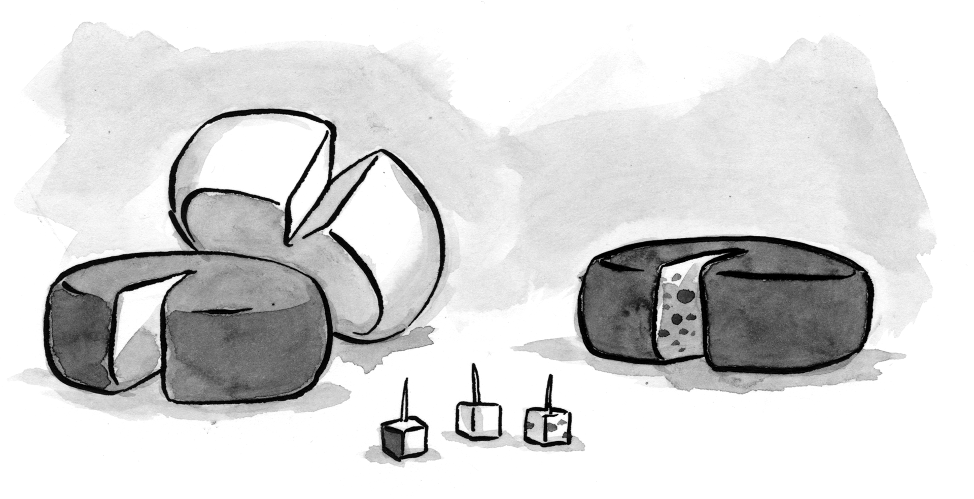
Websites are so much more than just usable interfaces: they tell a story. The style tile is a design deliverable that references website interface elements through font, color, and style collections delivered alongside a site map, wireframes, and other user experience artifacts. Style tiles are based on visual preference discussions with the client. They’re sample options that spur discussion with stakeholders on a common visual language. Containing sample UI style swatches, a style tile illustrates how a designer translates a stakeholder’s brand to the web. When a client uses the word “friendly” or “clean” to describe the site they want, the style tile visually represents those adjectives. Style tiles offer a catalyst for discussions to clarify and refine the client’s preferences and goals.
Emotional connection#section2
Style tiles are a flexible starting point that define a style to communicate the web in a way that clients understand. A style tile is more refined than a traditional identity mood board and less detailed than a website mockup or comp. When an interior designer redesigns a room they don’t build multiple options of the designs they’re proposing, they bring color swatches, paint chips, and architectural drawings. Style tiles act as paint chips and color swatches for the interface that we can execute on any device or at any dimension. It’s a truly responsive solution to visual design.
A mood board can provide a great jumping-off point for client discussion, but is often too vague to help clients make a clear leap from discussion to website. Mood boards are a good way to dig deep into a brand identity, but when it comes to bringing the identity to a complex web system, such a weak connection can make it hard for a client to understand and imagine the outcome. By contrast, style tiles make a great visual design artifact. They help a designer communicate how they will apply the styles across a larger web system, which includes desktop and mobile experiences.
Ask questions to extract adjectives#section3
The style tile process teases out the passion behind a brand, revealing nuggets of descriptive goodness all while connecting the client to the project. The first step in the style tile process is to question the stakeholders. You can use a survey or ask the questions in a design kickoff meeting. First, be sure to have the stakeholders list and rate their goals for the site’s visuals. Having them define their goals up front reinforces the priority of each style decision throughout the process. Next, ask questions that will encourage adjective-rich answers in your survey. Metaphor questions like the ones described in this Adaptive Path article are strategic and help break the ice. For example: “If your website was a vehicle, what vehicle would it be and why?”. This is a great question: there are social and cultural perceptions that surround different automobile brands and types of transportation. The adjectives associated with these brands may be very different. Your client will describe a Toyota Prius differently than an SUV.
Semantic differential survey questions are a really good way to understand the client’s aesthetic preferences. You can set up word pairs that are opposite of one another and ask clients to select a point on the scale between the two to help describe the way they envision the site. Do they envision the site as modern or old-fashioned, or somewhere in between? These questions help rate how closely the stakeholder relates to a word that describes the site’s potential style. Illustrative, photographic, and typographic are all words that a stakeholder can rate to help you get a sense for their preferences. Often I’ll pair an example site with each word so that the stakeholder can see the relationship. MailChimp is an example of “illustrative” while NPR is an example of “typographic.”
The answers you get are key to forming the emotional bond between a two-dimensional visual design concept and the passion that the client feels for their brand. Listen carefully, sort and dissect the stakeholder’s responses, and draw clear connections between the visuals in your style tiles and the client’s actual words. The more literal you can be, the more your client begins to feel connected to the process, which builds trust, and paves the way to a smoother approval process.
Once your stakeholders have filled out your survey or answered your questions during a kick-off meeting, analyze what they’ve given you. Study their answers and highlight adjectives to compile a list. Have some adjectives been used more frequently? Those words go to the top of your list. Themes will begin to emerge, and from this you can start to formulate an online brand vision. This can be a short statement that sums up your findings, or it might state that all of the stakeholders are in disagreement. Whether the online brand vision is clear or disjointed, it provides you with a jumping off point to discuss how to move forward with your client as you present the tiles.
In a recent project, the Phase2 Technology design team worked with The Washington Examiner to create a 2012 election campaign microsite to serve up-to-the-minute political information. The site goal was to extend the Examiner’s historic brand with more of a patriotic tone to energize readers for the upcoming election. Using adjectives the Washington Examiner team provided, Phase2 interpreted the newspaper’s brand by exploring three different stylistic options for the client to choose from. The styles reflected interpretations of three variations on their current online brand.
The three tiles presented to the client are below.


Iteration nation#section4
There was some overlap in the adjectives that the Washington Examiner stakeholders used to describe their brand, which helped us to create a clear brand vision. The word “patriotic” dictated a red, white, and blue color scheme and their rich history in publishing led us to choose several slab serif typefaces which were developed for readability and the publishing industry. Words like “current” and “modern” coupled with the fact that the site was specifically for the 2012 campaign spurred us to explore texture and depth in the presidential candidates’ brands. Beyond the adjectives that were most popular, “clean,” “strong,” and “friendly” dictated three directions that the overarching vision could evolve into. The “clean” tile was bright with a lot of white space, the “strong” tile featured brushed aluminum and the stars from their logo, while the “friendly” tile included large hits of vibrant color.
During the iteration period, the stakeholders decided they wanted the first tile but the red stars from the second tile and the typeface from the third tile. During this round, they decided that they preferred a friendly slab serif typeface, so we chose Adelle and they loved it. This final tile translated directly to the final design of the site.
 The style tile that the Washington Examiner approved.
The way it was#section5
It’s common to present multiple comps to a client during the design process. Clients like to see options, and multiple comps make stakeholders feel like they’re getting what they paid for. Design is sales and we love to make our clients happy, but presenting multiple, fully visualized comps hurts the process more than it helps it. Because it’s human nature for people to mix and match, this allows clients to sabotage the best solutions to their design problems based on transitory stylistic preferences. In the end, you have a Frankencomp, a mishmash of interface elements conceived outside the website’s goals.
Process and approach affect the end result#section6
Design is a tricky practice because everyone has an opinion on aesthetics. Clients are a major part of the design process: without them you’d be making websites for free and that’s not a design job, it’s a hobby. Style is preference-oriented while design is goal-oriented. It can be daunting to help your client understand how the two are separate, but style tiles can be a key component in the web design process that allows you to involve your client on an interactive, iterative level. When you expose the design process deliverables in iterative chunks, the client is able to provide more feedback, feel more involved, and become a valuable collaborator in the final design.
Design is about trust#section7
The style tile redefines the roles in the client/ designer relationship. People go to counselors when they need to solve life challenges. Clients go to designers when they need to solve communication problems. If you consider the designer as a counselor who guides the client to a solution, then trust builds with each iteration. Would you trust a counselor if you walked into a room and they pulled out your fully developed recovery plan based only on your previous history? You would walk out! An organization’s brand and the way they communicate can be delicate matters, as delicate as a family relationship issue or marriage. The approach, tone, and process that you take as a designer has a tremendous influence on the relationship you build with a client. Having direct access to the client, educating them on your plan for the process, and incrementally diving into the design are all parts of the style tile process that help to establish invaluable trust.
Responsive Design#section8
Designing for the web is no longer designing for just a 960-pixel width. Designing sites to act responsively across multiple screen widths and devices changes the relevancy of design comps for client interfaces but also for team communications. Creating a mockup for every possible device or screen size is inefficient and confusing to a client. Style tiles are the cornerstone of a solid design system that sets client expectations and communicates the visual theme to all the project team members. Designing a system rather than site pages gives your team the tools to create a living, breathing website. From a client-approved style tile you can begin to build other visual assets, such as component style guides that address frequently used elements. For more thoughts on design systems check out sweet systems.
Designing our design process#section9
As web designers we craft experiences for users, but we often overlook the need to design the experience that clients have during the web design process. Design thinking can improve how we tackle challenges, involve our clients, and present deliverables. Style tiles expedite project timelines, involve stakeholders in the brainstorming process, and are an essential artifact in the responsive design process. Involving stakeholders early on and mixing and matching styles with a deliverable that is void of layout can have a dramatic emotional effect on the entire team and the project’s outcome. For a quick cheat sheet on how to get started integrating Style Tiles into your process take a look at StyleTil.es.
One of the reasons I enjoy ALA is that compared to other sites about the craft, it’s written well and doesn’t suffer from marketing jargon. This piece, though, could have benefitted from being run through one of those filters that strips out meaningless MBA sales talk.
Most clients wouldn’t know a design element if it jumped up and hit them over the head. Do you really want the client insisting on Comic Sans throughout the site?
“Creating a mockup for every possible device or screen size is inefficient and confusing to a client.”
Seems to me like we’re going through a ‘development’ or ‘maturing’ phase here. This is the 2nd or 3rd piece I’ve read where supposedly mockups — particularly of the Photoshop-derived variety — are supposedly a thing of the past.
And why? Because you can’t deliver mockups for “every possible device or screen size”.
Of course, if the goal is to avoid things that are “inefficient and confusing to the client”, you might still want to include one or two examples of how your wonderful creation is going to look — at least on a ‘generic’ tablet or smartphone. That way you’ll avoid grief further down the road when your design hits the fan.
There are a whole lot worse things than doing mockups at maybe one or two levels. Nowadays, it’s simply part of the deal. Get used to it. The good news, is that once you’ve settled on a overall ‘look-and-feel’, developing subsets of that design ought not to be too difficult.
Great article. We just started using these in the shop and the more I read about them, the more I like them. Leo brings up a good point though – does this mean the death of the mock-up? I think changing the way we work is challenging, but manageable. Changing the expectations of clients by removing full mock-ups from the equation could be a little trickier.
I agree that in the long run this will set a much better foundation for quick iteration, responsive design and scalability but I’m interested to know how we might transition and educate clients who are used to seeing the whole room, not just the swatches.
@IrishChieftain
Style Tiles are a way to talk through recommendations for solving your client’s challenges not necessarily for giving them exactly what they are looking for. There are lots of alternatives to Comic Sans and there could be a Style Tile for each.
@leoklein
Style Tiles are not an end-all solution to mockups but an additional tool to help guide your client and team through the design process together. Style Tiles lead up to the selection of a style that is married with User Experience decisions. I have found that mockups are still a great tool, but the necessity to create one for multiple design options or for every page is less necessary with the Style Tile process. Efficiencies free up more time to spend on the detail later on in the process.
@mhy
Thanks! I have found that Style Tiles help set expectations early in the process that a web system is a journey. Mockups still have a place in the journey, but moving them farther along in the process helps your client understand the evolution of the problem being solved.
Education has been the key to success. I have found that clients are really receptive to not receiving mockups up front if they understand the efficiencies and benefits of the entire process before engagement.
Interesting piece and some good thoughts overall. Unfortunately very marketing copy heavy, as has been pointed out. Normally I wouldn’t care, but you’ve worked really hard here to brand the term style tiles while you’re basically talking about the time honored tradition of the brand board.
After gathering your client’s thoughts, you put together a visual representation of their brand as you heard it, and have a discussion they can react to. Usually this includes a mock-up of a brochure, some letterhead, primary and secondary color choices, photo selections, and more recently a web or facebook page. The brand board is used as a tool to have the visual dialog. Typically you’ll prepare two or three different options to discuss with a client.
This should be part of the branding process. These are then taken and adapted into the brand style guide, which these days should include all of the information you’ve specified, including web fonts, hex colors, and any special visual requirements. Even when you have a client without an offline presence, the brand board is still a powerful and important tool in the process.
As a design community we have a term for this, and a long history of the process. I can appreciate you want to own a brand here, and you have a website already set up to reap the SEO rewards, but the industry is best served when we use common terminology.
In the larger picture of the dialog, I guess it comes as a little concerning we’re talking about brand boards as if they are new trend to try out. They work, and they’ve been in practice for decades.
It’s too bad the knee-jerk reaction to this article is so negative.
One of the reasons I like ALA is that it offers genuine marketing (as well as design and code) insight. I direct our account executives to this site regularly. Hating on MBA language is misguided. The stereotype is that we creatives have their heads too far in the clouds to see the client-agency relationship as it truly exists. Comments like Victor Vacendak’s validate that stereotype.
It seems to me that design tiles would be different from brand boards. Brand boards represent the brand overall from a graphic standpoint; in this case, we’re talking about a board filled with just design elements for the website (and different executions of them). @Wild, if brand (or mood) boards are already a part of your workflow, perhaps the suggestion here is to offer them more weight and importance so that you won’t need to mock up designs for every display scenario.
Common terminology is an ideal, not a reality. As referenced above, I’ve heard brand boards referred to as “mood” boards. If I were to apply for jobs now, I’d be searching for titles including Web Designer, UI Designer, UX Designer, Front-End Developer, Graphic Designer, Web Art Director, Webmaster and a dozen others. Consistency doesn’t exist.
Thanks for the article, Samantha. I enjoyed it.
jP
I enjoyed your article Samantha and throughly enjoyed reading about your process.
@Wild
What design professionals call “standard terminology” is only applicable to design professionals and then again by each subset within the design community. Print designers, web designers, storyboard artist, writers, photographers, etc. all have different methods of presenting design concepts to clients. And every one of them originated from traditional advertising and marketing.
It makes no difference what a process is called. It only matters whether or not you find it’s application valuable in your own process.
@Victor Vacendak
Nearly every client pitch I’ve participated in over 17 years has required me to translate marketing mumbo jumbo into design-centric terms. It’s part of your job. Get used to it.
@mhy
And, no, it doesn’t mean the death of the mockup. Talk to me when painting or publishing dies.
you’re touched to good point. i tkink of that, designers must be look from end user eyes to. when designers blend with style and user needs, it will be good result…
I’m behind you all the way Samantha!
With the addition of style tiles in the design process (along with wireframing and other UX activities) no longer does a designer need to stare at blank Photoshop file and wonder where to start!
I’ve found this makes my team a lot more efficient because once we have an approved wireframe and style tile, we only have to provide one design comp for the client to review before building out. Plus client feedback on the comp is more focused on the design as a whole rather than getting stuck on whether or not they like the fonts or colors.
In the spirit of the companion article in this issue, please receive this and a following comment as constructive criticism.
The second paragraph begins: “Websites are so much more than just usable interfaces: they *tell a story*”¦ a style tile illustrates how a designer translates a stakeholder’s brand to the web.”
You can find adjective 9 times in this article, but verb is not found?
To *tell a story*, consider page 108 in _Write to the Point_ by William Stott: “Here is one of the most painful paragraphs I know. It is from John McPhee’s book about frontier Alaska, _Coming into the Country_. Note that it never tries to describe what a bad toothache _feels like_. It simply tells us in cool, flat words, how an isolated trapper _reacted to_ a toothache.” [emphasis added]
Continued from above. To meet user goals, consider pages 92-94 in _About Face 3_ by Cooper, Reimann, and Cronin.
* Experience goals: “Visual language studies, as well as *mood or inspiration boards*, which attempt to establish visual themes based on personna attitudes and behaviors, are a useful tool”¦”
* End goals: “End goals represent the user’s motivation for performing the tasks associated with using a specific product”¦end goals should be among the most significant factors in determining the overall product experience.”
* Life goals: “Interaction designers must translate life goals into high-level system capabilities, formal design concepts, and brand strategy. *Mood boards* and context scenarios can be helpful in exploring different aspects of product concepts, and broad ethnographic research and cultural modeling are critical for discovering users’ behavior patterns and deeper motivations.”
This article, published in Project Management and Workflow, begins: “When you engage in a new client project how do you get started? A solid process”¦” It would have improved this reader’s response if the introduction had said explicitly for which user goals it is relevant (one point for experience goals, half point for life goals) and for which goals it is not (one point for end goals, half point for life goals). Even so, a tie score is a good effort, so thank you for sharing with us.
“Designing our design process
“As web designers we craft experiences for _users_, *but* we often *overlook* the need to design the experience that _clients_ have during the web design process.” [emphasis and bold added]
For a reader to interpret this article in the context of the entire design process, this sentence would have been better placed in the introduction paragraph than in the conclusion.
Found in the body of the article:
* 42 client
* 15 stakeholder
* 1 usable
* 2 user
* 1 reader
Hi Paul and JP. Our terminology absolutely does matter when we’re changing it around only so we can start and sell a brand. If the idea really has merit, list all the possible names, acknowledge the idea is a riff from a standard practice, and don’t try to guide the audience to your own marketing initiative. Don’t come to an educated audience and pretend you have something new. Ending with a website all set up to reap the rewards of this commentary turned this piece from an interesting point of dialog to an advertisement. That isn’t why readers come to this site.
Instead of acting shocked at the “knee-jerk reaction” to this article, maybe you should consider it is a very valid criticism. Stop shilling and start communicating.
The design has to appeal to the human eye so people can rate the style and it should have a good end result.
Firstly, thank you, Samantha, really great post—even if some of the commenters missed the point. To say that Style Tiles is a marketing initiative and that there is some sort of agenda to subvert another method is misguided and cynical. Samantha has always been open about web designers sharing their process for the good of the industry.
Style tiles can be called whatever you want them to be called—though “_Style Tile_” is catchy and to the point. The idea of getting granular with visual design—separating style preferences from design goals—while involving the client early on frames the discussion in a way that doesn’t negatively impact the final design outcome. It starts to build consensus and trust that propels the rest of the process along a smoother tack.
Having a process that works is great and client education of that process is key. But, somewhere along the line, usually between wireframes and visual design comps, clients feel the creative process becomes nebulous. Likely, this is a result of legacy; the way ‘we’ve always done it’ or, a lack of respect for the client, playing a vital role success of the outcome. One commenter already proved that point when he said _that a client wouldn’t know design element if it hit them in the face_.
Evolving the process so that it becomes a partnership or a collaboration will net the best solutions to problems that can be solved by design. Style tiles accomplish this and have helped our shop become more efficient and nimble.
Interestingly, the stile tiles do not include real content. My colleagues and I have recently switched to an approach that revolves around having as good real content as possible in all design phases. This both serves the designers — they really understand what they’re designing around — as well as the client — who better comprehends what the final design will look like.
We too think that Google is getting smarter day by day and search engine optimization should be done meticulously and conciously. Not only variation in anchor texts are needed but your overall link profile should be diverse so that it looks natural.
Hi the information was really helpful for me
Specially I’m beginner in web design and always be confuse about the page layout
Thanks for your well thought out article Samantha. I do some similar processes that differ a bit in how I accomplish them… after my initial call or meeting with the client, I pick some existing sites and ask the client to comment on them and to pick design elements and color palettes they like. Once I have a solid idea of what they want I make a “Design and Content Worksheet” where all the job specs are detailed. I go back and forth with the client revising the document. Most of my “D & C”s are 6 pages but one went to 25 pages when we attached all our emails to it. Then I frame out a simple mockup. Sometimes I’ll copy that mockup with different design iterations so the client can do side by side comparisons. And I continue to revise until they are satisfied with every detail and we add the content. I like your style tile concept… I personally find it faster to build simple mockups because I use WordPress and I’m more a developer than an artist. Regards – Mal
I read the original article at http://styletil.es/ and I’m glad I followed the link here because this version filled in some of the gaps and answered some questions I had. I downloaded the template from the other site and was not quite sure what I needed to do with it. I think the concept is to use the right side for descriptive pieces and the left side as visual aids.
My take away from this article is that the style tile is another communication tool, if you will, for aiding the process of a “mind meld” with the client – another way to walk in their shoes, get in their mind – in order to end up with something that will make them say, “That’s exactly what I was thinking!” It also seems that style tiles would help move through the style guide creation on a more visual level for the client.
On another side of the coin, I see style tiles in the process right around questionnaires and wire frames for bringing more ‘reality’ or ‘life’ to a concept that is being conceived. I don’t think that mockups will go away because the typical client does not have the experience to translate a description, or just bits, into a fully imagined concept. A visual is important for them. When working with clients I have to consider them holistically – beyond just design, organization, deadlines, and process – and include their comfort level with and for the duration of the project. When I can do something at the onset to ease their mind it bodes well for everyone involved. I see style tiles as tool for this as well, introducing visuals before jumping into full on mockups.
I do like the idea of style tiles. I will work them into my process. Thanks for triggering the thoughts…
K
While style tiles are great in concept I think (at least for the projects I work on) it just adds a step to the process instead of making my time more effective.
I think @lustigson actually added the most relevant comment so far in that it doesn’t show ‘real content’. How can you make design recommendations without seeing the element in context of the full page?
– If I use a serif over a sans serif for body copy will that make my page look heavy when I have full content?
– If i make large buttons (ie the Examiner examples) will that cause problems when I have 4 of them on a page?
These things you probably won’t know until you design out the page.
The other thing is that very few of my clients would be able to look at a style tile and be able to visualize the whole page, how the elements interact, how the weight of the text shifts the focus from the hero photo, how the banner ads make the page unbalanced within a certain palette.
I feel this kind of item is helpful for the hand-off between designer and developer, but probably adds nothing more than just showing a full page design (other than a quick reference for hex codes which could be achieved much simpler than creating out a full style tile).
I agree that designing out every page of a site is rather pointless once the base has been established, but what does this add that a full page design doesn’t?
It also doesn’t alleviate any issues with responsive design, or designing for different platforms, since they still need their own specific considerations anyway.
@nathansarlow
Well put, that expresses my concerns better than I could have done myself!
The idea of something to simplify the process of designing for multiple devices is obviously very appealing, as a developer I’ve found myself in the position of having to increasingly interpret designs out of their original context because of the variety of different devices out there. Increasingly, the days where you’d just slice a mock up and be done with it, are gone. Unless you’re in the happy position of having the time and budget to mock-up numerous versions of the same design at different screen dimensions, you either find yourself having to interpret designs, or else becoming more inventive in process.
I think the key benefit of this “style tile” idea though is in aiding client communications, rather than developers or designers. It basically is a way of focussing the client on design without the distraction of content and layout. So as others have said, it’s not really so different from a brand board / mood board or whatever you want to call it.
But sooner or later you’ll have to deal with layout and content, and I’m not sure if this technique is a fix for the complexities that we all tend to encounter there.
Here’s the link to the case study with the final design that was created after this process. Helped me to see what it ended up like, not just how it got there.
http://samanthatoy.com/washington-examiner/