Design by metaphor—or, as is often the case, design by simile—happens when a client provides design and development in the form of a reference to another product. This can occur both in high-level concepts, such as, “MySpace, but for B2B relationships,” and in individual details, like “the login should be just like Gmail’s.”
Spoken language provides an interesting analogue to design by metaphor: If you’re not a fluent speaker of a particular language, you’re often forced to stretch your limited vocabulary into bizarre, descriptive phrases instead of the exact words that say what you mean. Maybe you remember the last time you were overseas and asked directions to the “shop of changing banknotes.” In the same way, you’ll mostly see similes in specifications provided by clients who may not know how to say that they want “database of user registrations with reports X, Y, and Z” or “JavaScript menus that degrade into CSS-formatted lists.”
Metaphors and similes are also excellent ways to summarize multiple, loosely-related concepts in shorthand. After all, the basic behaviors of any web-based discussion forum, contact form, or shopping cart are largely the same as those of any other once you factor out the specific content of the site.
Why put up with comparison-driven design?#section2
When used to pin down abstract concepts or unusual design details, design by metaphor or simile bridges a major gap of understanding. The customer may not be able to pin down what he wants from another site, but in some cases, pointing to that site can be enough to make the features he desires apparent to experienced developers.
Conversely, comparative references can be extremely powerful for explaining design decisions back to a client. Few client-provided specifications are all-inclusive, and you can expect questions when your judgment calls don’t match what he imagined. If you explain that you designed your booking process “like Expedia,” you can easily summarize a wide range of choices through the system, as well as gain added authority by showing that your choices mirror those of a successful system.
When comparisons attack#section3
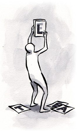
Unfortunately, the power of this method of communication comes at a significant cost. If a client says he wants his new auction site to be “like eBay,” what does that mean? An artist hears “It has a tacky color scheme.” A developer hears “It’s scalable to 20 million users.” A user hears “It has feedback ratings on all sellers.” Which, if any of these, did the client mean? You may spend dozens of hours writing specs for eBay-esque features that didn’t capture the client’s heart.
Conversely, defining your own work in terms of other products may set up unacceptable comparisons or fixations in your customer’s mind. If you boast that a new shopping cart works 95% like Amazon, the client may grow obsessed with “fixing” the 5% that’s different, or incorrectly believe that his site has acquired the capacity and features of Amazon across the board.
Moreover, the ability to identify a loose aggregation of features via a single comparison may cause clients to accidentally include irrelevant or needlessly expensive features in their specifications. For example, many off-the-shelf shopping systems include extensive support for multiple currencies and tax jurisdictions. This adds many layers of complexity, and if you’re running a single outlet in Chandler, Arizona, you probably don’t actually want to spend $5,000 more on development to ensure your “just like Zen Cart” shop is ready to handle British Value Added Tax.
Finally, a client who can only speak in similes may be unable to bring the best possible choices to the table. If the client is selling merchandise, he’ll probably say he wants a self-contained shopping system styled after his favorite e-commerce site—but his comparison is limited by his experience. Odds are, he hasn’t seen an example of a hosted shopping cart service, or a single-action “Buy Now” button that he can allude to, even if those would suit his needs better. Your experience and expertise comes in there, as you’ll be able to offer your clients choices they didn’t realize they had and rescue them from the tyranny of comparison.
Bounce back to the real world#section4
The ambiguity inherent in comparison-based design communication must be managed, or you’ll end up trying to build mutant websites which work as YouTube plus Newegg multiplied by DeviantArt…on a $750 budget. Fortunately, there’s a practical strategy for controlling runaway scope: limit the use of metaphors and similes to the phases in which they work best.
It makes sense to start with comparisons, especially if you’re about to develop a significant new functional unit. However, if you do so, the second round of specification development becomes critical. Once you understand what the client is asking for on a high level, you should restate that understanding in more concrete terms that will form the basis for binding design documents. You can even walk through the comparison product part by part and ask the client what he really means with his comparisons. There is absolutely no harm in asking “what part of this process do you want to copy?” Developers often over-complicate vague requests, and it may turn out to be a pleasant surprise when it turns out that all the client really wants to lift from the $300,000 commercial backend is its color scheme and menu placement.
You may also be able to control ambiguous comparisons by treating them not just as a design reference, but also as a source of benchmarks. Compare compatibility and performance of the model site: when you bring a focus group in, let them attempt to complete tasks on your site and then on the sites the client presented as models. Direct comparison of user experiences and task success rates are solid evidence that your site matches, or even exceeds, the models. Such a strategy is particularly effective when the client has questionable assumptions about user behavior.
When it’s clear that the client is relying on a poor or inadequate analogy because he lacks a better choice, you can combine his understanding of comparisons with your wide design vocabulary. Speak his language, and propose that “instead of doing it like your example, what if we try doing it like this other example?”
Finally, don’t miss the possibility of the sum of a client’s models being significant as well. If all the sites he idolizes average 700k per page of images and Flash, the unspoken message could well be “a seamless, graphics-intensive look is more important to me than 28.8 modem users.” Reading between the lines is no less important here than it is with a more conventional specification.
One more communication tool: no more, no less#section5
Design by comparison can help to engage your clients in the development process while keeping the discussion at a level they’re comfortable with. However, its practitioners must realize that poorly analyzed metaphors can say too much or too little. The need for this delicate balance keeps the technique from being a panacea, but doesn’t prevent it from being useful.
I am not a designer, so correct me if i’m wrong, but I would have thought that referring to other sites would kill a designer’s creativity.
Although I would rate myself a lot more web-savy than what most designers make their clients out to be, maybe a better approach would be to ask the client what he wants to achieve and then give a reference as an example. If he can’t explain what he’s trying to achieve, then don’t accept his example.
It’s part of my day to day business to try to figure out what a client want’s if he says “it has to be like XYZ, but …”. I think it’s still better if the client makes these comparisons than if he defines technical or design aspects by himself if he has no clue what he’s doing.
It’s not necessarily the clients fault when he/she can’t articulate his needs, it’s simply a lack of understanding on their part of this relatively new thing call the ‘web’ that everyone’s going on about. Often, when a client uses another website as a comparison, it is not that they want their site to look like the example, but rather that they want their site to provide a similar user experience and it is then the designers job to fathom which elements of the site are indeed required for that experience and use his design skills to provide that in an attractive/stylish/innovative way that fits r even stretches the design brief.
Sometimes a client’s wishes can stifle the creative juices of the designer – some jobs can be simply dull, but for a small agency or freelance web designer these jobs must be suffered in order to put food on the table.
Shouldn’t the article be called “Design by Simile” – don’t worry just me being pedantic 🙂
Steven I think Your right about the title of article im not pedantic but it’s something that can be changed. What do You think?
I agree with most of the commenters and article’s author have said. Clients always get excited after they see something new on web: new development, new fancy stuff or whatever eye-catching thing they found.
Since the beginning of my work life (after be conscious that kick clients wasn’t good idea -when they came up with this stuff ¬¬), I listen+take note of features clients asked (among useful/useless), then review the list, make a quick classification and finally a initial budget based on this high level requirement: simple.
Keep the EXAMPLES (google, amazon, ebay, flickr, etc ) as references but BUILD UP your OWN IMAGINARY EXAMPLE with all you now have and also try to identify/recommend some unique feature that will turn UNIQUE to your client on the web. Remember highlight this to your clients: you might look great like eBay, but being unique, you will look BETTER.
If your client really insists, you could use the budget as a leverage to make the client understands what some features are nice but expensive, and certainly won’t become in profit.
Finally … about the articles’ title, I think the author wanted to be SOPHISTICATED!
Pretty good article, but I also agree, the title was a little bit misleading.
A real article on designing with metaphors is more like:
“Visual Metaphors: 7 Rockstar Examples on the Web”:http://www.devlounge.net/articles/visual-metaphors-7-rockstar-examples-on-the-web
I tend to get frustrated especially when client tries to use technical terms, not really realizing what they mean. It would actually be better if they first would use a general concept, like “website like flickr”, because it gives you the chance to find out what it is about flickr they like.
One of the most difficult aspects of effective communication is trying to speak the same language. Some people believe they will be perceived as an expert by using lots of technical terms. Personally I find it better to try and build trust with clients by showing them that you understand their needs. And this is best achieved by being able to put into words and then action what it is that they want.
I once read (though I don’t recall where), that simile, especially when used in titles, is often misread.
Anyway, there are certainly pros and cons when it comes to the “something like that” approach. On the positive side, (and this applies to the use of metaphor/simile in language), a commonly understood visual metaphor ensures that you and the client are (heads down, cliché coming:) “on the same page”.
It’s also a great time-saver. If my client provides with with nothing more than “well, I want the site to look fun, but not flippant, corporate, but not too formal”, then I could “waste” my time coming up with several mock-ups (throwing stones at a tin can); or, I can suggest existing designs.
bq. I am not a designer, so correct me if i’m wrong, but I would have thought that referring to other sites would kill a designer’s creativity.
It depends on why you are referring to other sites.
This kind of comparison and ‘copying’ works well when you’re looking at functionality. There are a limited number of ways you can build a shopping cart process, or a photo-sharing website – taking the basic model from another website is a good point for starting the discussion about what is needed, and would would be nice to have. Likewise, in terms of the site architecture and content, there are only so many ways a site can be built, and similar sites tend to have similar sections and contents, so taking an existing site apart can provide a useful foundation that gets to the bones of what the client needs quickly, without needing the designer to be psychic or the client knowing more technical details than a client should be expected to know.
But when it comes to graphic design, I would have serious qualms about using another site as ‘inspiration’, especially if it is a related or competing site. Yes, it undermines the professionalism of the designer to be told “Make it look like _such-and-such website_”. Yes, it reduces the likelihood of a great design, suited to the tastes of the client and the needs and demographics of the target audience. Yes, it often leads to disappointment and/or bitterness from the client and the developer when the final design is not a carbon copy of the specified site.
That’s where it becomes really important for the designer to unpick what the client likes about the sites they are keen on. Is it the colour scheme? Is it the position of images on the page? Is it the way the menu works? Is it the list of section headings on the site? Is it something else altogether? But make sure the client understands that this is the basis for inspiration, to help you gauge his requirements, rather than simple plagiarism!
That way, you get to take the best bits of several sites, and synthesise them into a design of your own creation, that should serve everyone well. That’s the theory, anyway!
What’s Next after Web 2.0?
I do not like those buzz words like Web 2.0, Business 2.0 etc., however in order to communication, you have to conform to their protocols, otherwise they might think you are speaking in a foreign language. So far Web 2.0/Internet 1.0 lead by Youtube, FaceBook, same Amazon, New Yahoo! and New Google is successful, though at not successful as Web 1.0/Internet 0.0 led by Old Yahoo!, Ebay, Amazon and Old Google. Why? Not a big surprise anymore when from Web 1.0/Internet 0.0 to Web 2.0/Internet 1.0 as opposed from nothing to Web 1.0/Internet 0.0.
I believe the next after Web 2.0/Internet 1.0 is Web 3.0/Internet 2.0, however we’d better to call it Internet 2.0, since at that time, Web is not that important any more. Why?
Web 1.0/Internet 0.0 – Informed, you as a reader
Web 2.0/Internet 1.0 – Inform, you as a writer
Internet 2.0 (as opposed as Web 3.0/Internet 2.0) – formation of Information, you as a reader, writer, and much more
– BTW I am writing this post while I am watching a lecture C++0x (yes, C++0x) on at Univ. of Waterloo made by Prof. Bjarne Stroustrup – Prof. Stroustrup, think about C++ 3.0, borrow somthing nice from Ruby, the world is way too different now as opposed to 1980s
Frontier Space – http://www.hwswworld.com/space
Frontier Blog – http://www.hwswworld.com/wp
Good concept and article – thanks. I find metaphors and similes to be vital tools for communication in long-term planning and process design work, whether working with one person, or a group. I would think they’d be valuable to web designers, too. As for web design, I was telling a designer the other day what I want when my web site is redesigned soon. I described a site I found recently that I really like. I was restlessly searching until I saw this one, and recognized it for what it was, design-wise – an overall target, not a template to copy. The designer immediately told me how helpful specific reference sites are for her, because it directs her creativity and energy, and cuts out potential frustration for both of us, along with wasted time for her, and wasted money for me.
Whether or not you think design-by-(metaphor|simile) is a good idea, it’s necessary, and something we all deal with.
Of course, I still wish clients would be more articulate about what they like about their simile or example. Two of the most frustrating requests I’ve gotten were to make something look “more ready” or just “better.” Even when I showed examples of other sites they weren’t able to describe what it was that they wanted.
Good article. As designers I think we should be able to hold our clients’ hands through this process, if they need it.
One tool that we developed was what I called, “The Haircut Book.” Salons frequently have books and magazines for clients to reference. “I want my hair like Jennifer Aniston, except blonder,” would be a common request. The stylist then tries to identify how to best make that so (with the chubby woman with curly red hair in his chair).
Our “Haircut Book” included designs used for other projects, all within the corporate branding guidelines, as well as external examples that we could work with.
This provided two pluses. First, clients were able to talk about what they did and didn’t like using their own language. Second, we had a basis for discussion. People didn’t know what they wanted, didn’t know their limitations (if any), and felt intimidated by the process. The examples allowed us to probe preferences with the client and at least provide a good start at the design.
Good article, thanks for articulating.
I found using others sites as examples provides the client with very useful visual information.
They really have some fun when they can give thumbs up and thumbs down, make comparisons and express their likes and dislikes.
Thanks for the info.
I deal with a lot of SMB clients and am responsible for specifying and implementing the functionality of a site. After a decade of trying different approaches, I’ve found that one approach is more effective (at least for me) than any other. I don’t let the client talk. :->
They want to tell me about how the notification should support SMS because that is really cool, or how it is important that their client “embrace” the “usable” interface. In my experience, most clients are unequipped to drive the conversation about what they really want to achieve and focus on elements of implementation that may not be optimal.
I have a simple process:
Business Intent – Why bother building the website? Why not spend the time with your family instead? We try to keep the list of business intents under three and definitely under five specific, clear objectives.
Essential Tasks – What must your site users be able to do with the site Why do you want them to do that and why would THEY bother doing that? This elicits both the essential use cases and the functional roles the site needs to support (often you need to help/suggest/direct here).
Then for each essential task, we either recommend a pre-built configurable module (if you just need a simple catalog, we can make recommendations, and there are only so many ways to handle authentication and shipping). If a completely custom business process, what is the first screen they will see? What are the actions they can trigger (buttons/links)? What are the steps each will take and the possible next screens they will see. Repeat, including exception and conditional paths until complete.
Of course, there are many opportunities for research and consulting through this process, but for many SMB sites, you can walk a client through the core of a decent app in 3-4 hours.
Anyone honestly found a quicker process of specifying what a client actually wants well enough to get it built?
I’m usually relieved when clients use other websites as examples because at least it shows they’re thinking about what they want. I’ve had other clients who never use the Internet and haven’t got a clue what’s out there and they’re really difficult to work with.
Recently a client wanted a new website that would act as an entry site to four different but linked charities, each with their own logo, font, colour scheme, images and identity. I was unsure how the client expected me to do this, until they showed me an example of how another organisation had tackled a similar problem. Instant clarity and I was able to design a site that looked nothing like the one they used as an example but worked exactly like it.
Good piece. Keep up the good work!
I agree with practically everyone here on how it’s relieving to hear a client researching sites and figuring out for themselves what they like and don’t like about them. I think having to start from scratch to create a web site design would be great for the creativity but very wasteful if the client has no idea on what they want. You would probably be creating so many rejected design comps. Having an example site/sites gives the designer something to look at and study, but also put their creative spin to it and turn it into something really unique for the client.
Thanks for such a great article!
I just design website… only design; don’t have much idea about html or css or other technicals. So if i asked to design like ebay i’ll understand my design will look simple like ebay… just playing with the contents (normally a designer want to do some magic in his/her work to make a feel that its a rich design).
I think having the client give existing web site examples as design direction is great. However, the designer shouldn’t leave it at that and start designing. What the client likes about the site may very well differ from the designer’s view.
Ask “Why?” to clarify.
Using the eBay example, if you ask the client why he chose the site, he might confess it’s really the position of the logo, menu, sub navigation, etc. that grabs him. You might have been thinking primarily of the colors, fonts, and image treatments…and you would have wasted time trying to emulate aspects the client never felt passionate about in the first place, and at the same time, downplay elements the client really wanted.
Enjoyed this article (just having a little trawl through the back issues here)
I have to agree with Peter here. Client similes are useful for explaining design decisions and helping the client visualize graphical elements and process but it’s really your job as the designer to ensure that the final product fulfills their key business objectives. When they say “like ebay” they also mean “successful like ebay.”