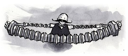
When you design for the web, you don’t know what software people will use to experience your site, and you don’t know what capabilities your users (and their software) have. Flexible layouts and resizable type can eliminate a lot of worst-case usability and design scenarios, but it’s still extremely difficult to create page layouts that don’t break even if the user increases the type size by more than a few settings.
Stick around and we’ll give you a way to detect your visitors’ initial font size setting—and a way to find out whenever your visitor increases or decreases the font size. Why would you want to know these things? Because with this knowledge in hand, you can create a set of stylesheets that adapt your pages to the users’ chosen font sizes, preventing overlapping elements and other usability and design disasters. (You can also do a lot of other interesting things, which we’ll discuss later.)

Our sample page before font resizing.

Our sample page with overlapping navigational elements after the font size is increased.
Flexible design approaches#section2
Some existing techniques—like Dan Cederholm’s “Bullet Proof CSS,” faux columns that simulate columns with background images, and oversized images and background-position that allow for growth of text—are a great help, but some designs just aren’t meant for large text. Furthermore, you won’t want to serve bite-sized content to visitors with large resolutions just to cater to visitors with smaller resolutions—if you can avoid it.
Designing into the unknown#section3
Before we get into the technique itself, let’s take a step back and examine the underlying problem.
We already know how to adapt to the size of the user’s window and screen resolution. Stuart Colville’s CSS Drop Column Layout shows content in four columns and drops the fourth below the third when there is not enough space on the screen. An older script by Cameron Adams allows for window-size dependent styling. If you use Cameron’s resolution script, your website can learn when the visitor’s window gets resized and react to it accordingly. Sadly, this is not the case when you resize the font.
How to detect font size changes#section4
It is remarkably easy to detect changes in font size. All you need is JavaScript that:
- creates a hidden
spanelement with a space inside it, - reads the height of that element and stores it,
- registers listener functions to call when the font size changes, and
- checks periodically if the height of the
spanelement changed—which means that the user has resized the font.
This is nothing new, and it has been used on some high-traffic web portals before. It becomes a lot more interesting, though, when you mix it with custom events. In essence, using a custom event means you get notified every time there is a change in font size.
Check the demo page to see the effect in action. (Resize the font in your browser to get the notifications.)
Using the text resize detector#section5
To implement this script, first embed it in the head of your document. (Line wraps marked » —Ed.)
<!DOCTYPE HTML PUBLIC "-//W3C//DTD HTML 4.01//EN" »
"http://www.w3.org/TR/html4/strict.dtd">
<html dir="ltr">
<head>
  <meta http-equiv="Content-Type" content="text/html; »
charset=utf-8">
  <title>Font Resizer Demo</title>
  <script type="text/javascript" src=" »
textresizedetector.js"></script>
</head>
<body>
  <h1>Resize me, now!</h1>
</body>
</html>
Next, define two properties:
- The
idof the element you want to add thespanto and - the name of the function that gets called when the text resize detector is initialized.
These are stored in two parameters called TARGET_ELEMENT_ID and USER_INIT_FUNC respectively.
  <script type="text/javascript" »
src="textresizedetector.js"></script>
  <script type="text/javascript">
    // <![CDATA[
    /* id of element to check for
       and insert test SPAN into */
    TextResizeDetector.TARGET_ELEMENT_ID = 'header';
    /* function to call once TextResizeDetector
       was initialized */
    TextResizeDetector.USER_INIT_FUNC = init;
    // ]]>
  </script>
Note: to determine the correct base font of the document, the element
with the id that you store in TARGET_ELEMENT_ID should be fairly high
in the source order and not inherit font size from any other element. This also
means that the detector runs as soon as possible.
If you don’t care about the base font size, you can specify any element.
Lastly, define the function that you set in the USER_INIT_FUNC property.
  <script type="text/javascript" »
src="textresizedetector.js"></script>
  <script type="text/javascript">
    // <![CDATA[
    function init(){
      var iBase = TextResizeDetector.addEventListener( »
onFontResize,null );
      alert( "The base font size = " + iBase );
    }
    // id of element to check for and insert control
    TextResizeDetector.TARGET_ELEMENT_ID = 'header';
    /* function to call once TextResizeDetector
       was initialized */
    TextResizeDetector.USER_INIT_FUNC = init;
    // ]]>
</script>
The init() function is where you register listeners with
addEventListener. This ensures that your function—in this caseonFontResize()—is called when the font size has been changed.
It also returns the base font size, which is useful for Opera and IE7
users.
A tangent: Opera and IE7#section6
These browsers take a different approach to resizing: instead of increasing the font size, they zoom the whole document, including form elements and images. As these browsers don’t resize the font, the event will never fire. However, the script allows you to initially read out the base font size and help you adjust your layout / widget according to that base size.
Back to work#section7
Once you’ve set everything up, you can define your listener function. (Line wraps marked » —Ed.)
  <script type="text/javascript" »
src="textresizedetector.js"></script>
  <script type="text/javascript">
    // <![CDATA[
    function init(){
       var iBase = TextResizeDetector.addEventListener( »
onFontResize,null );
      alert( "The base font size = " + iBase );
    }
    function onFontResize( e, args ){
      var msg = "\nThe base font size in pixels: " + »
args[0].iBase;
      msg +="\nThe current font size in pixels: " + »
args[0].iSize;
      msg += "\nThe change in pixels from the last  »
size:" + args[0].iDelta;
      alert( msg );
    }
    // id of element to check for and insert control
    TextResizeDetector.TARGET_ELEMENT_ID = 'header';
    // function to call once TextResizeDetector has init'd
    TextResizeDetector.USER_INIT_FUNC = init;
    // ]]>
  </script>
When the event fires, this function retrieves two parameters: the name of the event—textSizeChanged—and an array of arguments, the first of which is an object with the following properties:
iBase- The initial value of the document when it was loaded.
iDelta- The difference between the last font size and the new font size.
iSize- The new font size.
All font sizes are in pixels.
The TextResizeDetector object itself has three methods:
addEventListener()- Registers your event handler and returns the base font size. If you pass an object as a second parameter, your handler function is executed in the scope of that object.
stopDetector()- Stops the detector.
startDetector()- Starts the detector. This is only needed if the
stopDetector()method has been executed beforehand.
Possible Uses#section8
That’s grand, but what do you do with this information? Whatever you please. Possible options include
- Turning a horizontal menu bar into a vertical single list when the font is too large.
- Replacing a graphical button with a normal submit on large fonts
- Applying different style sheets to the document according to font size. You could also automatically switch to a zoom layout at a certain stage.
- Removing elements when a certain size is reached.
- Showing more elements when a certain size is reached (in case the user zooms out instead of in).
- Pulling in longer text passages via Ajax when the screen space allows for longer texts.
- Increase the width of a sidebar when the font size changes to keep a consistent line length.
- Center an element that is defined in em on the screen.
How else might this script be used? Tell us about it in the comments.
That’s it!#section9
That is all there is to it. You can download
all the code and examples in this zip.
For more info about custom events, here are two good resources.
Use this space to discuss the different options of this solution or to brag about great implementations. You can also use this spot to ask for solutions and liase with other developers willing to implement them. I will be busy over the next three days training some people in sunny Munich, but Lawrence will keep an eye on what is happening.
I created a plugin, “jQEm”:http://davecardwell.co.uk/geekery/javascript/jquery/jqem/ a few weeks back that adds similar functionality to the jQuery library.
I found that with Internet Explorer you can use setExpression to avoid having to inefficiently poll for changes periodically.
It shouldn’t be used as an excuse for developers to not design sites properly. Not everyone uses JavaScript.
That said, it’s a good solution to a common problem. Obviously you need a bit of JavaScript knowledge already. Out of interest, why didn’t you move all the JavaScript to external files?
Adam, actually I think it works the other way around. A lot of designers I met so far argued that they just cannot use resizable fonts (not realising that there is no way around it) as they will kill the layout sooner or later. This is a solution to counteract that. If you also only apply a stylesheet that uses a layout that doesn’t work with large fonts via JavaScript it is pretty safe. Users without JS get a fully resizable layout, others get one that works and switches.
bq. It shouldn’t be used as an excuse for developers to not design sites properly. Not everyone uses JavaScript
I don’t agree that this does equate to “not designing sites properly”. It is perfectly possible, maybe even very easy, to design a site that functions at all text sizes, but may not look all that good at the extremes of the scale.
Using Javascript to improve the performance of the page is perfectly acceptable – as long as the page still functions OK when JS is not enabled.
Adam, I left the initialisation javascript within the html file as I thought it would make the examples clearer. On production, it would probably be best to have it within an external file
Incidentally, my original need for such a script came about not from a site design issue but from a component/widget I was working on where I needed to update the widget if the textsize was larger than normal.
Thanks again for another great ALA article.
As ‘designers’ are, to a greater and greater extent, actually _designing_ web sites the need to fix broken layouts due to large font sizes shouldn’t be much of an issue.
Personally, I feel comfortable with designing a layout such that nothing breaks/overlaps for any of IE’s range of font sizes (a range which covers enough but doesn’t generally extend to silly large sizes). If a FireFox user wants to supersize the text then so be it.
However, buttons containing a fair amount of text are often annoying as I’ve never seen a browser that will maintain a fixed button size and wrap the text accordingly. Merely having the option, through text-resize detection and a bit of JS, to get a button to grow only vertically but not horizonally would be quite nice and is something I’ll have to play with some time soon.
It doesn’t work properly in Opera. A pop-up message occurs every time you zoom in an extra 20%! So at 110%, nothing. But press + again to reach 120% zoom and the pop-up tells me the font size has _decreased_ by 1px. This happens every 20%. Therefore, the script cannot be used as it stands – unless you hide it from Opera users.
Chris, Opera and IE 7 do not perform actually resizing of the text. These browsers zoom everything on the page so the actual size of the text stays the same. So for these browers detecting text size changes is not very useful. However it is useful to know the size of the text at the point of load (to detect users who need larger fonts for whatever reason – health or hi-res screens) which it does report correctly though.
The article does allude to this behaviour for Opera and IE7 but perhaps we should have made it clearer.
Thanks for posting the error in reporting the -1px decrepancy. Obviously this shouldn’t happen and I’ll take a look (didn’t notice this in testing). The event shouldn’t really fire for Opera and IE 7 but because of the bug, it thinks there is a font size change and fires.
The script breaks scroll wheel resizing in Firefox 2 on the “submit button demo”:http://www.alistapart.com/d/fontresizing/exampleSubmitButton.html . I have no idea why is that – all I know it’s serious and forces users to use keyboard for resizing, which is just as bad as forcing keyboard users to use a mouse for a certain task.
Running a 200ms interval to check the size? Oy! There must be a better solution. Wait.. there might be. Shaun Inman (with a small contribution of yours truly) figured at least part of this problem out with attaching an onresize event handler to a hidden iframe. I haven’t touched the code in years, but maybe there’s good stuff hidden in there.
http://www.shauninman.com/plete/2004/07/absolutely-positive
I am not sure about this comment, you cannot expect everybody to have a mouse with a scrollwheel either and I venture to guess that resizing with keyboard is more common than using the wheel. I myself only have trackpointers at my disposal.
Very interesting article and implementation. I’d be very interested to see some stats on the font sizes used by visitors. It’s a common problem with the client coming back saying “when I have the font-size set to the maximum level, the layout breaks.”
If only there were some stats to revert to..
I suppose AJAX could be used to record the font size changes?
Dmitri, ideally we’d like to be able to use a non-interval solution. There are stopDetector and startDetector methods available if it becomes an issue though. I wouldn’t expect it to though as its not doing anything too heavy.
Thanks for the link. I’ll check it out.
First off, excellent article. I can see this being really useful.
This is slightly off-topic, but what is the rational behind IE7 and Opera zooming, rather than increasing text size. Whilst zooming maintains the site layout, it can make the site really hard to read since there will be lots of horizontal scrolling. If this is what the site designer wanted, they could have used em’s for their sizes (ok images would still be an issue, but not that much on a well designed site).
I suspect its mostly related to screen resolution and so if you have these stats you could possibly make an educated guess. Definitely some stats on this might be useful, though I think AJAX would be overkill if reportage is only on font stats. A good old 1×1 transperent beacon gif could do the job just as well.
IE supports an onresize event which is fired when a div changes size due to changed fonts.
And for Firefox and Opera, you can use the resize event of a hidden iframe, and set the height/width of the iframe to ems.
If you are using Dojo, or can read Dojo widget code and widget templates, then functioning code using those techniques is available: http://trac.dojotoolkit.org/ticket/1437 (this also has true pixel measurements of font-sizes and scrollbars which can be very useful).
The article is slightly inarrucate. While it is true that IE7 does scroll the entire page when a user uses CTRL+scrollwheel/keyboard buttons, it also allows the user to just resize the text. Page –> Text Size –> the those five options we know and hate.
bq. it’s still extremely difficult to create page layouts that don’t break even if the user increases the type size by more than a few settings
Propaganda of the shoddiest variety. Play around with the technologies at your disposal, by all means let innovation thrive, but it is not innovative to distort reality in such a gross fashion.
Hello.
Thanks for this great examples.
I think this is very useful. I have just downloaded exapmple code and will try it now. Hopefully it is going to work.
Thanks again.
Hi, Chris.
I had done similar stuff before.
and I think that IFRAME may be a better detector to detect the change of font-size by the onResize Event Handler.
My prototype is available on :
http://www.hedgerwow.com/360/dhtml/js-onfontresize.html
Thanks.
With all the hard work already done it was actually quite simple to implement the same events in Flash. This way Flash content can resize with the same browser commands.
Demo and source can be found here: http://reefscape.net/?p=4
I’ve seen your comments and the work trail over at “Niqui’s”:http://niquimerret.com/?p=32 and must say well done.
@Hedger, you are right, to some degree. Personally I don’t like adding IFRAMES, as they may be confusing for assistive technology. Then again, most advertising in IFRAMEs is, too.
(comment long overdue, sorry about that, but days only last 24 hours in this part of the globe)
I found the scrollwheel issue troubling and experimented. I use indifferently mouse wheel or keyboard shortcuts, depending on my situation (alternatively laptop and desktop). And the resize did work for the first two bumps up, then it stopped and didn’t bump down.
I’m not criticizing the good work you guys did, the result is impressive; yet one would expect the script to work whatever the input device is, although for sure so far it’s only an experimental script.
If anybody could give us a hint as to why the script would break using the mouse, I’d be willing to hear it.
Need to add a late comment here.
The most important issue about this technique is *what does the user expect*?
They certainly do not expect items on the page do disappear or appear, or the page to transform when they shift the font size.
I can say with quite certainty that everyone except for the feature designer will be surprised and confused at first. While us, the more savvy users might get it, most users won’t, and they are the bigger majority that we create for.
I hope that anyone considering implementing this will think long and hard, and then test the design with a humongous number of (genuine) users.
The largest IE6 text size is not hard to support. And if it is, your design probably isn’t that well designed and/or coded. With CSS and none-table layouts it is not that hard to make designs that accommodates larger text sizes.
It may take practice and time to work it in to your workflow, but it is well worth it when you otherwise may have to resort to JavaScript functions that throw off your users.
Hi all, as I believe this to be a valuable article I published a German translation at:
http://mediengestalter.gleichjetzt.de/de/node/47
Thank you for sharing your insights.
Another approach to make your website scaleable, _without any javascript involved_, is to consequently use a relative size for your content. Just ensure, your website design does not rely on pixels: they are bad when it comes to zooming. You can instead define a base font-size (say specify font-size:small for the body element) and further on use relative font-size (eg. “font-size:smaller”? or “font-size:120%”? for all other elements. This, of course, also works for images: Just specify the width and height of your images using em and ex (eg. ). If your source image is large enough, it still will be displayed in acceptable quality as todays browsers scale it good enough.
Hi all,
Have been looking at http://www.alistapart.com/d/fontresizing/exampleSubmitButton.html and I am not sure it works in IE. On further research I have read that IE will not allow you to change the type of an input so this will not work: document.getElementById(‘send’).type=’image’;
Can someone confirm that they have not got this to work on IE and anyone have a workaround?
Cheers.
I discovered this implementation via google. While the idea is sound, I found mixed results from PC to Mac.
For example, on my page – the body font size is set to 72% arial, which is about 11px.
I found this solution got it close on a mac – but the results were different on a PC. For instance, on mac – the font size was returning at 12px when I first loaded the page. But on PC IE it was returning 15px.
It was only after I set the line-height on the hidden span to 1em that I started to find more consistent results both cross platform and cross browser. 11px on mac firefox and pc firefox. 12px PC IE