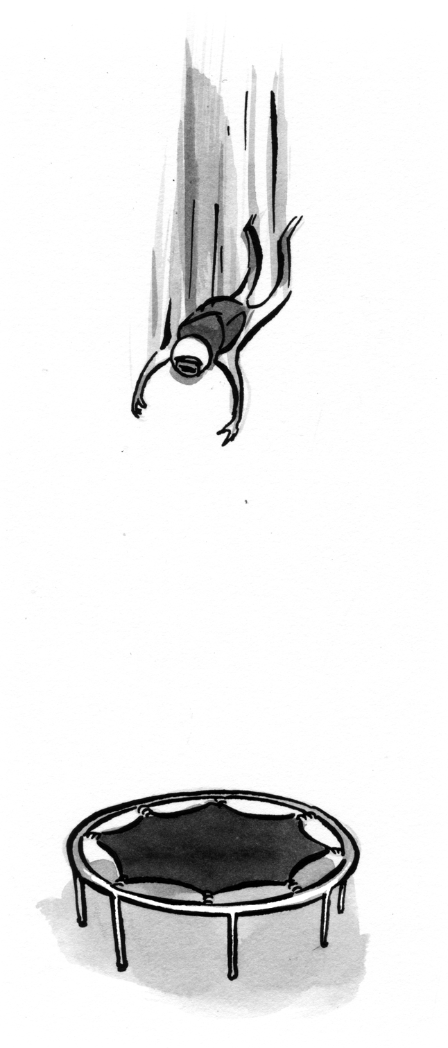
Have you ever had that sinking feeling when you realize—just a split second too late—that you shouldn’t have clicked “Okay” in the “Are you sure you want to quit?” dialog?
Yes? Well, you’re in good company—everybody has had a similar experience, so there’s no need to feel ashamed about it. It’s not your fault: it’s your software’s fault.
Why? Because software should “know” that we form habits. Software should know that after clicking “Okay” countless times in response to the question, we’ll probably click “Okay” this time too, even if we don’t mean to. Software should know that we won’t have a chance to think before accidentally throwing our work away.
Why should it know these things? Because software designers should know that we form habits, whether we want to or not.
Habit formation is actually good thing: it saves us the trouble of having to think when confronted with interface banalities and it lessens the probability that our train of thought will get derailed. In the case of the “Are you sure you want to quit?” dialog, our hands have memorized close-and-click as a single continuous gesture. That’s good, because most of the time we don’t want to think about the question—we just do the right thing. Unfortunately, our habits sometimes make us do the wrong thing: we don’t even have time to realize our mistake until after we’ve made it.
So, as designers we are led to a general interface principle: If an interface is to be humane, it must respect habituation.
Possible solutions#section2
What about making the warning harder to ignore? A subtle warning will get passed by, so let’s pull out all the stops: we’ll blink the screen and play a loud stretching noise to ensure that the user is paying attention. Try as we might, it still won’t work. The more in-your-face the warning is, the faster we’ll want to get away from it (by clicking “Okay”) and the more mistakes we’ll make. The thing is, no matter how fully in-your-face the computer presents the warning, we’ll still make the same mistake—clicking “Okay” when we don’t mean to. But it’s still not our fault: as long as it’s possible to habituate to dismissing the message, we’ll habituate, and then we’ll make mistakes.
What about making the warning impossible to ignore? If it’s habituation on the human side that is causing the problem, why not design the interface such that we cannot form a habit. That way we’ll always be forced to stop and think before answering the question, so we’ll always choose the answer we mean. That’ll solve the problem, right?
This type of thinking is not new: It’s the type-the-nth-word-of-this-sentence-to-continue approach. In the game Guild Wars, for example, deleting a character requires first clicking a “delete” button and then typing the name of the character as confirmation. Unfortunately, it doesn’t always work. In particular:
- It causes us to concentrate on the unhabitual-task at hand and not on whether we want to be throwing away our work. Thus, the impossible-to-ignore warning is little better than a normal warning: We end up losing our work either way. This (losing our work) is the worst software sin possible.
- It is remarkably annoying, and because it always requires our attention, it necessarily distracts us from our work (which is the second worst software sin).
- It is always slower and more work-intensive than a standard warning. Thus, it commits the third worst sin—requiring more work from us than is necessary.
In the Guild Wars example, points two and three aren’t particularly apropos because deleting a character is an infrequent action. However, if we had to type the name of a document before being allowed to exit it without saving, we would find it very burdensome.
What have we learned? That interfaces that don’t respect habituation are very bad. Making the warning bigger, louder, and impossible-to-ignore doesn’t seem to work; any way we look at it, warnings lead us into a big black interface pit. So let’s get rid of the warning altogether.
Undo to the rescue#section3
Merely removing warnings doesn’t save our work from peril, but using an “undo” function does. Let me say that again: The solution to our warning woes is undo. With a robust undo, we can close our work with reckless abandon and be secure in the knowledge that we can always get it back. With undo, we can make that horrible “oops!” feeling go away by getting our work back.1
Because we form habits, we’ll never be able to guarantee that we won’t have an “oops!” moment. Instead, designers must accept that it will happen and design for it. Whenever we have the opportunity to throw away work, the computer must allow us to undo our actions.
This leads to one of the most basic and important mantras of interface design: Never use a warning when you mean undo.
Google Mail is a outstanding example of this mantra. When you delete an e-mail, it immediately gives you an option to undo that action. How humane! This neatly sidesteps the issue of warnings (as well as the visibility issue of undo). When we make a mistake (which we are bound to do) it isn’t very costly because we can just undo it. With undo, we spend less time worrying and more time doing work.

Of course this is only one layer of undo—and Gmail goes even further. After you delete a message, it isn’t gone forever… it sits in the trash so that you can retrieve it if you decide later that you didn’t actually want to delete it.
Alas, this is a lesson that Google Calendar hasn’t learned yet. And, as predicted, I’ve deleted events that I didn’t mean to. Sometimes I’ve deleted the wrong event, which is particularly bad because then I’m not even sure what I’ve deleted. Without undo, there is no way to find out.

Actually, even Google Mail hasn’t fully embraced the lesson. When you remove a label from Gmail, up comes one of those wretched warnings. Why is it that Google can get it so right in one place, and mere clicks away get it so wrong? Perhaps because “warn-think” is so ingrained that it takes a heroic effort to break free. Even companies which are generally bastions of good design, like 37Signals, get this one dead wrong.

Using a warning instead of an undo is the path of least resistance from a programmer’s standpoint, and it doesn’t require any new thinking from a design standpoint. But that isn’t an excuse for our computers to be inhumane.
Conclusion#section4
Warnings cause us to lose our work, to mistrust our computers, and to blame ourselves. A simple but foolproof design methodology solves the problem: “Never use a warning when you mean undo.” And when a user is deleting their work, you always mean undo.
Oh, and the next time you see a warning used instead of undo, send the designer of the application/website a nice e-mail suggesting that they implement an “undo” feature instead. Send them a link to this article. Let’s see if we can’t change the way people design on the web—and in the process make everyone’s computing life more humane and less frustrating in one little way. Let the war on warnings begin!
I think that the undo option is much easier said than done when it comes to web based applications.
Great article right on the spot. Undo vs confirmation has been on my mind lately in a recent project I was working on.
Traditional desktop applications have followed this tendency for ages now, and you almost never see obtrusive warnings anymore (like “this cannot be undone. Continue?”).
The “business case” for undo gets better in the scenario where the user must delete multiple objects. The obtrusive confirmation box gets so annoying if, say, you have to delete 20 rows.
Once again, thanks for writing this article: It’s really useful in everyday web development.
PS. The name is “Raskin”:http://en.wikipedia.org/wiki/Aza_Raskin , right? Or did you change it to Raszin?
Yeah, those “this cannot be undone” warnings are really annoying and cause the user to keep things he doesn’t want to keep just for the matter that he’s afraid of making a irreversable mistake. But implementing an undo functionality is really harder than implementing a warning. The undo must be implemented all the way down to your persistence layer while the warning can be a simple JavaScript confirm.
In addition to what Brain (or Brian – typo?) said: if you implement an undo function for a delete functionality you also have to implement a “empty trash” kind of functionality. Sometimes you have to delete something and you don’t want it to be undone. Adds up some extra effort.
I would use a ‘last operation’ table in the database to record what the user did last, together with a serialised version of the record that has just been deleted.
If the user clicks undo, it will read the details of the last operation, extract the serialised record and re-enter it into the database.
Obviously this can run into complications if someone adds the same record afterwards. Also, what if the operation affects multiple tables?
I think an article outlining possible solution for implementing this would be most useful.
How do you undo program closing?
(One possible answer: save the work anyway, but in a special location that allows restoration on the next launch.)
Do you think they explicitly designed the undo functionality for the purposes of undoing a delete? I don’t.
Since they were keeping all mail items in the trash for a certain amount of time, the item wasn’t really being “deleted” until the trash was emptied. Can they undo the emptying of their trash?
Tin-Foil-Hat says: Isn’t it in Google’s interest to make their mail users retain their mail anyway?
I wager the intention was never to provide an undo function, rather store all e-mails anyway, and hey look – we can provide an undo action, since we do that already.
I think it’s important to make the distinction between two different situations which necessitate the option to undo:
* “Oh shit, I didn’t mean to do that!”
* “I deleted that the other day, now I need to get it back”
I have a feeling this article is implying that we should try to cater for the former, which perhaps means that using Gmail’s trash functionality as an example may confuse things.
In terms of implementation, a completely client-side approach would be to hold-off on informing the server that a mutable action has taken place until an unrelated action has taken place. For instance, if the user clicks “Delete item”, you can safely assume that they haven’t had an “oh shit” moment if they perform another of unrelated actions elsewhere. Another method might be to hold-off for a period of time – either will work. Server side would require short-term persistence of actions such that they can be rolled back when the user wants to undo. Sessions or cookies spring to mind, in this case.
Well, probably the approach of gmail is another. Since they have lables, they simply apply a label “trash”, and for the starred items they apply a label “starred”, and for the read items they apply “read”, and so on. So the “undo” is simply a “take-away-label-trash-from-item”.
Which is, in my opinion, the best solution.
The “Oops!” moment is also called the Oh no second.
http://en.wiktionary.org/wiki/Transwiki:Ohnosecond
Rather than trying to implement a possibly complex and difficult “undo” mechanism, another option is to do as the dialogue box in Fig 2 (partially) shows, and like OpenOffice does, and that’s to use different words.
By replacing OK/Cancel with Discard/Keep (for example), you make the user stop and think. Clicking ‘OK’ is a reflex and you do it without pause – but when the labels on the buttons are different, you do have to make a conscious decision about which option to choose.
The dialogue box should make it clear what you are doing as well, as the Google Calendar in Fig 2 does, but Highrise in Fig 3 does not.
The one that really annoys me is when I accidentally click on the [X] button of Outlook, and it comes up with an OK/Cancel dialogue box, but neither of the options given is ‘not to close’! Another of the things I love about Opera is the option to reopen *any* tab closed in the current session at the state it was last in, complete with full history.
That assumes that the user carefully reads each dialog box, instead of, say, skimming it (or worse). There is still the habituation factor.
The problem with undo is that it is not always practical. To undo you have to have a place to store the item while making it appear gone most of the time. Then you also have to have a way of restoring it. And you have to have a way of “emptying the trash”.
The other issue with undo is multi-users. Most desktop applications have undo because they are single user. Multi-user adds a new level of complexity.
Sometimes undo can easily be done (such as the GMail example). But other times it is not worth the effort. Sometimes “delete” is really the only practical option.
Firefox 2.0+ comes with a Session Restore feature, which enables you to pick up exactly where you left off when the browser was closed (including full history, form field contents, etc).
I use a Firefox add-on called Tab Mix Plus (TMP), which has its own Session Restore feature, as well as a Crash Recovery feature that lets you choose whether/how to restore a session from before the browser crashed. It also lets you undo closed tabs/windows, which is something I do several times a day, because I often get carried away with trying to quickly close a bunch of tabs.
[Oh.. just noticed Stephen Down’s comment about how Opera includes similar functionality. Awesome!]
I definitely agree with the overall premise of this post. It’s frustrating that just about every other desktop/web app that I use (besides from my web browser) suffers from this classic usability problem.
It’s all good and well to present Google as an example of the “right way” of doing things, but for most projects, there really isn’t an infinite well of database storage to collect every single action the user might perform in a “history”.
An example is an action I provide in one web application I wrote for clearing a rather verbose event log. This action is used to quickly reduce the size of the database. To provide an undo for that action would mean storing the entire log in the database even _after_ the log was deleted. To me, that’s counter-intuitive.
The problem is, if an application provides an undo that isn’t fully capable, it has the opposite effect to that described in the article: the user is lulled into a false sense that no action is irreversible, no matter how stupid or foolhardy. If the developer cannot (either logistically or logically) provide an extensive history, I would posit that he or she is better of providing no indication to the contrary.
Certainly, from a programatic point of view it’s a better idea to flag a database record as ‘archived’ or ‘trashed’ than to actually delete it from the database; and that’s fairly easily done in the real world. (Beyond deleting records however, I agree that implementing undo would be near impossible on the web at the moment; although I can’t wait to be proven wrong!).
But should we not present a warning *and* give the user the option to undo?
That way their habitual workflow remains unbroken 99% of the time, but they have the option to turn back the clock if (and only if) they have an “oops!” moment?
Instead of asking “Do you want to quit” perhaps we should ask “Would you like to Save before you quit?” and then label the buttons “Save” and “Don’t Save”. This way the user can’t just press OK or Yes by habit. At least for me it’s harder to accidentally press “Don’t save” than “Yes”.
The commenters seem to be hitting all around the answer by suggesting better text in the confirmation message. If you ask me “Do you want to quit?” the answer isn’t “Quit”, it’s “Yes”. The confirmation answer buttons could be improved by changing them to “Yes, quit” and “No, cancel” or something similar.
I applaud envisioning this ideal. Whether or not it is easy to achieve programmatically, the thinking is right. Interfaces should align with impulses, expectations and behaviors, not what is easy to engineer. Having said that, there is still the reality of building a product within a given scope. I would suggest an additional dimension to the thought — how important is the loss? Did I just lose something important or something easily recreated. That might contribute to the level of protection (undo, warning, confirmation) for the item.
Yes, whenever it is possible to undo, the user should be given that option, and whenever they have that option, warnings are less necessary.
But in many cases you *can’t* undo. Not because the developers were too lazy or busy to make it possible, but because the thing you are doing is by its very nature not undoable.
Once you’ve sent an email you can’t unsend it. Once you’ve spent some money you can’t unspend it.
In enterprise software, *most* of the actions users take are un-undoable because they involve collaboration with a larger system and with other people. The moment an action is taken it triggers other actions, and those actions trigger more actions. Within milliseconds you get to a state where it’s no longer even possible to get the toothpaste back into the tube.
None of this contradicts your basic point about respecting habituation. Some UI problems are easy to overcome and you’re right: we should overcome those problems. The thing is, though, that for every easy UI problem there are ten for which there are no perfect solutions. That’s when UI design gets tough.
A few points:
* In many cases, the confusion and danger is simply due to lack of clear language in the warning: “Canceling this task may cause data loss. [Abort / cancel] Clarity, and defaulting to the button that terminates the request, goes a long way towards addressing this: “If you do this, it’s final. [Go ahead / Oops, never mind]”
* What happens if you accidentally Undo? Can you Redo? Do these actions then take on additional assumed utility, that might be unwisely relied upon? Think of how easy it is in a program like Adobe Photoshop, to try something, undo it, redo it, etc. The concept of actions being destructive is forgotten, until you do something and get hit with a “can’t undo” or “can’t redo.” Okay, when you’re creating art, there’s a use for that. But *do you need an action stack to write an email*?
* Undo functionality in files/projects brings a novel set of security problems to be considered. If you provide undo, you must also provide a way to strip out the undoability before publishing or sharing. Any number of improperly-censored PDF documents released by government agencies exemplify this, either directly or in examination of their raw data.
*Keep the choice logical* whenever possible. Don’t introduce a lot of grey areas that are subject to confusion, that you will have to support and accommodate and debug. If you have to start remembering how many steps of which actions you can undo in an application, how is that moving towards a more transparent, easier, functional interface? Is it, perhaps, more confusing and less functional than a simple, single choice? [Yes / no]
To all the comments that claim “it’s too hard,” I say: too bad. Undo isn’t just humane, it’s also compelling. Web products that can begin to offer undo will make users happier and more satisfied with using the application. Reading this article as a suggestion for better confirmation messages (“Yes, Quit” and “No, Don’t Quit”) is to miss the point completely. It doesn’t matter if your confirmation addresses the user by name and whistles her favorite tune: they are obnoxious and disruptive.
It is worth thinking about some of the details. Nearly all operations in web apps are a form of Create, Update, or Delete. Leave aside one-way operations like sending e-mails as genuinely Too Hard–even though “un-send email” is something *everyone* would love to have, yet would require vast structural changes to email protocols and systems. Plenty of other apparently one-way operations exist (like dropping database tables), though even many of these could be accommodated with enough spare disk space.
Undoing Create operations is probably unnecessary. It’s unlikely you’d want to un-upload a video or un-create a new comment on a blog; you should be able to simply Delete those things immediately.
Undoing edits or updates would be hugely useful in more web applications. In the same way that Wikis maintain file change histories for their entries, web apps should be able to maintain histories for text objects (blog posts, comments, etc.) Even maintaining changes to other objects (for instance edits to a video) would be possible. Multi-user does make this tougher, but again, Wikis and version control systems prove that it can be done. “We don’t have storage space for keeping infinite change history” is a straw man argument: text doesn’t take up much space and it’s reasonable to limit the number of undos in other cases.
Deleting is where it gets slightly tougher, but complaints about “yes, but now you need an ‘Empty Trash’ action” seem silly. Infrequent, intentional actions like emptying the trash by definition will have the user’s close attention; if you have to find the one “Delete Forever” button, there’s much less of a chance of doing it accidentally.
Having a modal confirmation does help protect against actions we didn’t know we were doing – a mis-hit keyboard shortcut, for instance. There may be no “oops” moment in which we can consider undo then… or at least, not until five minutes later when it’s too late.
I’m very fond of applications with a trash bin. iPhoto, for instance, where I can trash everything I don’t want, and then review it the next day to make sure I’m certain about getting rid of them. It may not be suitable for every application, but the concept of even a word processor having a trash where unsaved documents reside has a certain appeal for me. Mail.app has its drafts, after all.
Nice article,
However, I just wondering if you’ve gotten a new Vista machine and it’s crazy incessant messages ([Cancel] or [Allow]) prompted you to write this little piece? hehe
It nicely applies to user friendly design and truthfully it’s not something I’ve really thought about before. Kudos.
Cheers,
JB
Great article. Depending on the context this could easily be implemented by just creating some sort of “soft delete” such as a date time field in the database.
Great way to stay unobtrusive but still give the user a second chance. I will try to implement this wherever I can. Thanks!
“Brian Lambert”:http://alistapart.com/comments/neveruseawarning?page=1#3 said:
bq. Yeah, those “this cannot be undone”? warnings are really annoying and cause the user to keep things he doesn’t want to keep just for the matter that he’s afraid of making a irreversable mistake.
If that is the case, would the user be attempting to delete said items to begin with?
I agree with the point of taking habitual activities into consideration and improving the interface, and so forth. I’m not so sure, however, that I agree with adding to the complexity of web applications to make up for user errors.
If I am doing something potentially harmful to my data (deleting items for example), I should expect no less than fouling things up when I am not paying attention. I don’t expect the software to read my mind. Likewise, I don’t expect the developers to try to accomplish such a feat.
For those of us that have the sense to pay attention to what we are doing, I find it redundant to have to repeat actions just to verify what it is I wanted to do in the first place.
From first hand experience, this is soooo true.
“Using a warning instead of an undo is the path of least resistance from a programmer’s standpoint, and it doesn’t require any new thinking from a design standpoint. But that isn’t an excuse for our computers to be inhumane.”
Those of you who are saying it’s too hard, you’re not thinking outside the box. Your mind is constrained to how you’d implement “undo” as a database schema or web-frontend, but that’s not where you should start. As I said in my first comment, when does the “oh no!” second pass?
p=. *When another action is performed*
So in the case of sending email…leave the email in the outbox until the user composes another email or starts reading other email. By that stage, they can’t possibly have made a mistake through habituation. Their actions imply that it’s safe to perform what they’ve asked. The same technique can apply to most of the other examples which have been given as well.
Listen to your user, they have much to tell you (even if they don’t know it).
What happens when the “oops factor”? happens six weeks later? At some stage the trash needs to be deleted or the server needs to remove old items from the available undo history.
I think Google’s undo message could still use some improvement as it doesn’t show what was actually deleted, making the chance of the user realising their mistake and pressing the undo button pretty unlikely. As another commentor noted, this perhaps leads to a false sense of security by giving the impression that any message in the trash can be recovered, when the reality is that it will be deleted permanently in 30 days time.
Undo is a nice goal to strive for though, but it is a huge problem technically and conceptually which I don’t think any body has really solved (but that does not mean we shouldn’t try).
“David Cassidy”:http://www.alistapart.com/comments/neveruseawarning?page=3#2926
bq. Yeah, those “this cannot be undone”? warnings are really annoying and cause the user to keep things he doesn’t want to keep just for the matter that he’s afraid of making a irreversable mistake.
bq. If that is the case, would the user be attempting to delete said items to begin with?
Yes! There are plenty of commands in Excel and Access that bring up this kind of “your action can’t be undone” message, and plenty of people in every office I’ve worked in who break out into a cold sweat at the thought of committing an un-undoable action. They know they want to delete something, but after seeing a message like that, become irrationally paranoid that they’re going to delete the wrong thing…
Remember, we’re talking about *ordinary people*, not techies, spods, geeks and nerds here!
If you’re working on a management system you are probably using a database. It’s really simple to add a field for ‘status’ in each table of deletable items. On a recent content management system I was designing, I removed the ability to really delete anything. The application simply ignored anything that has a status of ‘deleted’. This is really not hard to implement at all (when you’re starting from scratch).
There are couple of simple improvements necessary to make it really work well:
– always provide undo after delete actions
– provide a link to the trash, where you can see all items in all tables that have status ‘deleted’. allow users to remove the deleted status. Or in user-speak “undelete”.
– periodically delete items that have had status = ‘deleted’ for 30+ days. this is a cinch if you keep track of when any item was last updated.
Great article – I’d love to see more of this implemented on the web.
I think it’s safe to say that all humans are fallible (some more than others). In fact, I’d take that one step further and say that most humans are just kinda stupid. So, certainly, the availability of an “undo” option would absolutely alleviate some headaches…
I agree an undo is a best practice but as pointed out by several responses, undo isn’t always an option. Many databases e.g. SQL have transactional rollback capabilities, but what about more prosaic applications (web or other). Must the programmer roll his/her own? It may be beyond their programming ability or the functionality of the app.
Instead, I think a middle approach (assuming undo isn’t a viable option) is to ensure that the default option is Cancel or similar harmless option. It won’t slow the user down (they can still click directly on the more ‘destructive’ option) but at least the user is less likely to get into trouble by smacking the “return” key. In other words, make the user think prior to selection.
Of course, I agree that an Undo option should be included… if that’s feasible.
On Digg, you can edit your comments for over a minute after submission, which I find pretty helpful – it’s not indefinite so as to preserve the conversation thread. It’s a middle ground somewhat for actions that eventually can’t be undone.
It would be a pretty tough task to to, undo clicking the “Send E-Mail” button. That Ohnosecond when you forgot to add the attachment will not be prohibited so easy..
Sebastian Redl asked “How do you undo program closing?”. I’ve always admired Opera’s ability to reopen with all tabs and web pages intact after accidentally closing the browser. I pondered how they did it and thought it was really very easy: just keep a record of everything happening within the browser and only delete this when the program is properly closed. So if the browser crashes, the record is still intact and can be used to restore the open pages you were looking at when you restart the program. I also wondered why no-one else was doing this. Why should closing a program mean starting from scratch when you restart it? Where is the user continuity? Can it not just carry on from where you left off?
John Cartan wrote “Once you’ve sent an email you can’t unsend it. Once you’ve spent some money you can’t unspend it.” I’d argue this is not theoretically true. How hard would it be for servers to implement a simple time delay for all emails, that would allow you to retrieve them from the server before they were sent for good? Just because something exists in a limited form today doesn’t mean we can’t envisage an improved version. Or you can do what I used to do when I used Eudora, keeping sent emails in the Outbox until the program checks for new mail (as opposed to sending them straight away).
As for money, yes you can unspend it – by returning the goods to the shop and getting a refund.
Lastly, all these problems (at least on the desktop) could be solved by rolling back the computer to a previous state. Isn’t Vista set up to do this? And XP has a System Restore capability. So in theory you should be able to undo anything.
Another helpfull usability-article, thank you. And it offers a good solution, to a problem that is know for more then 20 years. (e.G. described in “the design of everyday things (a stil usefull book by Donald Norman from 1979)”:http://mitpress.mit.edu/catalog/item/default.asp?tid=5393&ttype=2 )
I agree with the author, being able to undo _everything_ would be nice.
But as some already stated, it sometimes is just not possible. In addition you can’t backup everything. In 2020 there will be file servers on moon keeping undos from John Doe’s unfortunate first steps in MS Paint. Man is a creature of habit and will always be; and man is bound to making mistakes. Sooner or later people will experience the “oops!” after having deleted the already deleted mail from their google trash. And after that comes the “trash-trash” that holds items that were deleted from the trash. People will accidentally delete things there, too.
And btw, I hate when software doesn’t behave the normal “OK, NO, CANCEL” way. I just keep getting angry when looking for “DISCARD”. ;P
I realize a good number of the pieces on this site are more theory than technique. But this particular article does little more than tell you “don’t use alerts.” Aza, I’m not trashing your idea, but _explain_, dude.
Kudos to “Dan”:http://alistapart.com/comments/neveruseawarning/?page=1#5 and “Nathan”:http://alistapart.com/comments/neveruseawarning/?page=1#8 and “Kit”:http://alistapart.com/comments/neveruseawarning/?page=2#15 and “Jeff”:http://alistapart.com/comments/neveruseawarning/?page=2#19 and “Jason”:http://alistapart.com/comments/neveruseawarning/?page=3#21 and (especially) “Andrew”:http://alistapart.com/comments/neveruseawarning/?page=3#22 and “Samuel”:http://alistapart.com/comments/neveruseawarning/?page=4#31, and “the other Andrew”:http://alistapart.com/comments/neveruseawarning/?page=4#35 for taking the initial steps in a dialogue about how to implement this concept.
Notice that they all inform without getting overly technical? With some forethought, the author could have flushed out an equally general set of web guidelines on the path toward a methodology that “doesn’t use alerts.”
Some might argue that this what the discussion area is for. I would rebut: let’s just cut to the chase and make the article one sentence, then.
My real frustration with making the posters do all the teaching is that it’s far less coherent than the voice of a single writer. Plus it updates in real time.
I oversimplified Aza’s idea. It’s actually _two_ sentences. (The first is “don’t use alerts.”) The second is “use undo instead.” He argues that warnings are bad, because they are habitual. He points to the example of Gmail’s undo as an alternative.
Some posters suggest rewording alerts, but fortunately “Mike”:http://alistapart.com/comments/neveruseawarning?page=2#12 points out early on that it’s still ultimately an alert.
Well…
Gmail’s undo is ultimately an alert.
The real confusion with popup warnings are their numerous options. You get an “OK,” a “Cancel,” and occasionally an “X” in the upper right to further complicate things.
Gmail’s undo, in contrast, has only one option. The undo has no close button. It sits on the screen until you take some other action, at which point it disappears.
The author would have done us a better service to distinguish an “undo” from an “warning” rather simply defining them as unrelated things.
Not that anyone asked, but in my opinion “Robert”:http://alistapart.com/comments/neveruseawarning?page=2#16 and “Marc”:http://alistapart.com/comments/neveruseawarning?page=3#25 and “Nathan”:http://alistapart.com/comments/neveruseawarning?page=3#28 present the best building blocks toward constructing an “undo methodology.”
Would that they were all in one place…
bq. Instead of asking “Do you want to quit”? perhaps we should ask “Would you like to Save before you quit?”? and then label the buttons “Save”? and “Don’t Save”?. This way the user can’t just press OK or Yes by habit. At least for me it’s harder to accidentally press “Don’t save”? than “Yes”?.
Even though this is already explained in the article (when deleting the wrong event in Google calendar), I’ll give another example: In Photoshop, I often create, or open and modify, an image that I never want to save — usually when I want part of it for the file I’m really working on, so I often blindly click buttons even though they are quite clearly labeled with their intention, and not just “OK” or “Cancel”. Sometimes I’ll even open a previous version of a file (with a similar filename and data), then tweak something to see what it looks like, but not want to save it, while still wanting to save the latest one. So even if it was really clear about what was going to happen, a mistake is still possible. I’m sure there are many other examples of similar situations.
As for the people saying that this simply isn’t possible in many cases, I think they are overlooking the many times where this is possible, but hasn’t been done because it’s easier not to. Then there is also the argument that immediate action with an undo option is simply better than a confirmation box, from a usability angle.
Even if a proper undo is not possible, sometimes data recovery would be nice, so that people can tell what has happened, and recover any important bits of data, even if it means jumping through hoops to get it back where it should be.
bq. Sooner or later people will experience the “oops!”? after having deleted the already deleted mail from their google trash. And after that comes the “trash-trash”? that holds items that were deleted from the trash. People will accidentally delete things there, too.
You’re forgetting something here (aside from something addressed at the beginning of the article): As these mistakes are from habituation, we can assume that they are generally something that is less likely to happen from a statistical point of view. Therefore, adding the trash layer isn’t just another layer to make mistakes that also need to be addressed, but a way of reducing the consequences exponentially (for lack of a better word). It’s about reducing the margin of error to a more acceptable level.
bq. I realize a good number of the pieces on this site are more theory than technique. But this particular article does little more than tell you “don’t use alerts.”? Aza, I’m not trashing your idea, but explain, dude.
Heh….In which language? In order for more technical things to happen, people first need to be made aware and convinced of the issue. This is what this article is doing.
I think that one of the best functions google ever implemented was the “get my email back” function. If it was sent by gmail to gmail (ie it still resides on Google’s server) you can get it back if you hit send instead of “no, i don’t really mean to send this un-pc rant to my boss”
Wish there was a way to do that across the board.
Way to go google.
_Designing the Obvious: A Commonsense Approach to Web Application Design_ by Robert Hoekman (an excellent book) will find this article awfully familiar. [ “Example”:http://safari.peachpit.com/0321453476/ch06lev1sec2?imagepage=168 ]
Not that there’s anything wrong with preaching good gospel, but it’s a bit cheap essentially regurgitating a partial chapter from someone’s book. In my humble opinion.
I like the concise rule of thumb: “Never use a warning when you mean undo.” It’s been said before, but it definitely bears repeating.
However, I think the article uses a bad example in making its case. I can’t recall a single application I’ve used recently that asked “Are you sure you want to quit?”? The applications I use assume I do mean “Quit” when I say “Quit”; what they want to know is what to do about unsaved data, which is an entirely different question. I *want* to be asked for confirmation in this case, because there’s no way the computer can know the right thing to do — whether to always save the changes (and allow me to undo them later by reopening the document), or always not save the changes (and remember them when I reopen the document so I can pick up where I left off). It shouldn’t automatically save my changes, because I might not realize or remember that I changed something. It shouldn’t always *not* save my changes, because I might not realize they’re unsaved — so I send my boss a spreadsheet that I *thought* I’d updated, but I was wrong, because the application exited with unsaved documents in exactly the same way as it exits when I’ve saved all my documents.
For the above reasons, I disagree with the statement that “With a robust undo, we can close our work with reckless abandon and be secure in the knowledge that we can always get it back.” (Also, if you know your work is recoverable, you aren’t being “reckless,” but that’s semantic quibbling.)
By the way, there’s another issue that I think has been glossed over, unless I missed it in the comments, and that is the issue of multiple levels of undo. Multiple undo is extremely valuable, but adds conceptual complexity.
SmartFTP asks if you really want to quit when you try to close it down.
I think the undo function would be a neat inclusion in web applications. I believe that this is easier to implement than I thought.
However, if we are to have a history of things we have done in the application (multiple undo), it would seem like way harder to create. Is the multiple undo really necessary?
Lets see the 1 layer of undo that is meant for the ohnosecond mistakes be integrated into web applications first.
That would be so cool. 🙂
@Jordan: More likely that Aza’s article (and possibly Hoekman’s chapter) stems from The Humane Interface by Jef Raskin.
One option could be to track users changes using a mechanism similar to the shopping basket concept. Changes are requested but not implemented until the user proceeds through a ‘checkout’ function to commit them. This would roll the undo and confirmation functions into one mechanism, which could be tracked client-side or server-side.
This whole concept becomes tricky very quickly when you’re working on shared data that multiple users can update though.
Multiple undo might not be so necessary in web applications. Handling the ohnosecond case gracefully is already a big step, and the cases where I mostly rely on multiple undo — mainly during text editing — would be handled by my browser’s text editing support. At the very least, though, I would consider the possibility.
Even single-undo needs thinking through. Should there be a “Redo” option, or should “Undo” mean “completely forget that last thing I did”? If you provide several web apps, should they be consistent in their Undo policy, or should each one use a policy appropriate for that application?
I would like to see an article, if there is one, that analyzes the undo approach for a variety of web apps, real or fictional. I’d like to see examples of thought processes that lead to good decisions.
There is one particularly nasty use case when undo just doesn’t work the way it was intended, or rather where it’s hard to come up with a working undo strategy: it’s when there are multiple people working on the same thing.
I often have the “oops moment” when using Gobby, a collaborative editor. Sometimes I will accidentally delete text that was written by different users. I immediately hit the ^Z, but in vain: Gobby doesn’t have undo, and even if it had, how would it be supposed to work? Should it be global, so that others can undo my editing, like in wiki? Or should it be local, so that only I have the power to put that accidentally deleted text back? What happens if someone already typed something in that place? What if the operation was something different than just deleting the text? Moving text around can be a tricky case, especially when someone else already modified it at its new location.
I think that dividing the document into smaller parts that can be acted upon (and reverted) independently is one possible solution (not unlike the section editing in Wikipedia), but there is a lot of room for improvement.
Great point! In real life practice this has been really useful too. Blender (a 3d modeling app) saves the file you’re working on whenever you quit in a special quit.blend file, and it’s saved me many, many times. It seems that maybe implementing that idea in desktop apps might be even easier than in web apps, at least in the closing-when-you-don’t-want-to sense.
How about English?
My “title”:http://alistapart.com/comments/neveruseawarning?page=4#40 notwithstanding, I think you may have missed some of the subtleties of my criticism, “Justin”:http://alistapart.com/comments/neveruseawarning?page=5#43 . Notice that I went on to point out several posts that “inform without getting overly technical?”
Another way to state my view is: solid concept, but it doesn’t warrant an entire article. We can agree to disagree on that.
I think Aza’s point could have been made in one or two paragraphs, as an introduction. He then could have spent the rest of the article preparing us to think in this “undo paradigm.”
“Example”:http://alistapart.com/comments/neveruseawarning/?page=3#22 : in a world of undo, your database will need an audit table. (See, that’s not overly technical. I don’t tell you which database, or what fields. Programming language never enters the conversation. It’s in _English._)
Great points all round, I would just add that for significant business benefits, carrying out user testing, especially as a user is negotiating their way through a checkout process, can really add weight to all the intellectual thoughts of any in-house or external people involved in optimising the user experience of a given site with warnings and undo’s featured.
I’m a new reader of ALA and by simple reading this article I’m very inspired. I’ll be sure to check back to what’s new on the site, after I dive into the archives for awhile. Thanks for your amazing content ALA, keep it up!
I really hate the warning message, “undo” is much more friendly and useful. And I will follow this suggestion in my design.
I think the talk about ways to make email undoable is missing part of the picture. Although the protocol itself is asynchronous, the preponderance of blackberrys suggests that people are increasingly using it for business-y things that are time sensitive. Any delay mechanism is just going to tick off anyone that does time sensitive stuff over email.
undo concept is very good idea and it does work. i even use that idea for new CMS, it will extend usabilitty a bit more!
I’ve been whinging at the Nokia folks for exactly this reason: http://blog.russnelson.com/770/connection-manager.html
Warnings are useless. Actually, they’re worse than useless, because they take the place of something which would be useful (undo).
I remember first being turned onto the idea of handling an ‘infinite’ undo stack in Jeff Cooper’s book About Face (1995), then I recall hearing Apple brag about Undo stacks in Cocoa in 1997 and several books since have cited the idea as the ‘right’ solution.
It’s often talked about in the same conversation about making people click ‘Save’ and even having the concepts of applications being bad examples of ‘exposing the implementation’.
So, where is it? I suspect it’s hard, expensive, and doesn’t sell well on boxes. Folks who love applications that do it probably don’t even realize it’s a reason they think ‘X is so easy to use’. I’ve asked people who use FileMaker whether they appreciate not having to save files, and none of them have noticed (aside from the occasional novice who feels really uneasy about the app if there’s no Save button).
In short, it’s the right thing for the user, but we need better metrics to justify taking care of the user (we used to have terms like ‘quality’ and ‘customer support’) to those calling the business decisions.
Undo is an ultimate solution here — but what if you could actually customize an actual alert/confirm dialog — and I don’t mean by using your own pop-element, but the actual JavaScript functions? That would go a long way towards curing the OK/Cancel issue. We could use some more flexibility in terms of what can be done with the functions — including content, formatting — at the very least customizing the text for the button elements. And please — I don’t want to hear about Microsoft’s modal windows here 😉
Follow the link to find out the article’s Russian version:
http://makskomaju.wordpress.com/2007/09/21/oy-a-kak-vernut-nazad/
We cant forget however the original idea of a warning. This just happened to me, I went to text message someone on my phone and scrolled down one option too far, delete. I just sighed in sadness as my phone displayed “contact deleted” No warning, no “are you sure?” No undo. So lets not forget that even a warning is better than nothing at all. Thank god for bluetooth synchronization to address book!
Great article Aza, this makes a lot of sense and I do love how Google does this in Gmail. It’s helpful to know that I can always get something back. I’ll definitely be implementing this in the stuff that I build.
That’s a good article AZA. The points that you have discussed are real for sure. But do you think that the same solution is going to be applicable for all types of applications, be it web based or standalone? I mean to say, is it all right for all the instances of deleting anything, from any kind of digital repository?
I understood the humane factor, the tendency of the human beings to get habituated. Google has done an excellent job on Gmail. But why didn’t they apply the same for the calender? Should we conclude that they did not give it a thought for the same? And yet, they came up with such a good solution for the mails, when they know that the same instances can occur for the calender as well.
But I must admit that, the points are applicable to some extent, and that would be very helpful for the user experience.
Good article, but the discussion assumes undo is the best solution without a viable discussion on the matter. There aren’t any arguments against this or for another solution altogether. Undo is OK, but how about arguments against such as privacy, development time or file space? Warnings are good. Undos are good. Neither are perfect, so just remember to choose what is best for the particular application – because in the real world, developers create apps for real users, within budgets. Develop accordingly.
we also can make habit of being cautious of what we are doing. And eg. data loss is such a great thing to doing so. And this can result only in faster development and “smarter” users and then even faster working with the program when it doesnt bother you with confirmation about everything you are going to do.
But what about the previous undo? Shouldn’t we give a warning that we’re about to overwrite the old Undo?
@Louisa: Undo is ALWAYS better than warn. Let’s take your objections one by one:
If privacy is important, then the existance of the data matters to the user. If it’s important to delete it when it’s not necessary, it’s important to keep it even in the face of user error. To make them comfortable that their deletion of sensitive data will actually occur, you say “This action is undo-able for the next ten minutes.”
Jef’s point (and his son Aza’s point) is that Warnings Do Not Work. If development time is important, then don’t waste time writing code to warn the user. Just do the action.
File space is *always* cheap relative to a user’s work output, and it’s becoming cheaper and cheaper by the day. Remember that when someone wrongly destroys their work, they almost always realize it within a second or two. You don’t need to keep a forever undo; being able to undo the last action is sufficient. So … you defer the actual action until the next command is entered. And if it’s “undo” then you just saved somebody’s bacon.
I never said undos are better than warnings, so please read the comment over again. Nor am I saying that warnings are terrific, either. I gave a comment on how the article was written definitively without any strong arguments.
I agree that actions taken should have immediate results, ie: click a button and it’s represented action occurs, like delete. That’s good HCI I think. But ours are a matter of opinions here on this case.
The code needed to write either case: A. undo action taken, make sure old data is available for x amount of time, take appropriate file space measures, create interface for undo action or selections or B. warn before doing the action forever – is actually more on the undo side – so arguing for the developers’/tech staff’s/etc sake is a bad argument.
My comment was trying to get at that even though it brought up a nice issue, “why warn at all?”, it doesn’t give any OTHER arguments altogether. How about another solution to interfaces that are prone to be confusing and how easily people delete things without realizing that they were deleting them? Why is it always the person’s fault? Why not better HCI design? Or why not VERSION control in general? Who knows, because the subject matter of the data is up in the air – and that’s key to how it should all work. The type of options would all be different when using Outlook, your computer’s file system, a content management system, Adobe Photoshop, Notepad, Calculator – which all depend on different types or file space amount, memory, hardware, interfaces, target audience, etc. This is quite like how Microsoft develops operating systems for the regular Joe (Are you sure you want to do that?) where as Linux develops operating systems for a developer (…no warning…). Some may say that’s why Linux or OSX is better than Windows, but millions of people prefer Windows over others because of small things like that, warnings which help direct them into good decision-making. There are a lot of factors to consider in any piece of software you’re developing as to what might work the best – and that isn’t ALWAYS undo.
The article ignored the thoughts of also, “well, how many undos do you give?” If space is a non-issue, and so is memory, and so is time, and so are salaries (we’re getting rid of a lot of factors here to make this possible) then you should never limit it – undo should cover every action taken from once the user starting using file/software/OS ___ . Because no amount of undo is ever good enough, once you give a user one, they expect more and that’s why programs now-a-days allow you to put in more and more undos in the history than ever before – users are dependent on not being accountable for data. That being said, I should be able to undo something I deleted 10 years ago, right? Or should I just be done with it after my 1 warning?
When is the user accountable? When are the HCI designers accountable? Can we not think of any other solutions?
Another possibility to prevent the user to click on the OK-button accidentliy might be to poste the question in the warning in the way that the user has to click the NO-button to continue. If he then clicks the OK-button although it wasn’t his intention he will just get one step back in the process. However, sometimes the question doesn’t sound good if you phrase it the other way round. But normally this is a good option.
@Phil Dubai, though your solution will prevent more users from performing operations they did not mean to perform, it will annoy a lot more users that clicks ok and expects their action to be comitted.
Andreas
A quick fix to this might be to accept the users decission and display a status message with undo option, and a 10 seconds counter.
“Message deleted, Undo (10)”
Andreas
One thing I’ve been implementing for a while is flagging content as deleted in the database.
When I feel it’s time to clean it up, I just run a delete function on the database where deleted equals 1.
It would be very easy to implement an “undo” function for users in my current applications, and hell, now I just might do so.
Great article.
I wrote an article about just this, more from a developer perspective.
http://obsurvey.com/Articles/WhereDidUndoGo.aspx
After I wrote my articel I found this articel, and I agree with what Aza is writing.
And It’s really not that hard to implement…
Email programmes should come standard with an undo send facility. Or a delay send. “are you absolutely sure you want to do this? sure you don’t want to wait till tomorrow when you’re sober/less angry?” Then it sends it round in a loop, which if you’re sober/not angry is easy to override, but otherwise (specially if you’re pissed) moves the send button around in a random kind of way. I just think computers should be more fun.
Users would be less likely to need to need “undo” if the messages more appropriately matched the answer.
“OK” and “Cancel” are difficult to answer; it’s not always clear thet “Cancel” is the opposite of “OK”. Perhaps users wouldn’t make mistakes as often if they were aked “Are you sure you want to delete foobar.doc?” and the buttons are “Yes” and “No”.
I know that some environments don’t allow you to change the options; I’m constantly challenged with trying to word a message that can easily be answered with “OK” and “Cancel” — it’s very difficult.
One common approach to the undo button is a soft delete, most of the time undo buttons come into play with CRUD operations, particularly the delete action – by giving a table a soft delete column (I like the name is_deleted) you can control the state of a record quite easily, by never actually removing the record the user is attempting to delete.
Ryan bates posts a screencast demonstrating infrastructure for undo/redo-based website CUD operations in Rails at railscasts.com.