A WTF moment in Silicon Valley#section1
Like everyone else who 1) has performed user research, and 2) is over age 40, I spent the requisite decade or two wandering a wilderness inhabited by misguided folks who assumed that, at best, users’ behaviors and opinions were but minor considerations in the design process.
So imagine my shock when, about five years ago, I found myself trolling (AKA “consulting”) down the corridors of a large Silicon Valley tech company. You most definitely know this company—in fact, you’ve likely complained bitterly about your experience with their products. Naturally, I expected to find precious little sensitivity there to users’ needs, much less any actual user research.
Instead I encountered a series of robust, expensive, well-staffed teams of researchers—many with doctorates—employing just about every imaginable method to study the user experience, including (but not limited to):
- Brand architecture research
- Call center log analysis
- Card sorting research
- Clickstream analysis
- Field studies
- Focus groups
- Market research
- Mental model mapping
- Net Promoter Score surveys
- Search analytics
- Usability testing
- Voice of the customer research
The company had all this research into what their users were thinking
and doing. And yet their products were still universally despised.
Why?
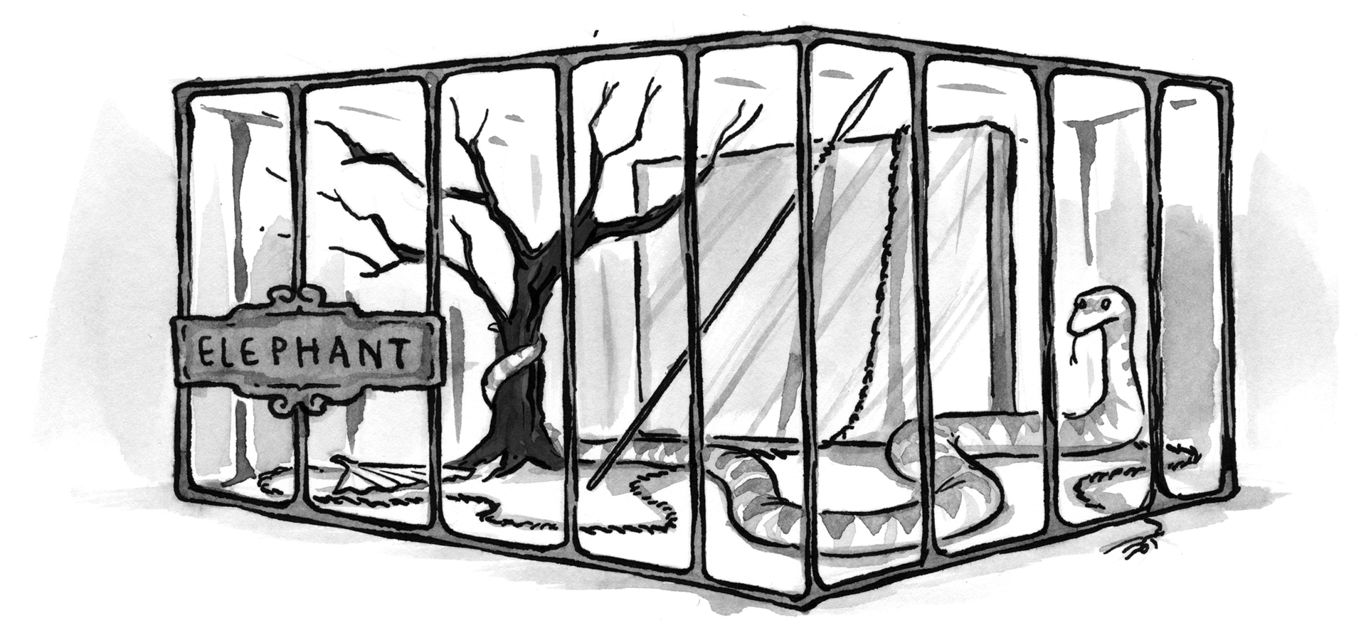
The fable of the blind men and the elephant#section3
You’ve heard this one before. Some blind men walk into a bar… Later, they happen upon an elephant. One feels the trunk and pronounces it a snake. Another feels a leg and claims it’s a tree. And so on. None can see the Big Picture.

Each of those teams is like one of those blind men. Each does an amazing job at studying and analyzing its trunk or leg, but none can see the elephant. The result is a disjointed, expensive collection of partial answers, and a glaring lack of insight.
Forget Big Data—right now, our bigger problem is fragmented data that comes from siloed user research teams. Here’s a simple example: one team may rely upon behavioral data—like a shopping cart’s conversion rate—to diagnose a major problem with their site. But they can’t come up with a solution. Meanwhile, just down the hall, another team has the tools to generate, design, and evaluate the required solution. Unfortunately, they don’t know about the problem. How come?
Because these two teams may not know that the other exists. Or they aren’t encouraged by their organization to communicate. Or they don’t share enough common cultural references and vocabulary to have a reasonable dialogue, even if they wanted to. So synthesis doesn’t happen, the opportunity for game-changing insight is missed, and products and services continue to suck.
I’ve since encountered the same problem in all sorts of industries and places outside the Valley. Even relatively small companies like Aarron Walter’s MailChimp struggle with fragmented user research.
Organizations that now invest in user research must resist the urge to congratulate themselves; they’ve only achieved Level 1 status. How can we help them reach a higher stage in their evolution—one where the goal isn’t simply to generate research, but achieve insight that actually solves real design problems?
I wish there were a pat answer. There simply isn’t.
But we can create conditions that get those blind men talking together. Consciously exploring and addressing the following four themes—balance, cadence, conversation, and perspective—may help researchers and designers solve the problems all that precious (and expensive) user research uncovers—even when their organizations aren’t on board.
Balance: Avoiding a research monoculture#section4
Just as we favor the research tools that we find familiar and comfortable, large organizations often use research methods that reflect their own internal selection biases. For example, an engineering-driven organization may invest far more in its toolsy analytics platform than what may appear to them as “nebulous” ethnographic studies.
If you’re only listening to one blind man, you’ll be stuck with an incomplete and unbalanced view of your customers and the world they inhabit. That’s risky organizational behavior: you’ll miss out on detecting (and confirming) interesting patterns that emerge concurrently from different research silos. And you likely won’t learn something new and important.
A healthy balance of research methods and tools will give you a chance to really see the elephant. Sounds simple, but it’s sadly uncommon in large organizations for two reasons:
- We don’t know what we don’t know. For example, you might have done dozens of field studies, but know nothing about A/B testing.
- We don’t know what to use when. There are so many potential approaches that it’s hard to know which to use and how to optimally combine research methods.
Plenty of good books can introduce you to user research methods outside your comfort zone. For example, Observing the User Experience and Universal Methods of Design will help you inventory research methods from the human-computer interaction world, while Web Analytics: An Hour a Day will do the same for web analytics methods.
But a laundry list of different research methods won’t, by itself, tell you which methods you should use to achieve balance. To make sense of the big picture, many smart researchers have also begun to map out the canon.
One of the most extensive and useful maps is Christian Rohrer’s “Landscape of User Research Methods.” It depicts research methods within four quadrants delineated by two axes: qualitative versus quantitative, and attitudinal (what people say) versus behavioral (what they do):

Use Christian’s “landscape” as an auditing tool for your user research program. Start with what you already have, using this diagram first to inventory your organization’s existing user research toolkit. Then identify gaps in your research methodology. If, for example, all of your user research methods are clustered in one of these quadrants, you need to find yourself some more—and some different—blind men.
Cadence: The rhythm of questions and answers#section5
User research—like any other kind of effort to better understand reality—doesn’t work well if it happens only once in a while. Your users’ reality is constantly in flux, and your research process needs to keep up. So what research should happen when?
Just as a map like Christian’s can help you make sense of user research methods spatially, a research cadence can help you understand them in the context of time. A cadence describes the frequency and duration of a set of user experience methods. Here’s a simple example from user researcher and author Whitney Quesenbery:

Whitney’s cadence incorporates a mix of research methods, gives us a sense of their duration, and, most importantly, maps out how frequently we should perform them. It helps us know what to expect from an organization’s upcoming research activities, and figure out how other types of research might fit timewise.
To establish a cadence, first prioritize your organization’s research methods by effort and cost. Simple, inexpensive methods can be performed more frequently. You might also take a shortcut: look for (and consolidate) the de facto cadences already employed within your organization’s various user research silos.
Then consider how frequently each method could be employed in a useful way, given budget, staffing, and other resource constraints. Also look for gaps in timing: if your research is coming in on only a daily or annual basis, look for opportunities to gather new data monthly or quarterly.
Here’s a sample cadence. Given that your organization will employ a different mix of research methods, your mileage will vary:
| Weekly | |
| Call center data trend analysis | 2 – 4 hours (behavioral/quantitative) | Task analysis | 4 – 6 hours (behavioral/quantitative) | Quarterly |
| Exploratory analysis of site analytics data | 8 – 10 hours (behavioral/qualitative) | User survey | 16 – 24 hours (attitudinal/quantitative) | Annually |
| Net Promoter Score study | 3 – 4 days (attitudinal/quantitative) | Field study | 4 – 5 days (behavioral/qualitative) |
I’ve added in the categories from Christian’s two axes to ensure that our cadence maintains balance.
Balance and cadence can help organizations get the right mix of blind men talking, and make sure they’re talking regularly. But how do we enable dialogue between different researchers and get them to actually share and synthesize their work?
Conversation: Getting researchers talking#section6
Getting people to talk is easier said than done. If your user researchers have HCI backgrounds and your analytics team is mostly engineers, their languages and frames of reference may be so different that they crush any hope of productive conversation.
Create a pidgin#section7
To make that conversation more likely to succeed, it’s helpful to identify at least a few shared references and vocabulary. In effect, look to develop something of a “user research pidgin” that enables researchers from different backgrounds to understand each other and, eventually, collaborate.
A concept from sociology, boundary objects, can be useful here. Boundary objects are two items from different fields that, while not exactly the same thing, are similar enough that they can enable a productive conversation between groups. For example, personas and market segments, or goals and KPIs, could be considered boundary objects.
Dave Gray, co-author of Gamestorming and The Connected Company, has taken the idea further, developing a simple process for identifying a fuller boundary matrix of common concepts.

While Dave’s process will help you determine common concepts and vocabulary, it’s still a Big Win to get broad acknowledgment that, while you and your colleagues may be speaking (for example) English, you’re really not speaking the same language when it comes to user research. That realization will make it much easier to meet each other halfway.
Tell each other stories#section8
Common language makes it easier to have an effective interdisciplinary dialogue. So do stories that demonstrate the value of that dialogue. Can you tell a story that shows the power of getting the blind men to talk? Here’s one Jared Spool—a master storyteller, for sure—told me a decade or so ago:
The analytics team at a large U.S. clothing retailer found, when analyzing its site search logs, that there were many queries for the company’s product SKUs—and that they were all retrieving zero results. Horrified, they quickly added SKUs to their catalog’s product pages—an easy fix for a big problem—but they still couldn’t understand how customers were finding the SKUs in the first place. After all, they weren’t displayed anywhere on the site.
The analytics team could tell what was going on, but not why. So they enlisted the team responsible for performing field studies to explore this issue further. The field study revealed that customers were actually relying on paper catalogs—an old, familiar standby—to browse products and obtain SKUs, and then entering their orders via the newfangled website, which was deemed safer and easier than ordering via a toll-free number.
The story may be an interesting example of cross-channel user experience. But for our purposes, it’s a great way to show how two very different user research methods—search analytics and field studies, wielded by completely separate teams—deliver compounded value when used together.
Buy candy for strangers#section9
Of course, sometimes it’s not that hard to get interdisciplinary dialogue going; you just might need to resort to some innocent bribery.
Samantha Starmer, who led design, information architecture, and user experience groups for years at REI, relates her experience in creating dialogue with her counterparts in the marketing department. Samantha made a point of regularly trekking across the REI campus over to their building to peek at the research they had posted in their war rooms and cubicle walls. She would even buy candy for the marketing people she wanted to get to know. She did whatever she could to get them talking—and sharing—in an informal, human way.
Samantha’s guerrilla efforts soon bore fruit—her team developed relationships not just with marketing, but everyone touching the customer experience. Informal lunches led to regular cross-departmental meetings and, more importantly, sharing research data, new projects, and customer-facing design work across multiple teams. Ultimately, Samantha’s prospecting helped lead to the creation of a centralized customer insights team that unified web analytics, market research, and voice of the customer work across print, digital, call center, and in-store channels.
Perspective: Making sense and making function#section10
So far, we’ve covered the need for a balanced set of user research tools and teams, coordinating their work through orchestration, and getting them to have better, more productive conversations. But that’s quite a few moving parts—how do we make sense of the whole?
Maps like Christian Rohrer’s landscape can help by making sense of an environment that we might find large and disorienting. You’ll also find that the process of mapping is, in effect, an exercise in putting things together that hadn’t been combined before.
But maps are also limiting—they are hard to maintain, and more importantly, you can’t manipulate them. To overcome this, the MailChimp team took a very different route to sense-making, employing Evernote as a shared container for user research data and findings (see Aarron Walter’s article, also in this issue of A List Apart, “Connected UX”). It’s actually an incredibly functional set of tools, all pointed at MailChimp’s collective user research—but, unlike a map, it struggles to make visual sense of MailChimp’s user research “geography.”
Would it make sense to combine your map and your container? Dashboards are both orientational, like maps, and functional, like containers. They’re also attractive to many leaders who, when confronted with their organizations’ complexity, seek better ways to make sense and manage. But before you get your hopes up, remember that there’s a reason you don’t steer your car from its dashboard. Like any other design metaphor, dashboards tend to collapse as we overload them with features.
Perhaps some smart team of designers, developers, and researchers will be able to pull off some combination of user research maps and containers, whether presented as a dashboard or something else. In the meantime, you should be working on developing both.
Blue skies#section11
These themes—balance, cadence, conversation, and perspective—provide a framework for positioning your organization’s user research teams to talk, synthesize, and, ultimately, come up with more powerful insights. So, go make friends, have conversations, and get outside of your comfort zone. Take a step back and look at what you and your counterparts are doing—and when. Then sketch maps and other pictures of which kinds of user research are happening in your organization—and which are not.
Once you’ve done that, you’ll be armed to bring senior leadership into the conversation. Ask them what evidence would ideally help them in their decision-making process. Then show them your map of the imperfect, siloed user research environment that’s currently in place. Balance, cadence, conversation, and perspective can help make up the difference.
Good article, and I have encountered the same, where research becomes an end unto itself. But I feel the bigger issue with getting these Big Companies to even marginal experiences is implementation.
This is not a rant about developers, but about higher level processes, and organizations. Many places I consult or have worked at, there is NO ONE who can champion, much less approve a project across the enterprise. No, not even the CEO, because if you get to chief officer level and they all nod, then it has to go operational, and operations are about money more than anything.
While we can sneak in design exercises and pattern libraries, who is going to pay for implementing and maintaining Sitewide Search. I mean, not a common UI, but a single search server and experience. Not to mention making stores and bills and call centers and the 28 websites (as in, different domains, yes for a single Fortune 50 company) talk the same language. Etc.
Do you think a tool to manage different techniques in an integrated manner would help to see the full elephant?
I mean something like this: UCDmanager
This is a great article. Thanks for taking such time and thoughtful care to layout the common issues and suggested ways to address them. Just remembering that there is an elephant (bigger picture) is key to making all this great data and research work for the end goal of a better customer solution and experience.
Thanks Steve and Carey. I agree: how do you get someone to champion cross-silo initiatives? My only advice is to show decision-makers that user research is essentially where they get the evidence (which they’ve paid for) to make well-informed decisions. Looking at it that way, you might get them to see that if they were going to design this evidence-generating apparatus from scratch, it would look NOTHING LIKE the disorganized, disconnected dog’s breakfast of teams, methods, applications, and data stores that’s currently in place in their organizations. Really, they should be both horrified and embarrassed at what’s there now.
Jordi, will have a look at your tool soon.
Lou,
Thanks for the article. As for the cross-silo initiatives, I believe the only solution is to eradicate them, and that can only come from the top. Everyone has to be focused on the company’s raison d’être and not their own department objectives.
It is great article!
Thank you for sharing.
一番安い引越し業者
It’s perfect time to make some plans for the future and it is time to be happy. I’ve read this post and if I could I desire to suggest you few interesting things or advice. Maybe you can write next articles referring to this article. I want to read more things about it!
THIS!
I’m working on a post for my own blog and stumbled on this from Inbound. Big Data comes with a lot of problems and the “bigger problem is fragmented data that comes from siloed user research teams.” This is perfect and it happens far too often.
Your story about the Silicon Valley company with the well-staffed “trophy” teams of researchers was very poignant, and explains a lot.
Samantha Starmer’s guerrilla methods have worked best for me…find the right people and get the conversation going informally. Look for opportunities to use your skills to make them look good and they’ll keep coming back for more.
user research makes impact only when the data is shared across organizations to build the big picture. Hoarding data in organizational silos is detrimental to the cause of building great experiences
1123
LOVED IT! The elephant story is a favorite, buying candy… Genius!